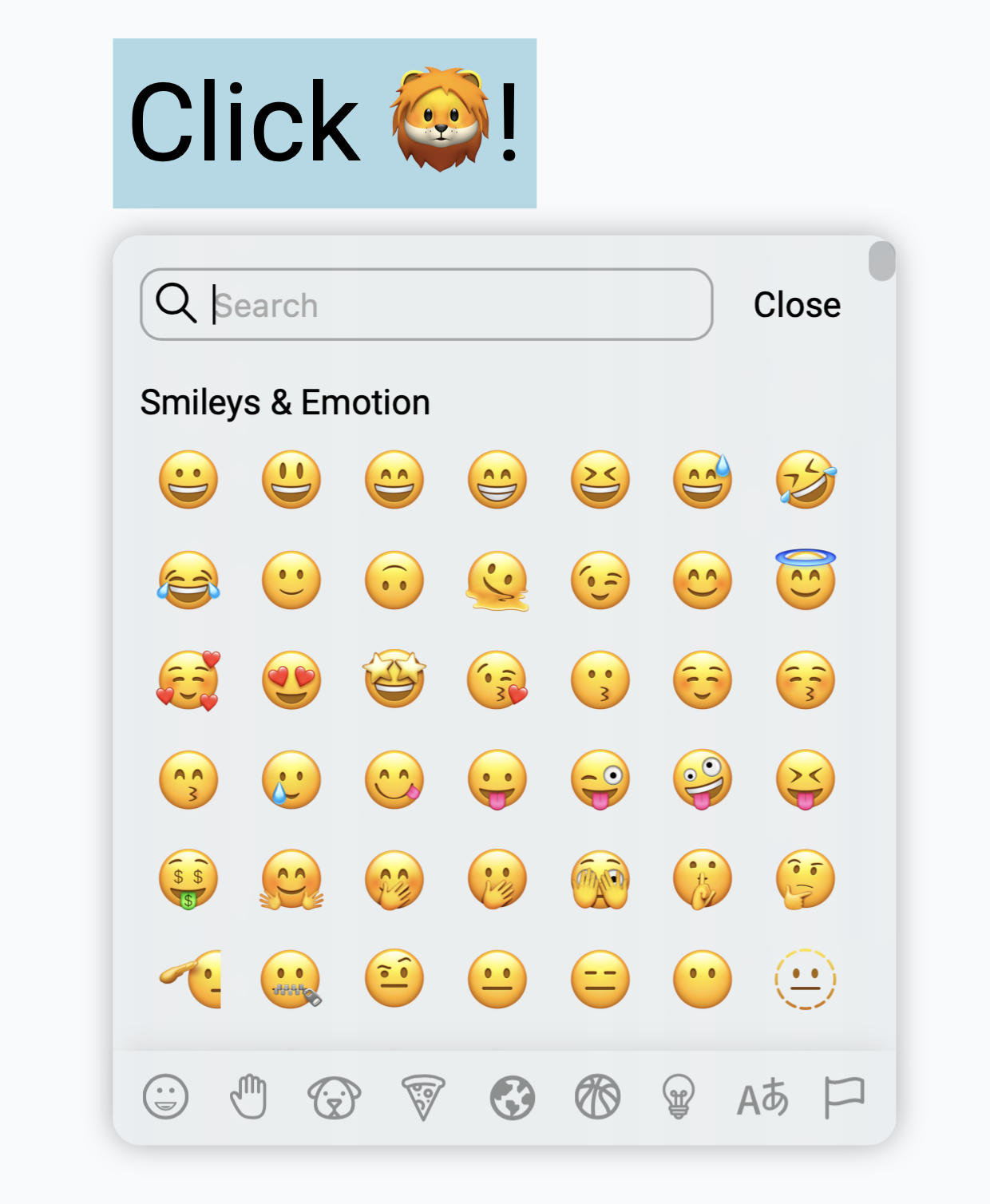
React Emoji Selectors
Simple, ready to use, and customable react emoji selector component for every react project.
👺 Demo
Try and custom your emoji selector here.
Content
📒 Guideline
Install 💾
yarn add react-emoji-selectors
Usage 📠
To use EmojiSelector, we recommend you to wrap your triggle element and EmojiSelector under the same tag as an example below.
This is just a simple example of EmojiSelector.
You can customize it by using component props from next section.
import React, { useState } from 'react';
import { EmojiSelector } from 'react-emoji-selectors';

function App () {
   const [output, setOutput] = useState('🦁');
   const [showSelector, setShowSelector] = useState(true);

   return (
      <div className="App">
         <div>

            <div onClick={() => setShowSelector(true)}>
               Click {output}!
            </div>

            {showEmoji &&
               <EmojiSelector
                  onClose={() => setShowSelector(false)}
                  output={setOutput}
               />
            }

         </div>
      </div>
   )
}
If you want responsive version for your responsive app, we recommend you to use mobile version MEmojiSelector for mobile and tablet screen size.
Of course, you can use both in one application as well.
Here is the example of mobile version.
{showEmoji &&
   <MEmojiSelector
      onClose={() => setShowSelector(false)}
      output={setOutput}
   />
}
🐼 EmojiSelector Props (Desktop version)
onClose (default: none)
Use this attribute as a function to set useState variable to close the emoji selector.
- input
function - return nothing
output (default: none)
Use to get selected emoji from selector. You can pass function through this attribute as an example below.
- input
function - return
string (emoji)
closeAfterSelect (default: true)
The emoji selector will close after user select an emoji when this attribute is true otherwise nothing happen.
- input
boolean
clickOutsideToClose (default: true)
If this attribute set to true, onClose function will be called when user clicks outside the emoji selector.
- input
boolean
highlight (default: 'lightblue')
Change color of highlight color of emoji selector.
- input
string (rgb or hex)
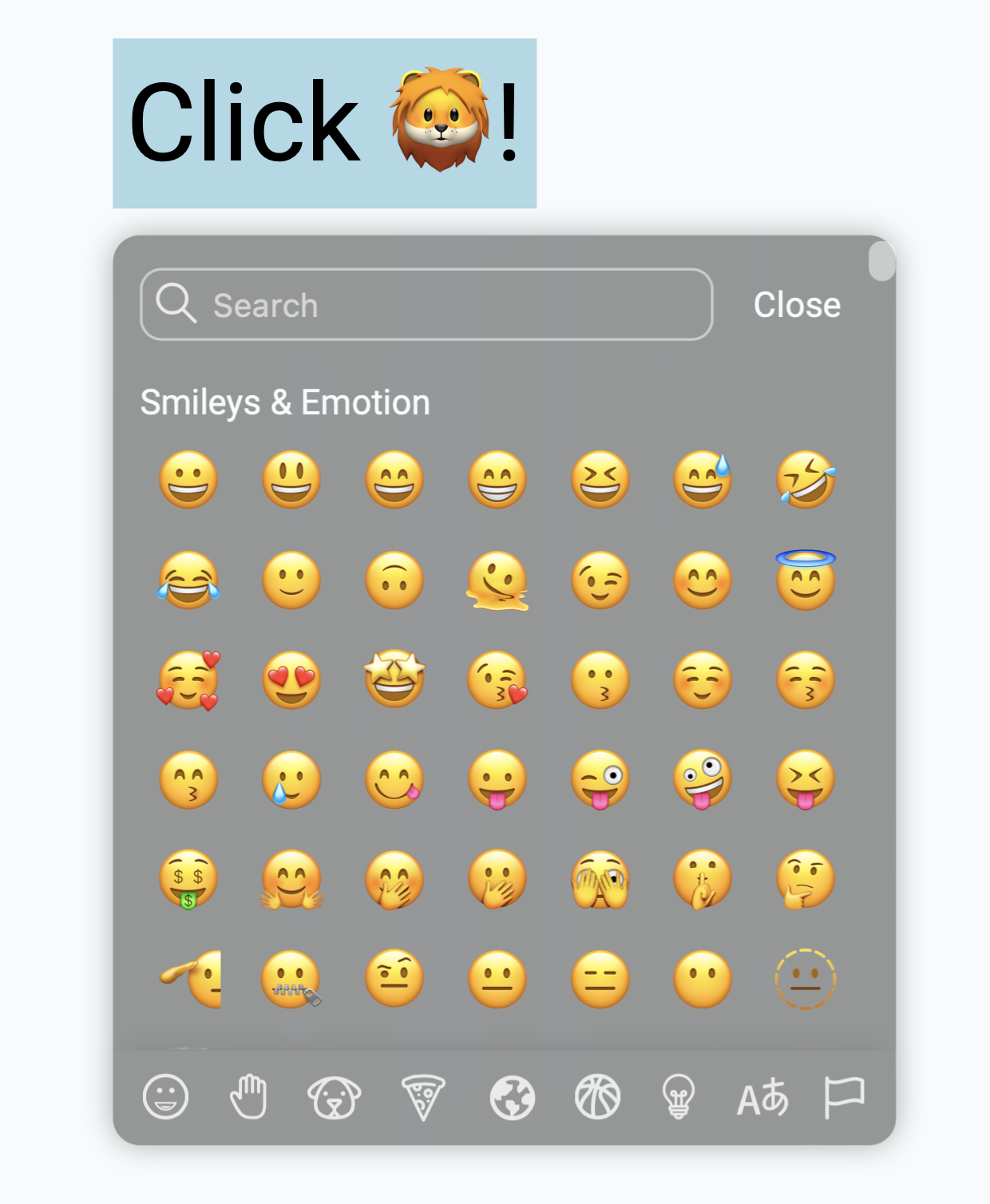
darkMode (default: false)
Change to true, if you want it darker.
- input
boolean
backgroundColor (default: none)
Change background color of emoji selector container.
- input
string (rgb or hex)
cornerRadius (default: '10px')
Change corner radius of the selector.
- input
string
recently (default: true)
To disable recently section at the top of selector, set this to false otherwise do nothing.
- input
boolean
recentlyData (default: null)
This props can be use only when recently props is true.
Use this props to pass your user recently emoji data.
By default, recently data will be collected in user's browser localStorage with the name of react-emoji-selectos (for this option no need to pass anything through this props).
Another option, if you would like to pass your own user data, you can pass array data of emoji through this props to show in recently section.
- input
Arraye.g.['🦁', '🦙', '👺']
clearRecently (default: none)
This function will be called when user click at the clear button when you use your own data in recentlyData.
On the other hand, if you use localStorage (default setting) to collect recently data, you don't have to do anything.
This function will delete data from localStorage by default.
- input
function
📱 MEmojiSelector Props (Mobile version)
onClose (default: none)
Use this attribute as a function to set useState variable to close the emoji selector.
- input
function - return nothing
output (default: none)
Use to get selected emoji from selector. You can pass function through this attribute as an example below.
- input
function - return
string (emoji)
closeAfterSelect (default: true)
The emoji selector will close after user select an emoji when this attribute is true otherwise nothing happen.
- input
boolean
clickOutsideToClose (default: true)
If this attribute set to true, onClose function will be called when user clicks outside the emoji selector.
- input
boolean
highlight (default: 'lightblue')
Change color of highlight color of emoji selector.
- input
string (rgb or hex)
darkMode (default: false)
Change to true, if you want it darker.
- input
boolean
recently (default: true)
To disable recently section at the top of selector, set this to false otherwise do nothing.
- input
boolean
recentlyData (default: null)
This props can be use only when recently props is true.
Use this props to pass your user recently emoji data.
By default, recently data will be collected in user's browser localStorage with the name of react-emoji-selectos (for this option no need to pass anything through this props).
Another option, if you would like to pass your own user data, you can pass array data of emoji through this props to show in recently section.
- input
Arraye.g.['🦁', '🦙', '👺']
clearRecently (default: none)
This function will be called when user click at the clear button when you use your own data in recentlyData.
On the other hand, if you use localStorage (default setting) to collect recently data, you don't have to do anything.
This function will delete data from localStorage by default.
- input
function
📝 TodoList
- [x] Demo page
- [ ] Emoji name badge when hover
- [x] Category tab
- [x] Close button
- [x] Recently group
- [x] Clear recently emoji
- [ ] Better search
- [x] Mobile version
- [x] Light/Dark mode
- [x] Selector position
- [x] README.md guideline
- [x] Recently section in mobile version
- [ ] Gitdoc with better guideline
Contributing
I'm a newbiew developer so feel free to pull requiests or log issues.

