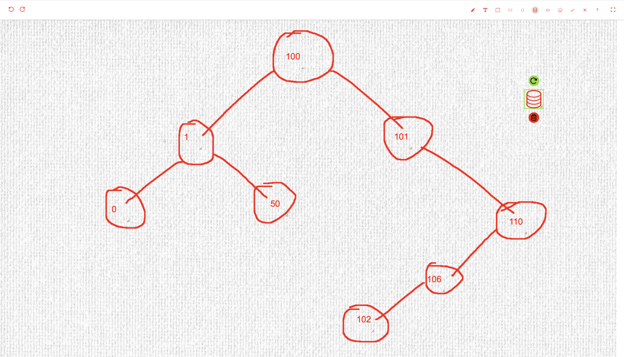
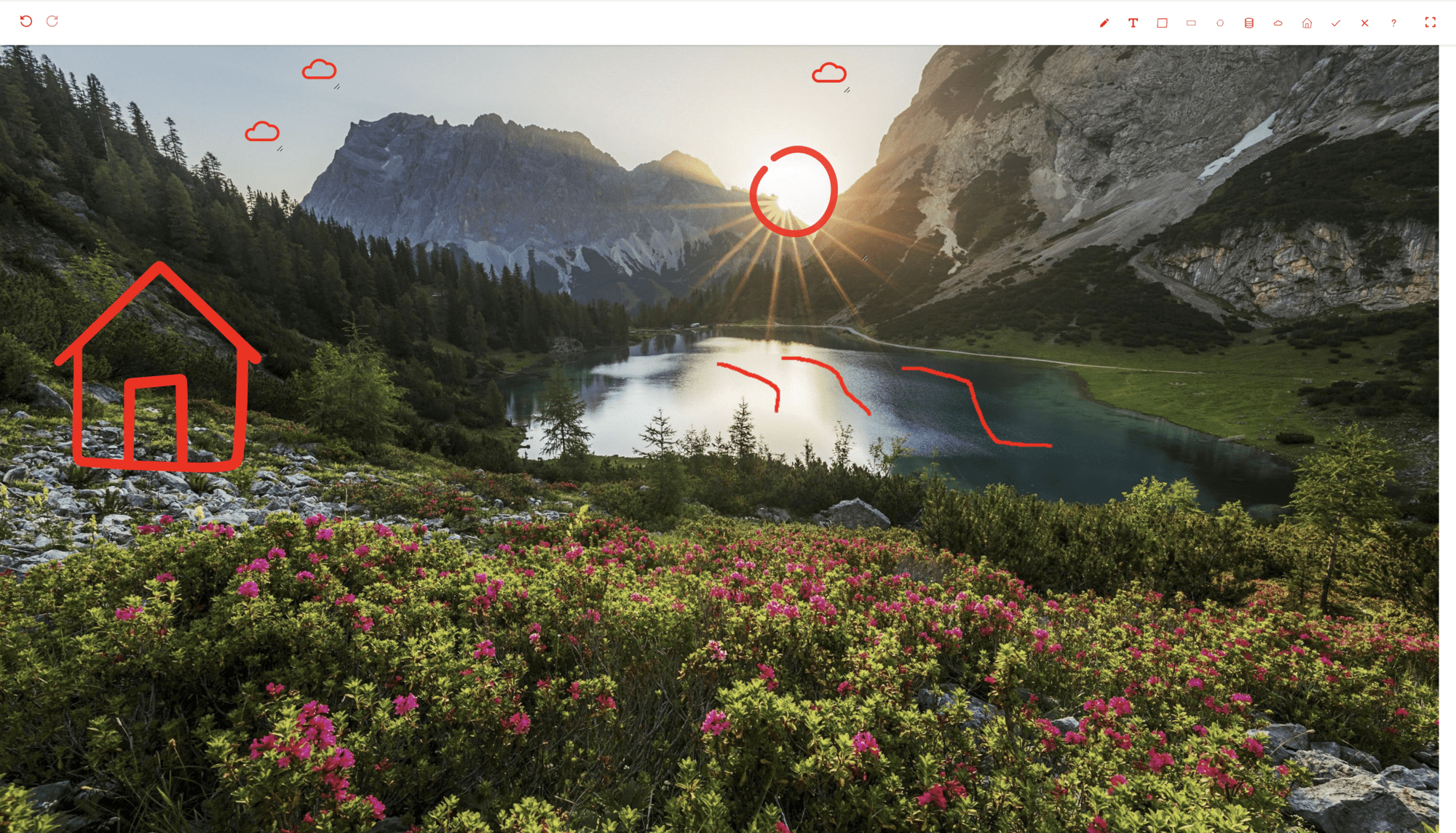
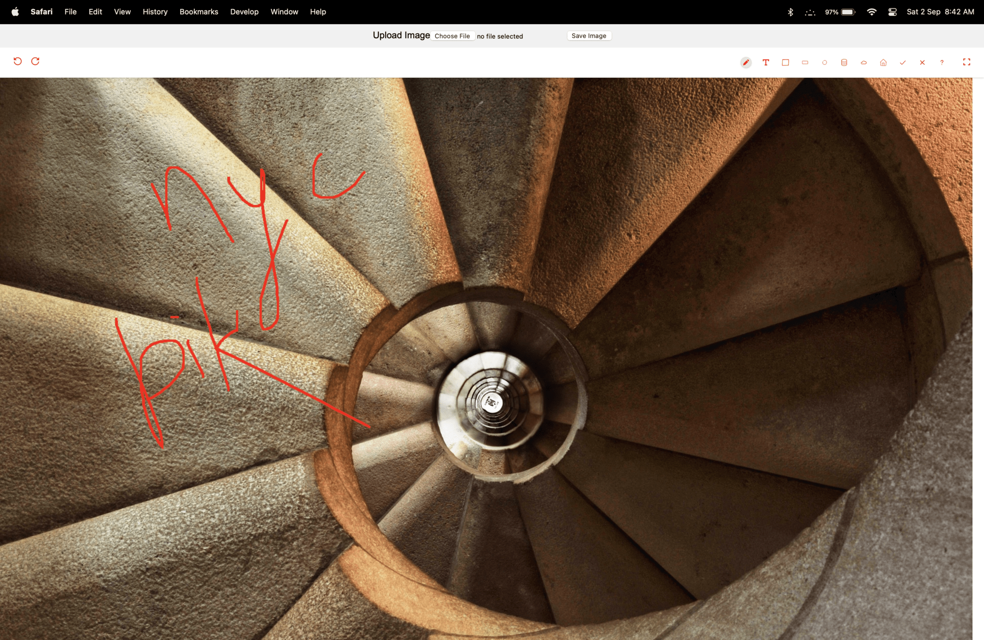
This library is available at react-image-annotate-mngo
A JavaScript React Library (npm package ) which provides an area over an image to annotation/markup/write.
One can easily annotate over image in react.js by installing react-image-annotate-mngo package
<MNgoImageAnnotate
    isViewMode={boolean}
    isDarkMode={boolean}

    compIdx={number}
    compMaxHeight={string}
    compMaxWidth={number}

    image={string | Image}
    imgWidth={number}
    loc={number[]}

    loadingRenderer={string | ReactElement}
    errorRenderer={string | ReactElement}

    textInputField={(textInputVal: string, setTextInputVal: Dispatch<SetStateAction<string>>) => ReactElement}
    shapes={{ [key: string]: any }}
    annotations={any[]}
    onChange={(data: { [key: string]: any }) => void}
/>
props example
-
isViewModeto load component in view (non-editable mode) -
isDarkModeto enable dark mode?, default value is false -
compIdxunique index of the component when usingMNgoImageAnnotatemultiple time in view/screen/oage -
compMaxHeightmax height allowed to component (max height component can go to) -
compMaxWidthmax width allowed to component (max width component can go to) -
imageimage of type JS Image object or image url/link, e.g. https://tinypng.com/images/social/website.jpg -
imgWidthwidth of the image, default value is 900 -
locloc represents co-ordinates of visible portion of the image, i.e. [x1, y1, x2, y2] -
loadingRendererReactElement or string to display while image is loading/downloading, default value is "loading" -
errorRendererReactElement or string to display when image could not be loaded, default value is "something went wrong" -
textInputFielda function to render Text Tool Input Field, e.g.function (textInputVal, setTextInputVal) => { return ( <textarea autoFocus className="sa-h-[50px] sa-w-[95%] sa-resize-none sa-border-[lightgrey] sa-shadow-md sa-rounded-md" value={textInputVal} onChange={(e) => setTextInputVal(e.target.value)} /> ) } -
shapesshape button in tool bar{ <shape type | title>: { btnIcon: <string | Image>, img: <string | Image> }, } e.g. { tick: { btnIcon: tickShape, img: tickShape }, cross: { btnIcon: crossShape, img: crossShape }, } -
annotationsarray of annotations present on the image[ { "type": <shape type or title>, "pos": { "x": number, "y": number }, "size": { "height": number, "width": number }, }, { "type": "pencil, "pts": [number, number][], }, { "type": "pencil, "pos": { "x": number, "y": number }, "size": { "height": number, "width": number }, "html": string, } ] e.g. [ { "type": "cross", "pos": { "x": 757, "y": 224 }, "size": { "height": 50, "width": 50 }, }, { "type": "pencil", "pts":[ [878,96],[878,98],[878,102],[878,122],[878,168],[874,224],[872,281],[872,331],[872,363] ], }, { "type": "pencil", "pos": { "x": 408, "y": 115 }, "size": { "height": 62 , "width": 126}, "html": "hello world", } ] -
onChangecallback function run when any change is done on annotationsonChange (annotationData: object) => void `annotationData` is { imgWidth: number, annotations: annotations[]}
- npm install
- npm start
In the project directory, you can run
Runs the app in the development mode Open http://localhost:5173 to view it in the browser.
it is for final package build which create dist folder.
to publish the project on npm
Note: do npm run lib-build before npm publish because it publishes dist folder as defined as key main, module, files in package.json, and do not forget to login in npm using npm login
this command make build of the project and publishes it, basically it is combination of npm run babel-build and npm publish
All rights reserved under MNgo.


