A lightweight and customizable React component to create a step-by-step tour guide for your application.
You can install the package via npm:
npm install react-light-tour'use client';
import React, { useState } from 'react';
import Tour, { Steps } from 'react-light-tour';
const App = () => {
const [isTourRunning, setIsTourRunning] = useState(true);
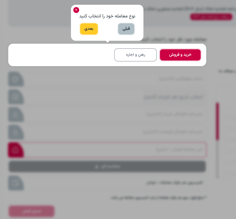
const steps: Steps = [
{ selector: '#step1', content: 'This is the first step' },
{ selector: '#step2', content: 'This is the second step' },
{ selector: '.step3', content: 'This is the third step' },
];
return (
<div>
<button onClick={() => setIsTourRunning(true)}>Start Tour</button>
<Tour
isRun={isTourRunning}
steps={steps}
bodyScrollDisable={true}
buttonsClassName={{ next: 'next-btn', preview: 'prev-btn' }}
/>
<div id="step1">Step 1</div>
<div id="step2">Step 2</div>
<div id="step3">Step 3</div>
</div>
);
};
export default App;The react-light-tour component accepts the following props:
-
isRun: Flag to start or stop the tour. -
steps: Array of steps for the tour. -
buttonsClassName: (Optional) Class names for next and preview buttons. -
saveKey: (Optional) Key for saving tour completion state in local storage. -
nextText: (Optional) Text for the next button. -
previewText: (Optional) Text for the preview button. -
doneText: (Optional) Text for the done button. -
bodyScrollDisable: (Optional) body scrolling while tour is run. -
scrollLogicalPosition: (Optional) scroll to center is default.