Responsive React Native Animated Bar
Install
npm install react-native-animated-bar --save

yarn add react-native-animated-bar
Live Demo
https://snack.expo.io/Hk03E4Avb
Configuration Options
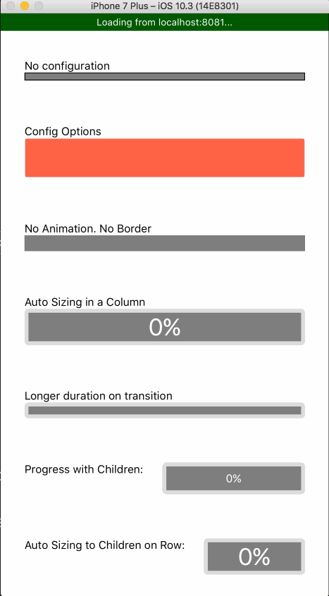
height- Configure the height. Default:10. AutoSize height of bar set to null (height={null})borderColor- Configures the border color. Default:#000.borderWidth- Configures the width of the border. Default:1.borderRadius- Configures border radius. Default:0.barColor- Configures the color of the progress bar. Default:#FFF.fillColor- Configures color behind progress bar. Default:rgba(0,0,0,.5).duration- Configures length of time in milliseconds the change in progress should take. Default:100.animate- Configures whether or not change in progress should be animated. Default:trueonAnimate- Callback listener for the animated value. Default:undefinedstyle- Pass in any styling for the outer containing view. This defines the general layout of the bar for column, row, and theheightprop.wrapStyle- Add arbitrary styling to the wrapping view. This is whereborderColor,borderWidth, andborderRadiusstylings are applied.fillStyle- Add arbitrary styling to inner fill(behind the bar), this is whatfillColoris applied to.barStyle- Add arbitrary styling to the bar, this si whatbarColoris applied to.
Any color above can be an animated interpolated value
Example Usage
;; ; { return <View style=stylescontainer> <AnimatedBar /> </View> ; } const styles = StyleSheet; AppRegistry; The Big Examples
;; ; state = progress: 0 ; { const interval = ; } { return <View style=stylescontainer> <View> <Text>No configuration</Text> <AnimatedBar progress=thisstateprogress /> </View> <View> <Text>Config Options</Text> <AnimatedBar progress=thisstateprogress height=50 borderColor="#DDD" fillColor="tomato" barColor="red" borderRadius=5 /> </View> <View> <Text>No Animation No Border</Text> <AnimatedBar progress=thisstateprogress height=20 borderColor="#DDD" barColor="tomato" borderRadius=5 borderWidth=0 animate=false /> </View> <View> <Text>Auto Sizing in a Column</Text> <AnimatedBar progress=thisstateprogress height=null borderColor="#DDD" barColor="tomato" borderRadius=5 borderWidth=5 duration=500 > <View style=stylesrow stylescenter> <Text style=stylesbarText fontSize: 30 > Math% </Text> </View> </AnimatedBar> </View> <View> <Text>Longer duration on transition</Text> <AnimatedBar progress=thisstateprogress height=20 borderColor="#DDD" barColor="tomato" borderRadius=5 borderWidth=5 duration=500 /> </View> <View style=stylesrow> <Text style=stylesrowText>Progress with Children: </Text> <AnimatedBar progress=thisstateprogress height=40 borderColor="#DDD" barColor="tomato" borderRadius=5 borderWidth=5 duration=500 row > <View style=stylesrow stylescenter flex: 1 > <Text style=stylesbarText> Math% </Text> </View> </AnimatedBar> </View> <View style=stylesrow> <Text style=stylesrowText>Auto Sizing to Children on Row: </Text> <AnimatedBar progress=thisstateprogress height=null borderColor="#DDD" barColor="tomato" borderRadius=5 borderWidth=5 duration=500 row > <View style=stylesrow stylescenter> <Text style=stylesbarText fontSize: 30 > Math% </Text> </View> </AnimatedBar> </View> </View> ; } const styles = StyleSheet; AppRegistry;