
react-native-app-intro-slider
An easy-to-use yet very configurable app introduction slider/swiper based on FlatList that supports RTL.
yarn add react-native-app-intro-sliderUsage
Simple examples
| Basic | showSkipButton |
bottomButton and showSkipButton |
|---|---|---|
 |
 |
 |
The component is based on FlatList so usage is very similar. Pass a data-array to AppIntroSlider along with a renderItem-function:
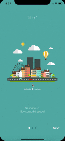
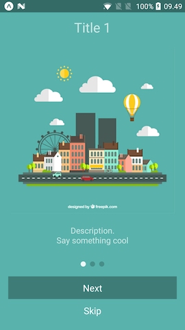
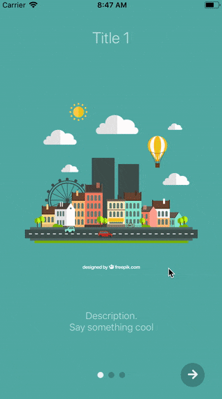
;;; const slides = key: 1 title: 'Title 1' text: 'Description.\nSay something cool' image: backgroundColor: '#59b2ab' key: 2 title: 'Title 2' text: 'Other cool stuff' image: backgroundColor: '#febe29' key: 3 title: 'Rocket guy' text: 'I\'m already out of descriptions\n\nLorem ipsum bla bla bla' image: backgroundColor: '#22bcb5' ; Component thisstate = showRealApp: false { return <View style=stylesslide> <Text style=stylestitle>itemtitle</Text> <Image source=itemimage /> <Text style=stylestext>itemtext</Text> </View> ; } { // User finished the introduction. Show real app through // navigation or simply by controlling state this; } { if thisstateshowRealApp return <App />; else return <AppIntroSlider renderItem=this_renderItem data=slides onDone=this_onDone/>; }Configuring buttons
;;;; const styles = StyleSheet; // slides = [...] Component { return <View style=stylesslide> <Text style=stylestitle>itemtitle</Text> <Image source=itemimage /> <Text style=stylestext>itemtext</Text> </View> ; } { return <View style=stylesbuttonCircle> <Ion name="md-arrow-round-forward" color="rgba(255, 255, 255, .9)" size=24 /> </View> ; }; { return <View style=stylesbuttonCircle> <Ion name="md-checkmark" color="rgba(255, 255, 255, .9)" size=24 /> </View> ; }; { return <AppIntroSlider data=slides renderDoneButton=this_renderDoneButton renderNextButton=this_renderNextButton /> ; }Here a custom renderItem is supplied and the bottomButton-props has been set to true. Notice how the setup of slides has been configured to support icons and gradient backgrounds.
Props and methods
The component extends FlatList so all FlatList-props are valid.
Props
| Name | Type | Default | Description |
|---|---|---|---|
| data | object |
None, required | An array of objects (they should either contain a unique key-prop or you should pass a keyExtractor-function to the component) |
| renderItem | function |
None, required | FlatList's renderItem. Receives ({item, index, dimensions}) where dimensions contains height and width of the slides |
| onSlideChange | function |
void |
Called when user goes changes slide (by swiping or pressing next/prev). Function called with arguments (index: number, lastIndex: number) |
| renderPagination | function |
Function to render a custom pagination/button component on top of slides. Receives the index of the currently active slide | |
| onDone | function |
void |
Called when user ends the introduction by pressing the done button |
| onSkip | function |
Scrolls to the end | Called when user presses the skip button |
| bottomButton | boolean |
false |
Enable to show a full-width button under pagination |
| dotStyle | style |
{backgroundColor: 'rgba(0, 0, 0, .2)'} | Style of inactive pagination dots |
| dotClickEnabled | boolean |
true |
Whether users can navigate using the pagination dots |
| activeDotStyle | style |
{backgroundColor: 'rgba(255, 255, 255, .9)'} | Style of active pagination dot |
| skipLabel | string |
Skip |
Custom label for Skip button |
| doneLabel | string |
Done |
Custom label for Done button |
| nextLabel | string |
Next |
Custom label for Next button |
| prevLabel | string |
Back |
Custom label for Prev button |
| showSkipButton | boolean |
false |
Enable to show a skip button to the left of pagination dots. When bottomButton == true the skip button is a small text under the full-width next button |
| showPrevButton | boolean |
false |
Enable to show a previous button. If showSkipButton is true, the skip button will be displayed on the first page and prev button on subsequent one |
| showNextButton | boolean |
true |
Disable to hide the next button |
| showDoneButton | boolean |
true |
Disable to hide the done button |
| renderNextButton | function |
renders a Text-component | Use to supply your own next button. Has no effect if using renderPagination. |
| renderPrevButton | function |
renders a Text-component | Use to supply your own prev button . Has no effect if using renderPagination |
| renderDoneButton | function |
renders a Text-component | Use to supply your own done button. Has no effect if using renderPagination |
| renderSkipButton | function |
renders a Text-component | Use to supply your own skip button. Has no effect if using renderPagination |
Methods
| Method Name | Arguments | Description |
|---|---|---|
| goToSlide | number |
Change to slide with specified index |
| getListRef | none |
Returns the Flat List ref |