react-native-dropdown-select
下拉框组件
安装组件:
npm i --save react-native-dropdown-select
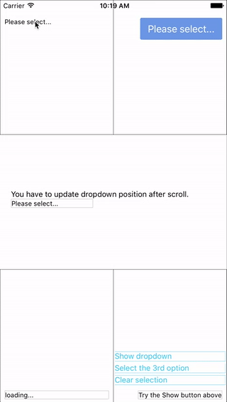
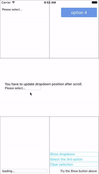
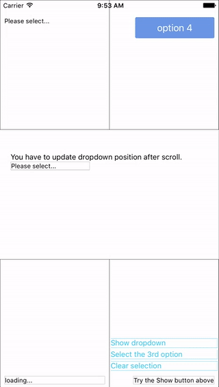
展示ui图


使用(这些ui组件的详细方法参数、作用、属性,可查看源文件,里面有详细注释)
; /**单选**/<PickDropdown options=thisstatetypesList style=stylesdropdwon onSelect=this defaultValue="请选择客户"/> /**多选**/<PickDropdown options=thisstatetypesList multiple=true style=stylesdropdwon onSelect=this defaultValue="请选择客户"/> /**图片按钮**/<ButtonImage icon=TriangleDown disabled=disabled style=stylessearchIcon width:thisheight == undefined ? thisheight : thisstylesheight height:thisstylesheight iconStyle= width:thisstylesheight height:thisstylesheight stylesicon this onPress=this_onBtnImgPress/> /**按钮**/<Button style=stylesmultipleBtn textStyle=stylesmultipleBtnText onPress=this text="确定"/> DropdownBox 详解
 You can also render your option row and row separator by implement
 renderRow and renderSeparator function.
DropdownBox自定义样式属性
Give the style props as your choice:
style: Change the style of the button (basic mode) / container (wrapper mode).textStyle: Change the style of text of the button. Invalid in wrapper mode.dropdownStyle: Change the style of dropdown container.multiple: Change the style of dropdown container.
DropdownBox的api属性
| 属性 | 类型 | 可选 | 默认值 | 描述 |
|---|---|---|---|---|
disabled |
bool | Yes | false | disable / enable the component. |
defaultIndex |
number | Yes | -1 | Init selected index. -1: None is selected. This only change the highlight of the dropdown row, you have to give a defaultValue to change the init text. |
defaultValue |
string | Yes | Please select... | Init text of the button. Invalid in wrapper mode. |
options |
array | Yes | Options. The dropdown will show a loading indicator if options is null/undefined. |
|
animated |
bool | Yes | true | Disable / enable fade animation. |
showsVerticalScrollIndicator |
bool | Yes | true | Show / hide vertical scroll indicator. |
style |
object | Yes | Style of the button. | |
textStyle |
object | Yes | Style of the button text. Invalid in wrapper mode. | |
dropdownStyle |
object | Yes | Style of the dropdown list. | |
dropdownTextStyle |
object | Yes | Style of the dropdown option text. | |
dropdownTextHighlightStyle |
object | Yes | Style of the dropdown selected option text. | |
adjustFrame |
func | Yes | This is a callback after the frame of the dropdown have been calculated and before showing. You will receive a style object as argument with some of the props like width height top left and right. Change them to appropriate values that accord with your requirement and make the new style as the return value of this function. |
|
renderRow |
func | Yes | Customize render option rows: function(option,index,isSelected) Will render a default row if null/undefined. |
|
renderSeparator |
func | Yes | Customize render dropdown list separators. Will render a default thin gray line if null/undefined. |
|
renderButtonText |
func | Yes | Use this to extract and return text from option object. This text will show on button after option selected. Invalid in wrapper mode. | |
onDropdownWillShow |
func | Yes | Trigger when dropdown will show by touching the button. Return false can cancel the event. |
|
onDropdownWillHide |
func | Yes | Trigger when dropdown will hide by touching the button. Return false can cancel the event. |
|
onSelect |
func | Yes | Trigger when option row touched with selected index and value. Return false can cancel the event. |
|
accessible |
bool | Yes | true | Set accessibility of dropdown modal and dropdown rows |
keyboardShouldPersistTaps |
enum('always', 'never', 'handled') | Yes | 'never' | See react-native ScrollView props |
multiple |
bool | Yes | false | Sets single or multiple selections |
DropdownBox的方法
| 方法 | 描述 |
|---|---|
show() |
Show the dropdown. Won't trigger onDropdownWillShow. |
hide() |
Hide the dropdown. Won't trigger onDropdownWillHide. |
select(idx) |
Select the specified option of the idx. Select -1 will reset it to display defaultValue. Won't trigger onSelect. |
欢迎交流
欢迎提问交流;若有bug,请添加bug截图或代码片段,以便更快更好的解决问题。
欢迎大家一起交流