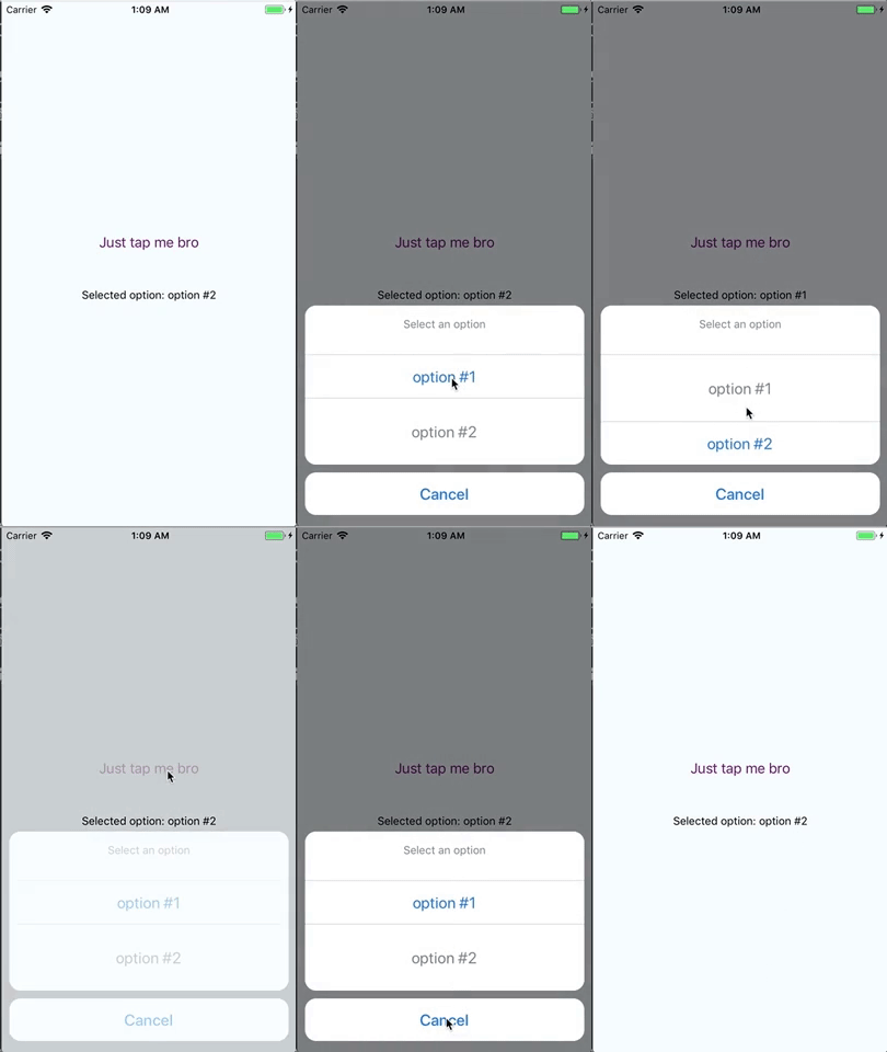
react-native-enhanced-actionsheet
A super lightweight, fully customizable, dependency-free component for React Native that replicates native iOS action sheet. An Android style action sheet will be added as well within the next few versions.


How to install it
- Run
npm install react-native-enhanced-actionsheet --saveoryarn add react-native-enhanced-actionsheet - Import it in the component of your choice
import Actionsheet from 'react-native-enhanced-actionsheet'
How to use it
; const COUNT = 0 const OPTIONS = id: COUNT++ label: 'option #' + COUNT id: COUNT++ label: 'option #' + COUNT { superprops thisstate = visible: false selected: 0 } { const selectedOption = OPTIONS return <View style=stylescontainer> <Button title="Just tap me bro" color="#841584" onPress= this /> <View style=marginTop: 40> <Text>Selected option: selectedOptionlabel</Text> </View> <Actionsheet visible=thisstatevisible data=OPTIONS title='Select an option' selected=thisstateselected onOptionPress= this onCancelPress= this /> </View> } const styles = StyleSheetProps
| Prop | Info |
|---|---|
| visible | (bool) - Toggles actionsheet |
| data | (array of objects) - A list of actionsheet options. Each object must have id and label fields. |
| title | (string) - Actionsheet title. Default value is Select |
| cancelBtnText | (string) - Actionsheet cancel button text. Default value is Cancel |
| selected | (string/array of strings) - If you would like to highlight the selected element, provide the id of this element. If you want to make Actionsheet support multiple selected items, provide an array of ids. |
| titleStyle | (style object) - Object that styles actionsheet title. Provided styles should be appropriate for Text component |
| titleContainerStyle | (style object) - Object that styles actionsheet title container. Provided styles should be appropriate for View component |
| cancelTextStyle | (style object) - Object that styles cancel text. Provided styles should be appropriate for Text component |
| cancelContainerStyle | (style object) - Object that styles cancel button. Provided styles should be appropriate for View component |
| optionTextStyle | (style object) - Object that styles options text. Provided styles should be appropriate for Text component |
| optionContainerStyle | (style object) - Object that styles option buttons. Provided styles should be appropriate for View component |
| selectedOptionTextStyle | (style object) - Object that styles selected option text. Provided styles should be appropriate for Text component |
| selectedOptionContainerStyle | (style object) - Object that styles selected option button. Provided styles should be appropriate for View component |
| onOptionPress | (function) - Callback function that it is called when an option is pressed. The whole object of the option that was pressed, is returned. |
| onCancelPress | (function) - Callback function that it is called when cancel button is pressed. |