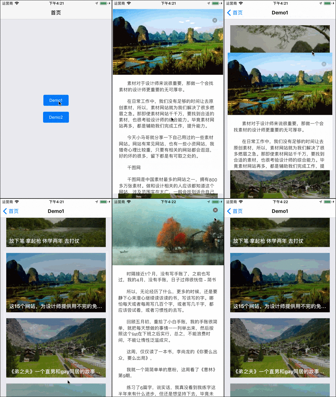
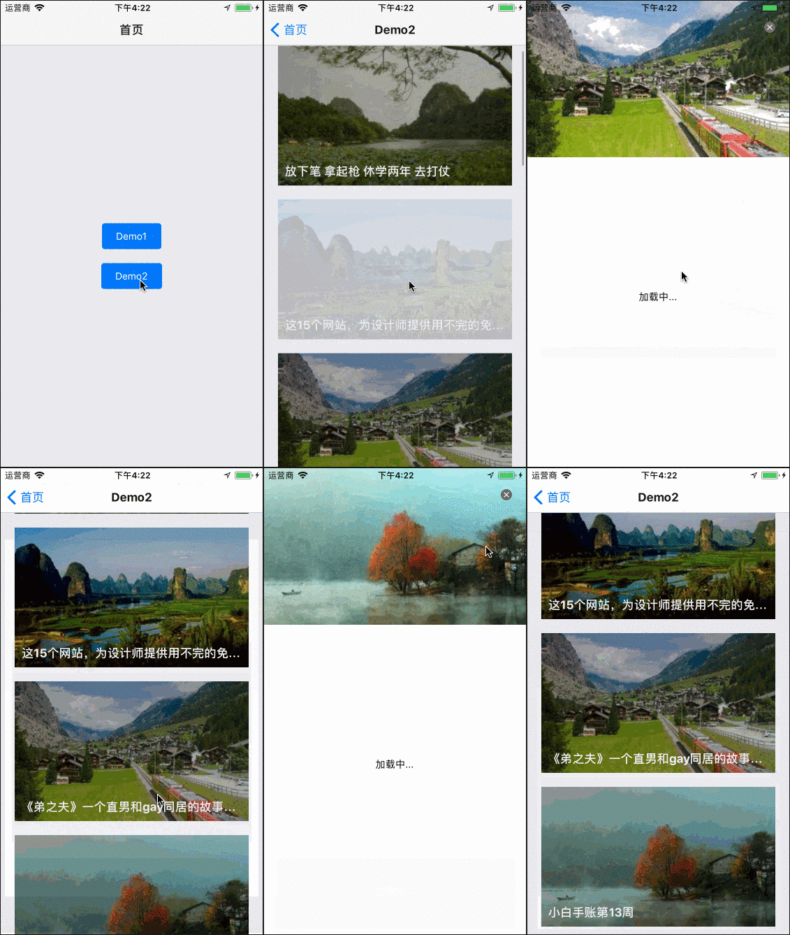
MagicMoving
A novel transition animation between components.
1. Examples
Download the repository, cd the examples directory, and run it on simulator.
git clone git@github.com:SmallStoneSK/react-native-magic-moving.git
cd examples
react-native run-ios      # for ios
react-native run-android  # for android
2. Basic Usage
At first, you should install react-native-magic-moving. Like this:
npm install react-native-magic-moving --saveThen, you can refer to the following example. At least, you should pass 4 properties to MagicMoving:
- data: the dataSource for rendered list.
- cardStyle: it will work on the list's card container.
- renderCardContent: custom what you want to show in the card.
- renderPopupLayerContent: custom what you want to show in the popup layer.
Note: each item in the data should have a image. Because it is the image source of popup layer banner image.
import React from 'react';
import {Text, Image, StyleSheet} from 'react-native';
import {MagicMoving} from 'react-native-magic-moving';

const mockedData = [
  {
    image: {uri: 'https://hellorfimg.zcool.cn/preview260/525525049.jpg'},
    content: 'card 0'
  },
  {
    image: {uri: 'https://hellorfimg.zcool.cn/preview260/267756197.jpg'},
    content: 'card 1'
  },
  {
    image: {uri: 'https://hellorfimg.zcool.cn/preview260/409679020.jpg'},
    content: 'card 2'
  },
  {
    image: {uri: 'https://hellorfimg.zcool.cn/preview260/682966966.jpg'},
    content: 'card 3'
  }
];

export class Demo extends React.Component {

  _renderCardContent = (item, index) => {
    return <Image style={styles.cardImage} source={item.image}/>;
  };

  _renderPopupLayerContent = (item, index) => {
    return <Text>{item.content}</Text>;
  };

  render() {
    return (
      <MagicMoving
        data={mockedData}
        cardStyle={styles.cardContainer}
        renderCardContent={this._renderCardContent}
        renderPopupLayerContent={this._renderPopupLayerContent}
      />
    );
  }
}

const styles = StyleSheet.create({
  cardContainer: {
    marginTop: 20,
    marginHorizontal: 20
  },
  cardImage: {
    width: 335,
    height: 200
  }
});
In the example above, the content of popup layer is ready before it shows. If you want to read it asynchronously from the network, you can see the demo2 (click here).
In fact, you can do much things as MagicMoving offers 3 methods for you: onPopupLayerWillShow, onPopupLayerDidShow, onPopupLayerDidHide.
3. Properties
| Prop | Default | Type | Description |
|---|---|---|---|
| style | - | object | allow custom list |
| cardStyle | - | object | allow custom list card |
| data | [] | array | data source of list |
| openDuration | 300 | number | duration of showing popup layer animation |
| closeDuration | 300 | number | duration of closing popup layer animation |
| renderCardContent | - | function | complete control how to render the content of list card |
| renderPopupLayerContent | - | function | complete control how to render the content of popup layer |
| renderPopupLayerBanner | - | function | you can custom the popup layer's banner using this function with params(bannerImageStyle) |
| onPopupLayerWillShow | - | function | be called before popup layer showing |
| onPopupLayerDidShow | - | function | be called after popup layer has shown |
| onPopupLayerDidHide | - | function | be called after popup layer has hidden |

