react-native-material-btn
Install
npm install react-native-material-btn --save
Usage
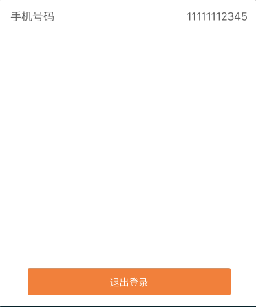
{ return <View style=styleslogoutBtn> <MaterialBtn rippleColor='rgba(255, 255, 255, 0.2)' style=marginBottom: 10 padding: 15 backgroundColor: '#FF7421' > <Text style= color: '#fff' >Click</Text> </MaterialBtn> </View> }Properties
withRipple (Boolean) - Show ripple animation (default: true),
withShadow (Boolean) - Show shadow (default: false),
shadowLevel (Number) - Shadow radius when button is unpressed (default: 1),
pressedShadowLevel (Number) - Shadow radius when button is pressed (default: 5),
shadowColor (String) - Shadow color (default: #000),
shadowOpacity (Number) - Shadow opacity when button is unpressed (default: 0.4),
pressedShadowOpacity (Number) - Shadow opacity when button is pressed (default: 0.6),
animationTime (Number) - Ripple animation time in ms (default: 600),
rippleColor (String) - Ripple color (Should be transparent) (default: rgba(0,0,0,0.1)),
styles (Object) - Styles for outer container (margins, ...),
Events
onPress: This function is called when the button is pressed.
onPressIn: This function is called when the button is pressed in.
onPressOut: This function is called when the button is pressed out :)
中文文档
安装
npm install react-native-material-btn --save
使用
{ return <View style=styleslogoutBtn> <MaterialBtn rippleColor='rgba(255, 255, 255, 0.2)' style=marginBottom: 10 padding: 15 backgroundColor: '#FF7421' > <Text style= color: '#fff' >Click</Text> </MaterialBtn> </View> }属性
  withRipple (Boolean) - 是否显示动画效果,默认为true,
  withShadow (Boolean) - 是否显示阴影,默认为 false,
  shadowLevel (Number) - 未点击的时候阴影的圆角,默认 1,
  pressedShadowLevel (Number) - 点击的时候阴影的圆角 5,
  shadowColor (String) - 阴影的颜色,默认 #000,
  shadowOpacity (Number) - 未点击时候的阴影透明度,默认0.4,
  pressedShadowOpacity (Number) - 按钮点击的时候的阴影透明度,默认0.6,
  animationTime (Number) - 动画效果的时间 ,默认600ms
  rippleColor (String) - 动画效果的颜色,默认: rgba(0,0,0,0.1),
  styles (Object) - 按钮的样式,
事件
  onPress: 点击按钮时候的回调
  onPressIn: 刚点击按钮时候的回调
  onPressOut: 刚点击完按钮之后的回调
DEMO