react-native-modal-swipe

1.0.2 • Public • Published

react-native-modal-swipe

npm version npm downloads

Getting started

$ npm install react-native-modal-swipe --save

Usage

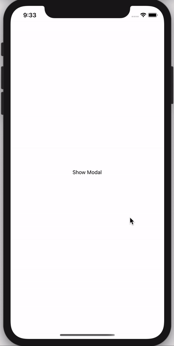
// Import react-native-modal-swipe in your component
import React, { useState } from 'react';
import { View, Text, TouchableOpacity, Image, StyleSheet } from 'react-native';
import ModalSwipe from 'react-native-modal-swipe';
 
export default () => {
  const [visible, setvisible] = useState(false)
  const onChangeMoadl = () => {
    setvisible(!visible)
  }
  return (
    <>
      <TouchableOpacity style={styles.showModalBtn} onPress={onChangeMoadl}>
        <Text>Show Modal</Text>
      </TouchableOpacity>
      <ModalSwipe visible={visible} onClose={onChangeMoadl} layoutBackgroundColor="#fff">
        <>
          <View>
            <Text style={styles.title}> ! Paper Plane</Text>
            <Text style={styles.smallText}>Lorem Ipsum is simply dummy text of the printing and typesetting industry.</Text>
          </View>
 
          <Image
            style={styles.modalImage}
            source={require('./assets/images/Paper-Plane-Transparent.png')}
          />
          <View style={styles.modalContainer}>
            <Text style={styles.modalText}>JOIN PREMIUM</Text>
          </View>
        </>
      </ModalSwipe>
    </>
  )
};
 
const styles = StyleSheet.create({
  showModalBtn: {
    flex: 1,
    justifyContent: 'center',
    alignItems: 'center'
  },
  modalContainer: {
    backgroundColor: 'rgba(0, 0, 0, 0.2)',
    width: null,
    borderColor: '#FFFFFF',
    borderWidth: 1.5,
    borderRadius: 100,
    shadowColor: "#000",
    shadowOffset: {
      width: 5,
      height: 2,
    },
    shadowOpacity: 0.1,
    shadowRadius: 3.84,
    elevation: 5,
    marginBottom: 20
  },
  modalText: {
    color: '#fff',
    fontWeight: 'bold',
    marginHorizontal: 30,
    marginVertical: 15
  },
  modalImage: {
    height: 250,
    width: 200,
    resizeMode: 'center'
  },
  title: {
    fontSize: 22,
    marginVertical: 10
  },
  smallText: {
    fontWeight: '500',
    fontSize: 16
  }
});

Properties

Prop Default Type Description
visible false Boolean Show the modal
onClose - Function onClose the modal it's call the function
children - element You can pass your own view here it will render on modal
layoutBackgroundColor rgba(0, 0, 0, 0.6) String Modal BackDrop color
backgroundColor rgba(255, 146, 43, 0.8) String Show the modal BackGround color

Package Sidebar

Install

npm i react-native-modal-swipe

Weekly Downloads

1

Version

1.0.2

License

MIT

Unpacked Size

26.7 kB

Total Files

15

Last publish

Collaborators

  • subhodip