A modest checkbox component for React Native
Table of Contents
About
A customizable checkbox component for React Native that supports setting a custom image or component as the checkbox. Inspired by react-native-checkbox.
Install
$ npm install --save react-native-modest-checkbox$ yarn add react-native-modest-checkboxUsage

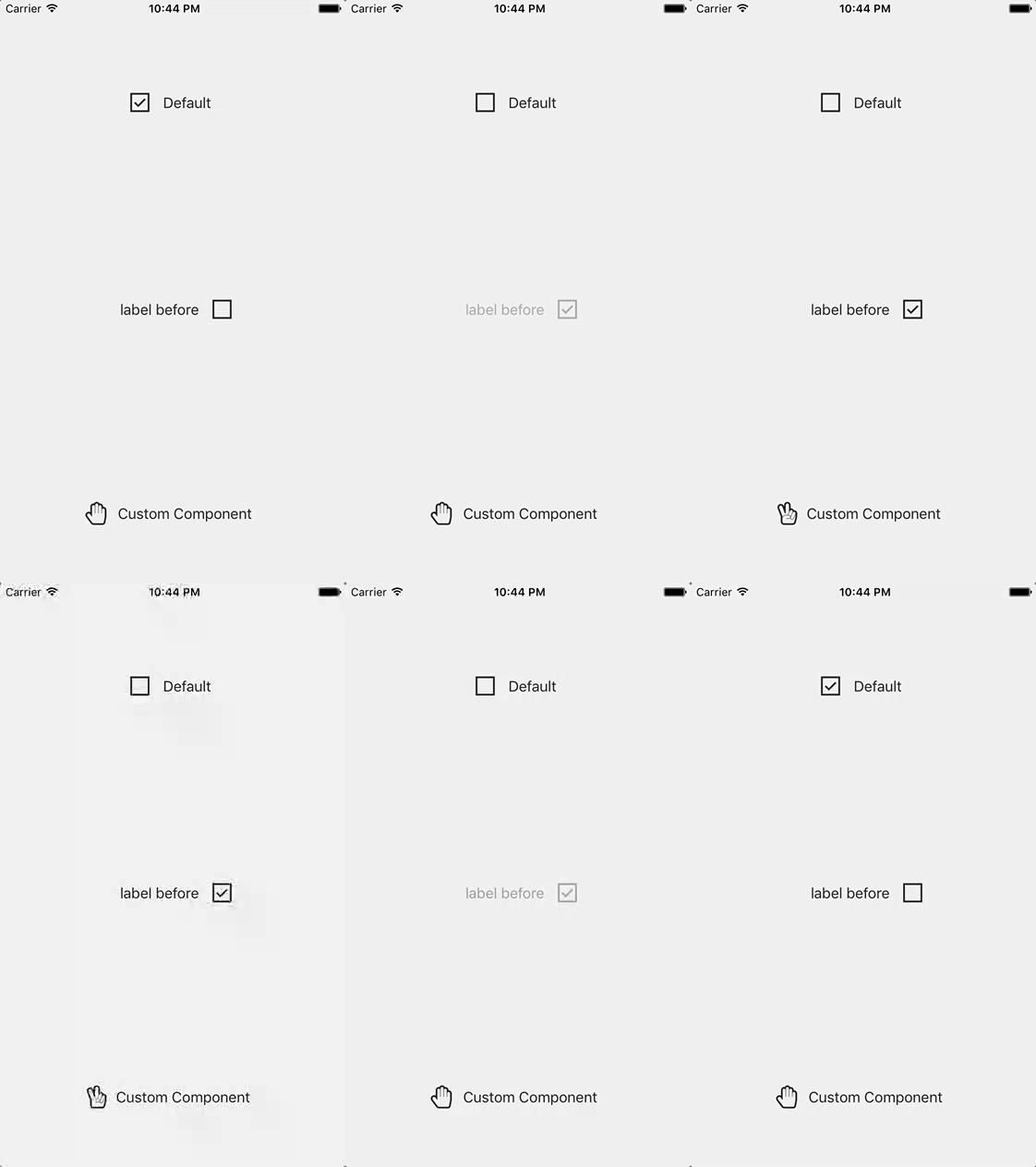
// ... Imagine imports here { return <View style=stylescontainer> <Checkbox label='Text for checkbox' onChange= console /> </View> ; } const styles = StyleSheet AppRegistry; You can use your own images for the checkbox states:
<CheckBox checkedImage= uncheckedImage= />It can also be used with your own components for the checkbox states:
// Using react-native-vector-icons <CheckBox checkedComponent=<Icon name="hand-peace-o" size=25 color="#222" /> uncheckedComponent=<Icon name="hand-paper-o" size=25 color="#222" /> label='Custom Component' onChange= console/> Props
| Property | Description | Default Value |
|---|---|---|
checkedComponent |
Custom component representing the checked state | <Text>Checked</Text> |
uncheckedComponent |
Custom component representing the unchecked state | <Text>Unchecked</Text> |
checked |
Checked value of checkbox | false |
checkboxStyle |
Styles applied to the checkbox | { width: 30, height: 30 } |
label |
Text that will be displayed next to the checkbox | 'Label' |
customLabel |
Customize label using React Component | null |
labelBefore |
Flag if label should be before the checkbox | false |
labelStyle |
Styles applied to the label | {fontSize: 16, color: '#222'} |
numberOfLabelLines |
The number of lines over which the label will be displayed | 1 |
containerStyle |
Styles applied to the container of label & checkbox | { flexDirection: 'row', alignItems: 'center'} |
checkedImage |
Image representing checked state (e.g. require('./path/to/image.png')) |
checked.png |
uncheckedImage |
Image representing unchecked state (e.g. require('./path/to/image.png')) |
unchecked.png |
onChange |
Callback that will be invoked when the checked state has changed. receives a object with name & checked properties as arguments |
none |
noFeedback |
Use TouchableWithoutFeedback as container of checkbox |
false |
Contribute
Contributions are welcome. Please open up an issue or create PR if you would like to help out.
Note: If editing the README, please conform to the standard-readme specification.
License
Licensed under the MIT License.
Icon made by Freepik from www.flaticon.com is licensed by CC 3.0 BY.


