Phosphor is a flexible icon family for interfaces, diagrams, presentations — whatever, really. Explore all our icons at phosphoricons.com. Inspired by phosphor-react.
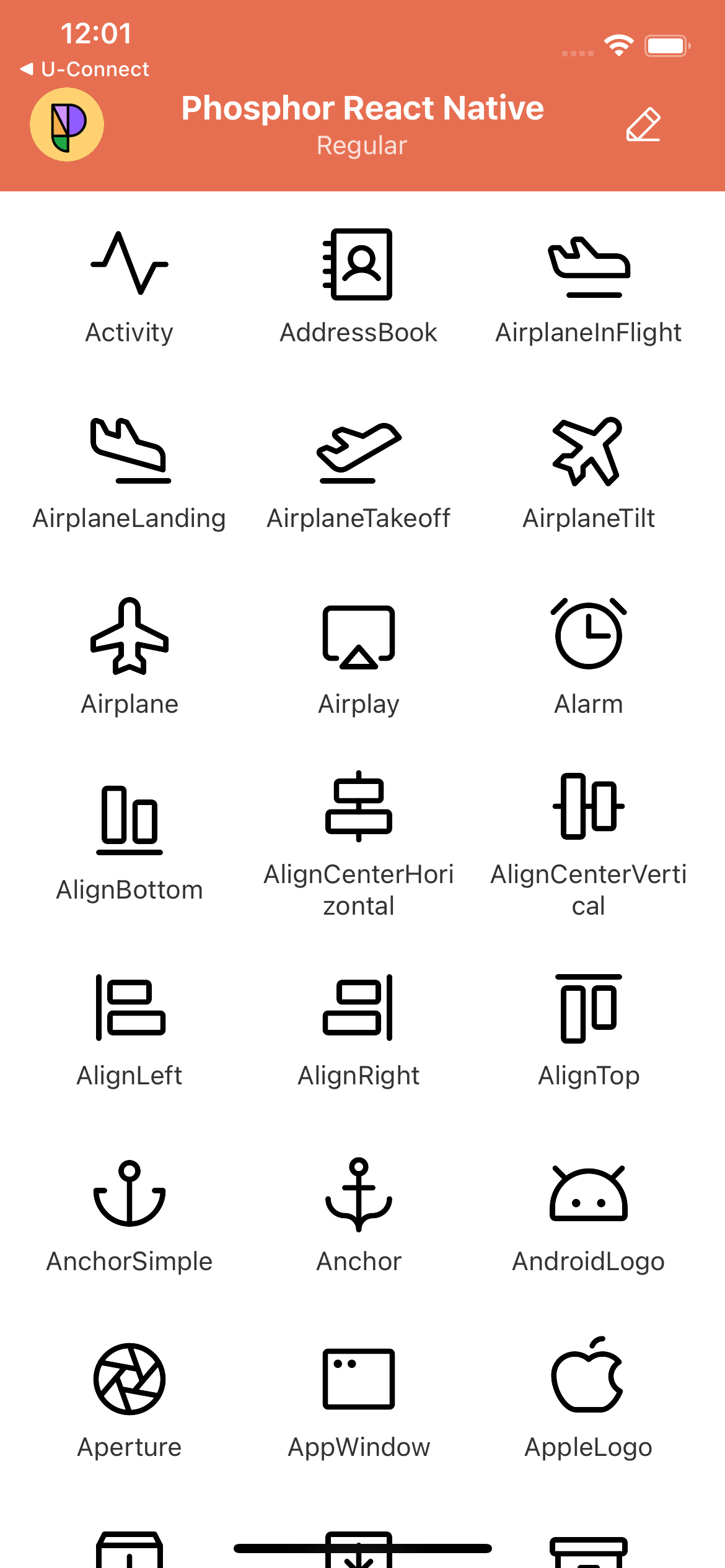
|
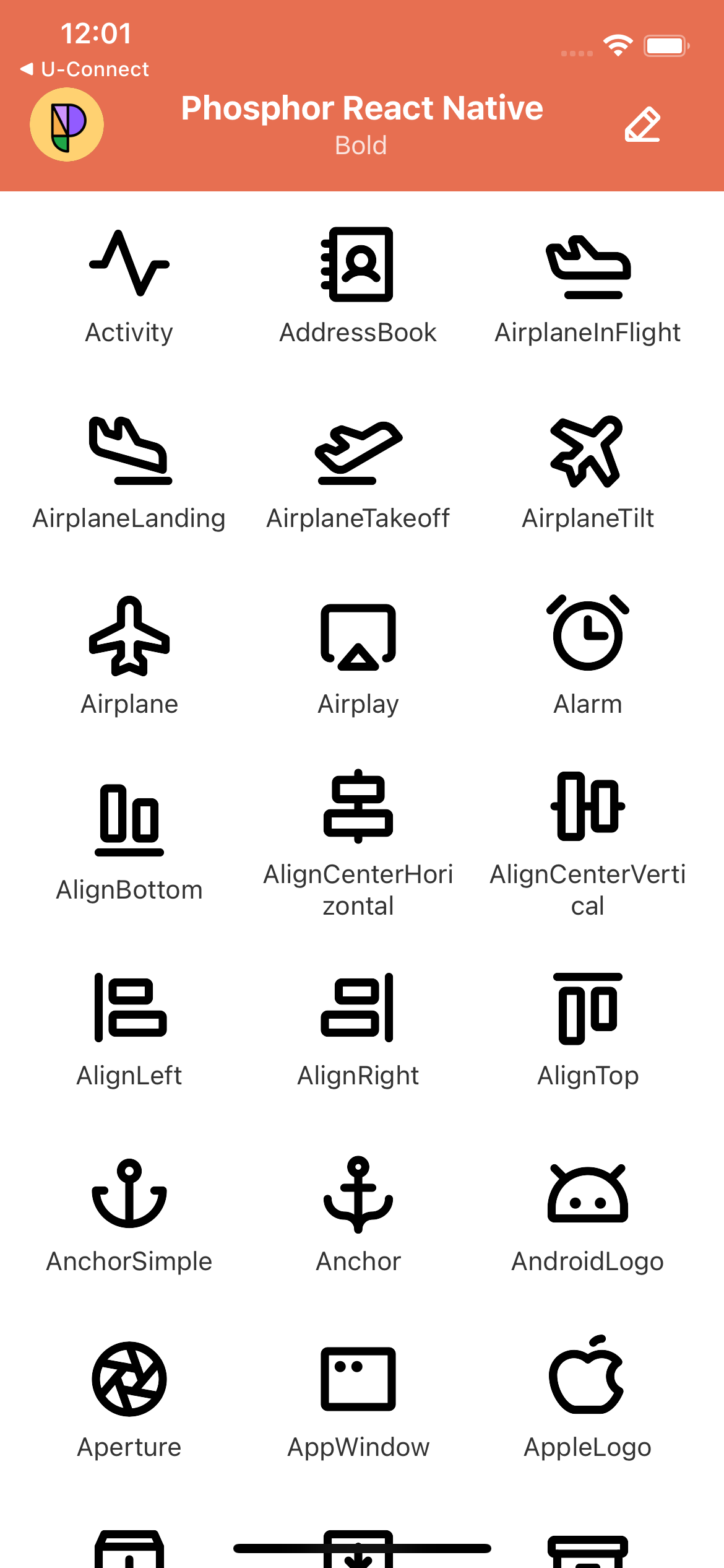
|
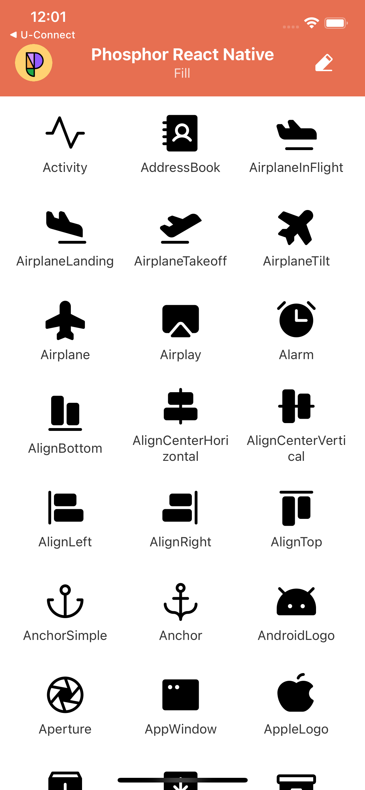
|
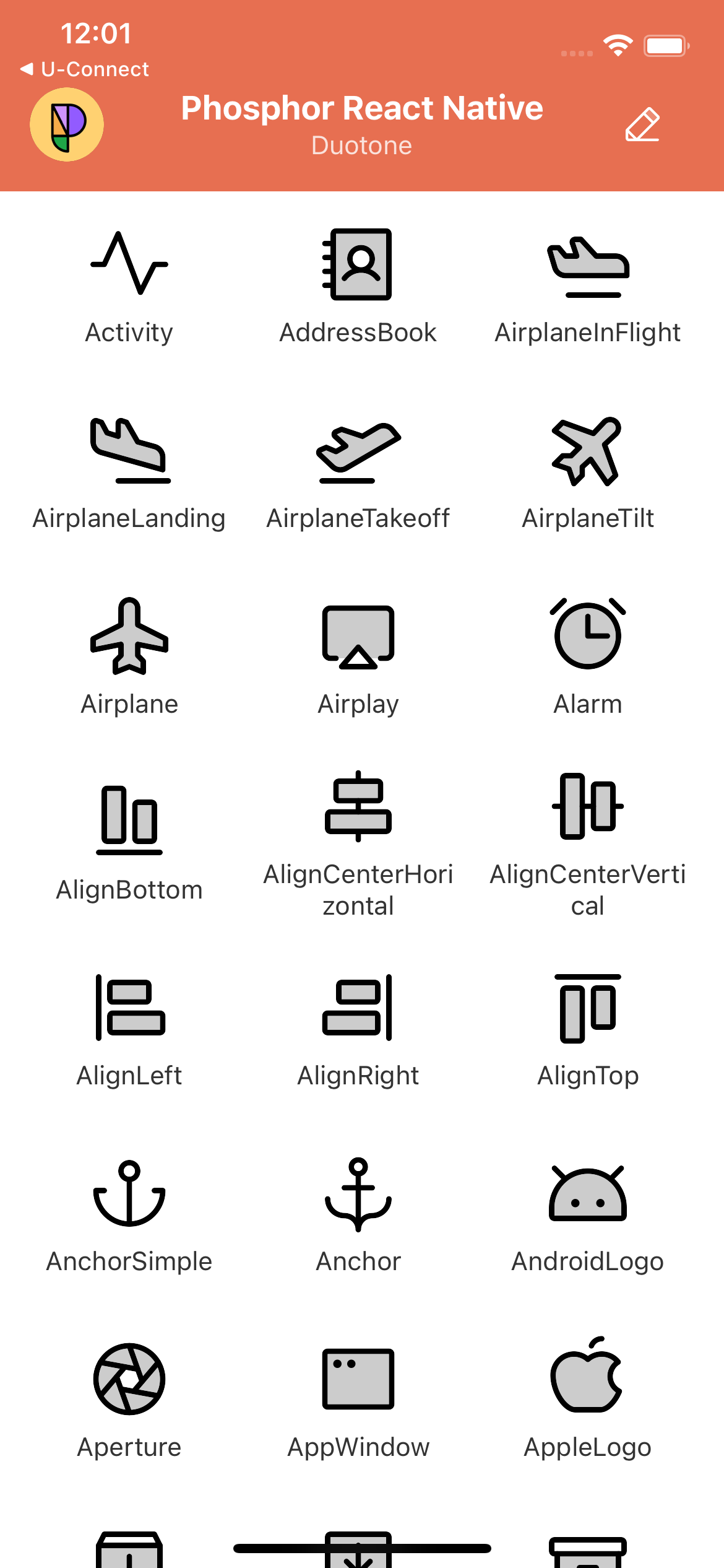
|
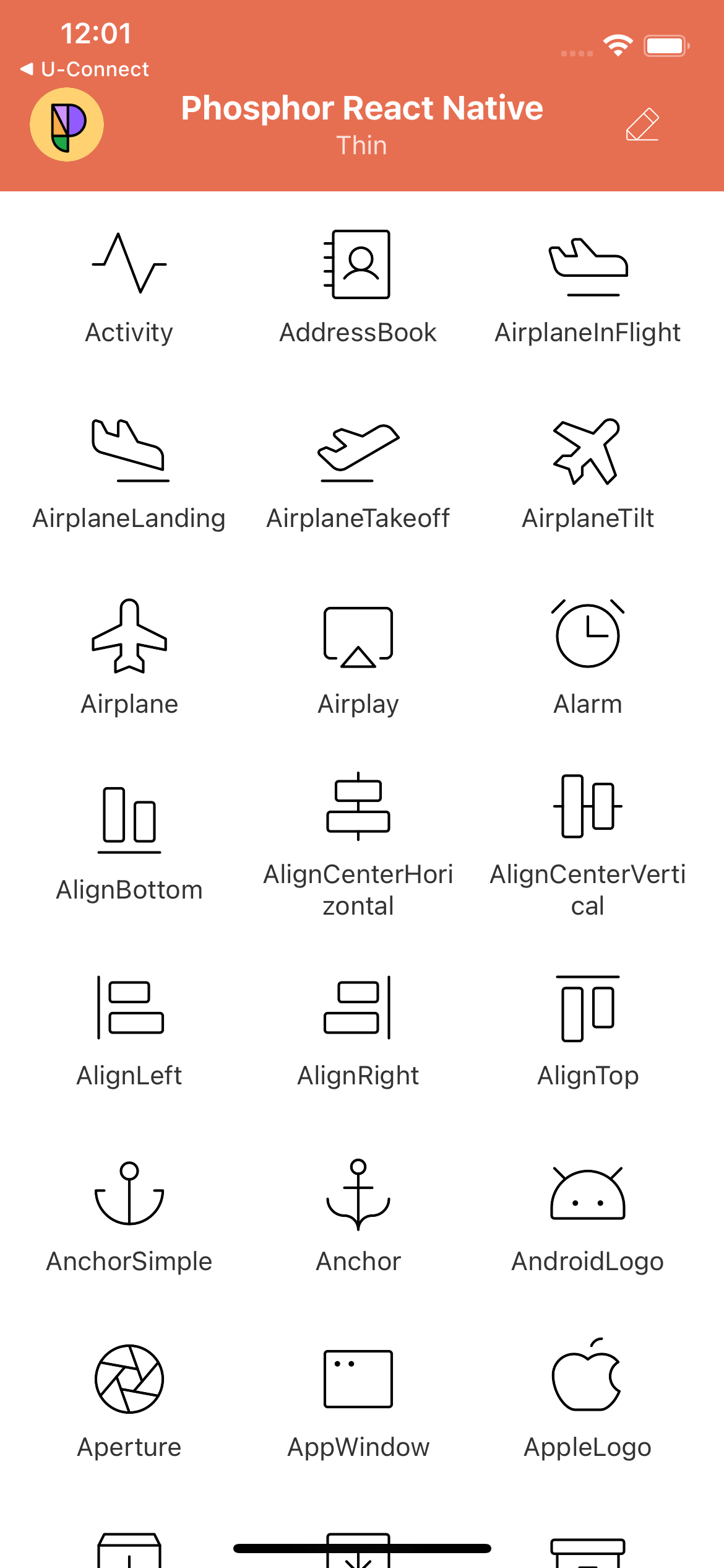
|
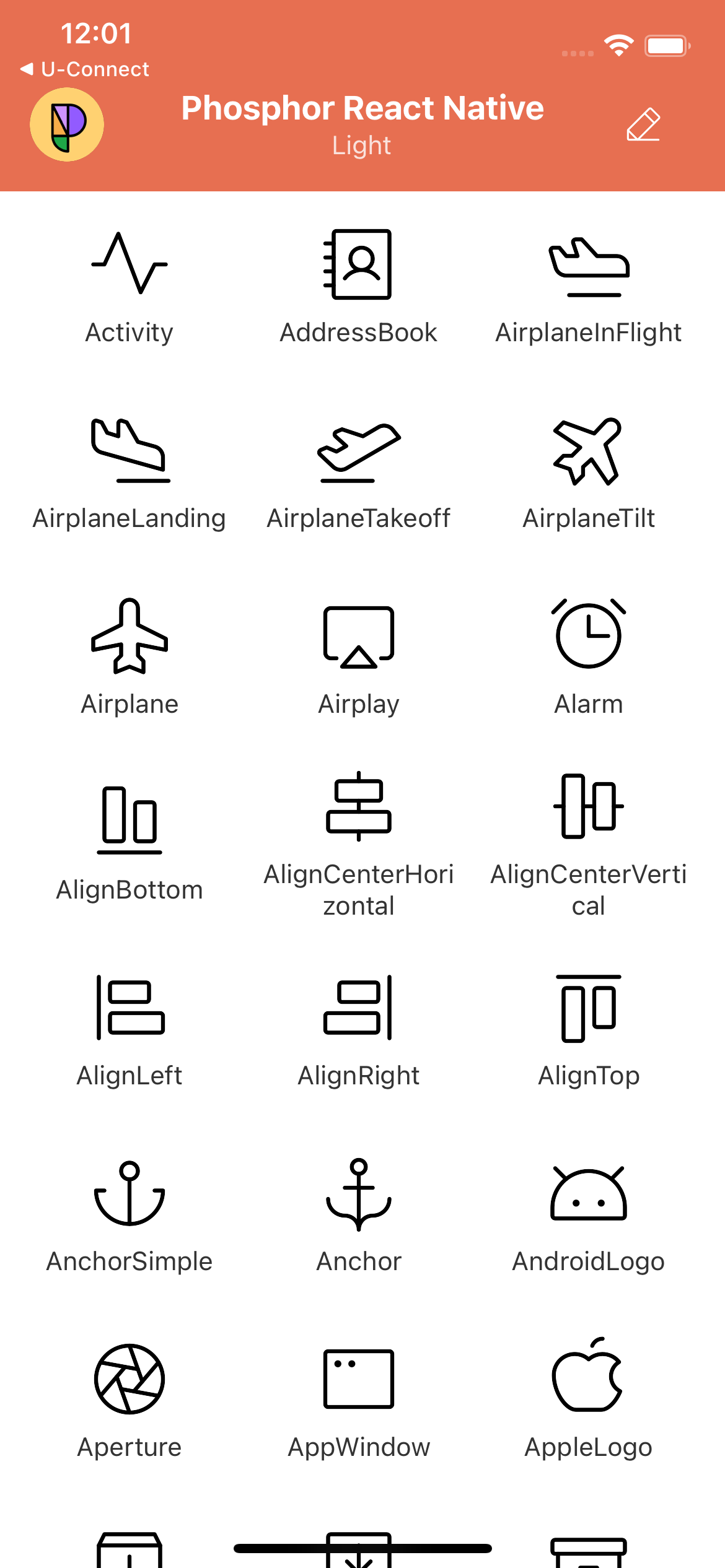
|
yarn add phosphor-react-nativeor
npm install --save phosphor-react-nativeSimply import the icons you need, and add them anywhere in your render method. Phosphor supports tree-shaking, so your bundle only includes code for the icons you use.
import React from 'react';
import { View } from 'react-native';
import { Horse, Heart, Cube } from 'phosphor-react-native';

const App = () => {
  return (
    <View>
      <Horse />
      <Heart color="#AE2983" weight="fill" size={32} />
      <Cube color="teal" weight="duotone" />
    </View>
  );
};If you get this error...
Property 'className' does not exist on type 'IntrinsicAttributes & IntrinsicClassAttributes<Svg> & Pick<Readonly<SvgProps>, "children" | "style" | ... 144 more ... | "fontVariationSettings"> & InexactPartial<...> & InexactPartial<...>'
Add this code to your global.d.ts file
import type { SvgProps as DefaultSvgProps } from 'react-native-svg';

declare module 'react-native-svg' {
  interface SvgProps extends DefaultSvgProps {
    className?: string;
  }
}Icon components accept all props that you can pass to a normal SVG element, including inline style objects, onClick handlers, and more. The main way of styling them will usually be with the following props:
-
color?:
string– Icon stroke/fill color. Can be any CSS color string, includinghex,rgb,rgba,hsl,hsla, named colors. -
size?:
number | string– Icon height & width. As with standard React elements, this can be a number, or a string with units inpx,%,em,rem,pt,cm,mm,in. -
weight?:
"thin" | "light" | "regular" | "bold" | "fill" | "duotone"– Icon weight/style. Can also be used, for example, to "toggle" an icon's state: a rating component could use Stars withweight="regular"to denote an empty star, andweight="fill"to denote a filled star. -
mirrored?:
boolean– Flip the icon horizontally. Can be useful in RTL languages where normal icon orientation is not appropriate.
Phosphor takes advantage of React Context to make applying a default style to all icons simple. Create an IconContext.Provider at the root of the app (or anywhere above the icons in the tree) and pass in a configuration object with props to be applied by default to all icons:
import React from 'react';
import { View } from 'react-native';
import { IconContext, Horse, Heart, Cube } from 'phosphor-react-native';

const App = () => {
  return (
    <IconContext.Provider
      value={{
        color: 'limegreen',
        size: 32,
        weight: 'bold',
      }}
    >
      <View>
        <Horse /> {/* I'm lime-green, 32px, and bold! */}
        <Heart /> {/* Me too! */}
        <Cube /> {/* Me three :) */}
      </View>
    </IconContext.Provider>
  );
};
You may create multiple Contexts for styling icons differently in separate regions of an application; icons use the nearest Context above them to determine their style.
You may wish to import all icons at once for use in your project, though depending on your bundler this could prevent tree-shaking and make your app's bundle larger.
import * as Icon from "phosphor-react-native";
...
<Icon.Smiley />
<Icon.Folder weight="thin" />
<Icon.BatteryHalf size="24px" />
<Icon.AirplaneTakeoff size="24px" mirrored={true} />
In cases where tree shaking does not work (resulting in large bundle size), you can import icons individually in this format:
// Javascript
import Star from "phosphor-react-native/lib/commonjs/icons/Star";

// Typescript
import Star from 'phosphor-react-native/src/icons/Star';

<Star size="24px" />- phosphor-home ▲ Phosphor homepage and general info
- phosphor-react ▲ Phosphor icon component library for React
- phosphor-vue ▲ Phosphor icon component library for Vue
- phosphor-icons ▲ Phosphor icons for Vanilla JS
- phosphor-flutter ▲ Phosphor IconData library for Flutter
- phosphor-webcomponents ▲ Phosphor icons as Web Components
- phosphor-figma ▲ Phosphor icons Figma plugin
- phosphor-sketch ▲ Phosphor icons Sketch plugin
MIT

