react-native-pie
Pie chart for React Native, works on both iOS and Android
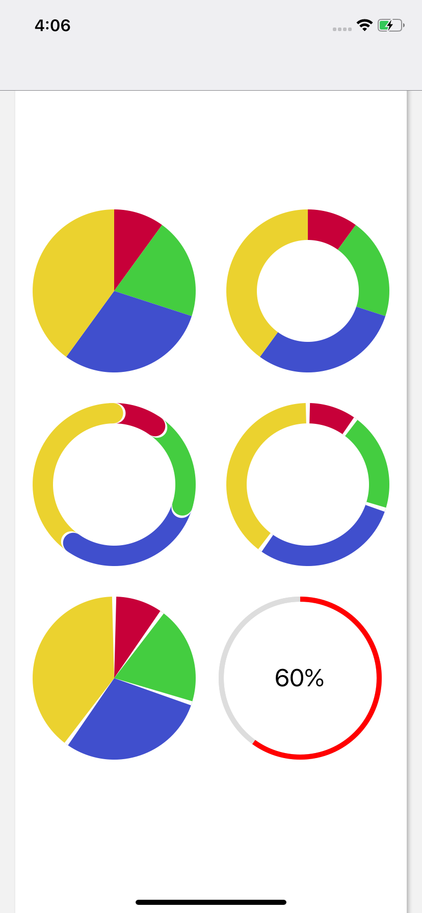
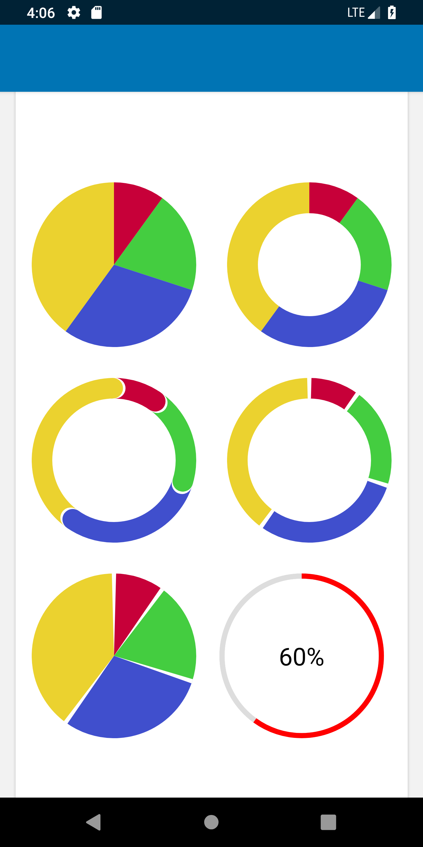
Demo
Install
# NPM npm i --save react-native-pieOR# Yarn yarn add react-native-pieFor react-native-pie >= 1.1.0 install peer dependency
# NPM npm i --save @react-native-community/artOR# Yarn yarn add @react-native-community/artMigration from react-native-pie <= 0.6.2
Please unlink react-native ART library
Linking module
Mostly automatic linking
If react-native >= 0.60 && react-native-pie >= 1.1.0, the package will be linked automatically.
Manual linking for react-native-pie <= 0.6.2
Link the ART library to your ReactNative project (how to link a library). You'll find the React ART library in node_modules/react-native/Libraries/ART/ART.xcodeproj
React Native Version Support
If you are using <
.45, please installreact-native-piev0.1.0instead
npm i --save react-native-pie@0.1.0
Please use >=
0.50.0-rc.0otherwise there is a ring shape drawing issue withreact-native-pie
Usage
import React from 'react'import StyleSheet View Text from 'react-native'import Pie from 'react-native-pie' return <View => <View = > <Pie = = = /> <Pie = = = = /> </View> <View = > <Pie = = = = = /> <Pie = = = = = /> </View> <View = > <Pie = = = = /> <View => <Pie = = = ="#ddd" /> <View = > <Text = > 60% </Text> </View> </View> </View> </View> const styles = StyleSheetProps
- sections
{percentage, color}of each section in the pie - array, required - radius
radius = size / 2, - number, required - innerRadius defaults to
0- number, optional - backgroundColor defaults to
#fff- string, optional - strokeCap (
round,butt) defaults tobutt- string, optional- PLEASE NOTE If using
strokeCap={'round'}it is highly recommended to use a higherinnerRadius(around 60% ofradiusand higher) in addition to not having very small percentage sections. This will ensure proper display. We hope to address these issues in future PRs
- PLEASE NOTE If using
- dividerSize defaults to
0- percentage size to divide the sections - number, optional
License
MIT