react-native-progress-circle2
TypeScript icon, indicating that this package has built-in type declarations

0.0.1 • Public • Published

license

React Native Progress Circle2

React Native Progress Circles

✅ Fixed the following error for latest RN version

❌ Invariant Violation: ViewPropTypes has been removed from React Native. Migrate to ViewPropTypes exported from deprecated-react-native-prop-types

Features

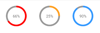
  • Custom colors
  • Custom size and border radius
  • Light-weight: No other dependencies besides react-native

Installation

yarn add react-native-progress-circle2

or

npm install --save react-native-progress-circle2

Usage

import ProgressCircle from 'react-native-progress-circle2'

render() {
    return (
        <ProgressCircle
            percent={30}
            radius={50}
            borderWidth={8}
            color="#3399FF"
            shadowColor="#999"
            bgColor="#fff"
        >
            <Text style={{ fontSize: 18 }}>{'30%'}</Text>
        </ProgressCircle>
    )
}

Props

Name Description Type Required Default Value
percent The percentage used for displaying the progress Number
radius The radius in px of the component (including border) Number
borderWidth The border width in px Number
color The border color String #f00 '#f00'
shadowColor The background color of the border String #999 '#999'
bgColor The inner background color of the component String #e9e9ef '#e9e9ef'
children The children to render inside this component Node null
containerStyle The custom styling which will be applied to the container of the children Style null
outerCircleStyle The custom styling which will be applied to the outer circle Style null

Implementation Details

React Native Progress Circle

License

MIT

Package Sidebar

Install

npm i react-native-progress-circle2

Weekly Downloads

7

Version

0.0.1

License

MIT

Unpacked Size

15.7 kB

Total Files

7

Last publish

Collaborators

  • its_palwisha