react-native-search-select
Select objects from a searchbar
About the project | Getting Started | Usage | Props | How to contribute | License
Configuration props | Styling props | Animation props | Icon props
ℹ️ About the project
This project was made for my final paper in the Computer Science course at UFES (Federal University of Espírito Santo), where I created this public library to study the acceptance of the developer community with new proposals for reuse.
Please leave a STAR at the repository and contribute to my work.
🚀 Getting Started
-
Install react-native-vector-icons and the icon sources you want. In the main example, we use
Ionicons. You can see all the sources and its icons here -
Install this library. You can use
$ yarn add react-native-search-selector$ npm install react-native-search-select
ℹ️ Usage
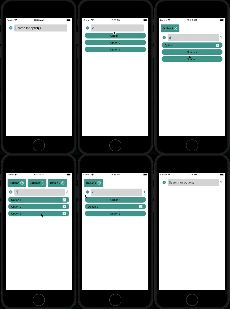
- In this example, you can select several objects, also using the counter and the list of selected objects
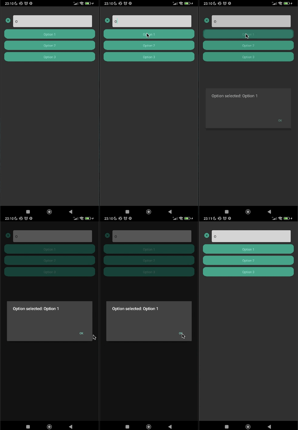
- In this example, you can select a single option in a simple way
📜 Props
Configuration props
| Property | Type | Required | Description |
|---|---|---|---|
| placeholder | String | False | placeholder of the searchbar TextInput |
| options | array of { key: string; label: string; selected: boolean } | True | array of items to search and select |
| setOptions | function | False | function that set the value of options array |
| multipleSelect | Boolean | True | if the search should allow to select multiple options or not |
| isPaginated | Boolean | False | if the list is paginated (default is false) |
| pageSize | Number | False | in case the list is paginated, what would be the number of items of every page |
| showSelectedOptionsOnTop | Boolean | False | boolean value that says if the selected option should appear on the top of the bar |
| showSelectedOptionsCounter | Boolean | False | boolean value to show a counter of selected options. Shows nothing when there is no selected options. |
| onSelectOption | Function | False | function called when the option is selected. Use as (selectedIndex, selectedOption) => {} |
| setIsShowingList | function | False | function that sets a boolean value that says if the list is showing or not |
| setHasSelectedOptions | function | False | function that sets a boolean value that says if there is any option selected |
Styling props
| Property | Type | Required | Description |
|---|---|---|---|
| placeholderTextColor | String | False | color of the placeholder of the searchbar TextInput |
| searchTextColor | String | False | color of the text of the serch in the serachbar TextInput. It can also be set in the inputStyle |
| searchContainerStyle | ViewStyle | False | style of the View that wraps the searchBar |
| itemListContainerStyle | ViewStyle | False | style of the View that wraps individually the result of the search |
| inputStyle | ViewStyle | False | style of the searchbar TextInput |
| optionsOnTopContainerStyle | ViewStyle | False | style of every view that wraps the selected option at the top of the bar |
| optionsOnTopTextStyle | TextStyle | False | style of the text in selected options in the top of the bar |
| counterTextStyle | TextStyle | False | style of the text of the selected options counter |
| counterContainerStyle | ViewStyle | False | style of the view of the selected options counter |
| paginationWrapContainerStyle | ViewStyle | False | style of the pagination container, applied into ListFooterComponentStyle and into the style of the view that wraps the component |
| paginationComponentContainerStyle | ViewStyle | False | style of the pagination container individual components, applied the views that wraps the TouchableOpacity component that changes the page, and into the View componenent that wraps the informs the current page |
| paginationComponentTextStyle | TextStyle | False | style of every text that appears into the pagination component |
Animation props
| Property | Type | Required | Description |
|---|---|---|---|
| animationList | String | False | name of the choosen react-native-animatable animation for the entrance of the list |
| animationInput | String | False | name of the choosen react-native-animatable animation for the entrance of the input |
Icon props
| Property | Type | Required | Description |
|---|---|---|---|
| IconSource | React-native-vector-icons icon component | True | name of the selected source of the React-native-vector-icons source |
| searchIcon | String | False | name of the icon that it will represent the search. It will be located in the right of the searchBar TextInput. It will only appears when there isn’t any item selected on the list |
| searchIconColor | String | False | color of the icon that represent the search. Default is 'black' |
| searchIconSize | Number | False | size of the icon that represent the search. Default is 6% of the width |
| closeIcon | String | False | name of the icon that it will represent closing the search. It will be located in the right of the searchBar TextInput. It will only appears when there is selected items on the list |
| closeIconColor | String | False | color of the icon that represent closing the search. Default is 'black' |
| closeIconSize | Number | False | size of the icon that represent closing the search. Default is 6% of the width |
| optionSelectedIcon | String | False | name of the icon that it will represent when the the individual item is selected. It will only appers at the right side of the selected item |
| optionSelectedIconColor | String | False | color of the icon when the option is selected. Default is 'black' |
| optionSelectedIconSize | Number | False | size of the icon when the option is selected. Default is 6% of the width |
| closeTopOptionIcon | String | False | name of the icon that it will represent when an option at the top of the bar will be deleted |
| closeTopOptionIconSize | Number | False | size of the icon the icon that it will represent when a selected option at the top of the bar will set as unselected |
| closeTopOptionIconColor | String | False | color of the icon the icon that it will represent when a selected option at the top of the bar will set as unselected |
🚀 How to contribute
- Clone the library repository
git clone https://github.com/Danilo-Js/react-native-search-select.git
- Create a test project in the same folder where you cloned the repository
npx react-native init teste --template react-native-template-typescript
-
Install the library at "teste" by following the Getting Started steps
-
You can test your changes by using the script below. It will compile all the changes and past at the project "teste"
yarn compile
-
Create your branch, commit and push your changes
-
Wait for feedback approval
📝 License
This project is under the MIT license. See the LICENSE for more information.


