react-native-smart-picker
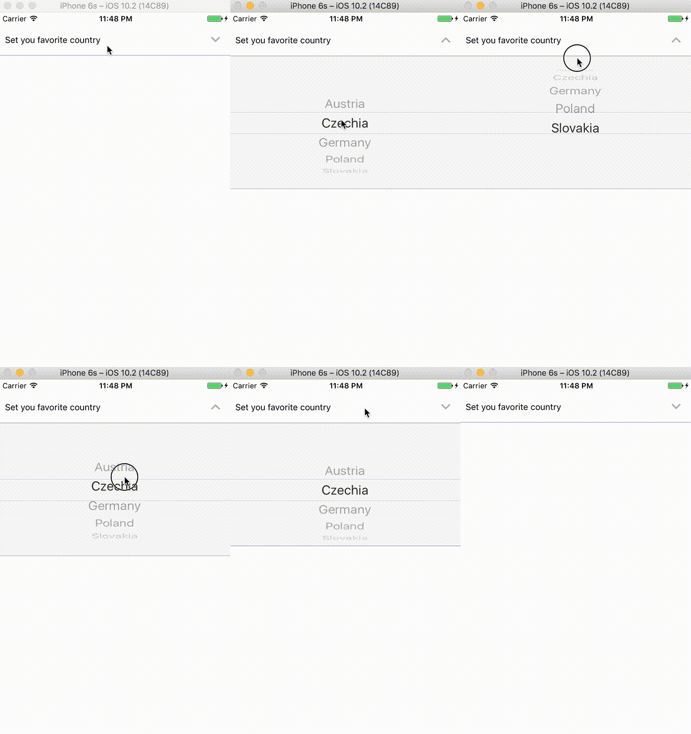
React Native Smart Picker is easy wrapper for React Native Picker. Allows toggling the picker open and closed on iOS and native behaviour on Android.
- The
SmartPickerscene should be wrapped in aScrollViewto allow the page to grow as the toggle opens - Works on Android but there are no toggle effect (follows native UX guidelines)
- PRs welcome
Demo

Installation
npm i react-native-smart-picker --saveor
yarn add react-native-smart-picker --saveUse
... thisstate = selected: "A" ; { this; } <ScrollView style="Your custom styles here"> <View style=flex: 1 marginTop: 20> <ScrollView style=stylescontainer> <SmartPicker selectedValue=thisstateselected label='Set you favorite country' onValueChange=thishandleChange > <PickerItem label='Austria' value='A' /> <PickerItem label='Czechia' value='CZ' /> <PickerItem label='Germany' value='DE' /> <PickerItem label='Poland' value='PL' /> <PickerItem label='Slovakia' value='SLO' /> </SmartPicker> </ScrollView> </View></ScrollView>Props
| Prop name | Default prop | Required | Note |
|---|---|---|---|
androidBoxStyle |
{} |
- | Custom styles |
androidPickerTitle |
true |
No | Enable or disable title in android picker box |
androidPickerStyle |
{} |
- | Custom styles |
androidPickerWrapperStyle |
{} |
- | Custom styles |
androidBoxStyle |
{} |
- | Custom styles |
arrowColor |
rgb(178, 178, 178) |
- | - |
arrowSize |
30 |
- | - |
arrowDownType |
'keyboard-arrow-down' |
- | Icon name fromreact-native-vector-icons/MaterialIcons |
arrowUpType |
'keyboard-arrow-up' |
- | Icon name fromreact-native-vector-icons/MaterialIcons |
expanded |
false |
- | Boolean if box should be expanded or not |
iosBoxStyle |
{} |
- | Custom styles |
iosPickerStyle |
{} |
- | Custom styles |
iosPickerWrapperStyle |
{} |
- | Custom styles |
onValueChange |
- | Yes | Prop from RNPicker (expects func) |
label |
- | Yes | Left label on the left of title |
selectedValue |
- | Yes | Prop from RNPicker (expects any) |
value |
null |
- | Value on the right title |