React Native Photo Browser
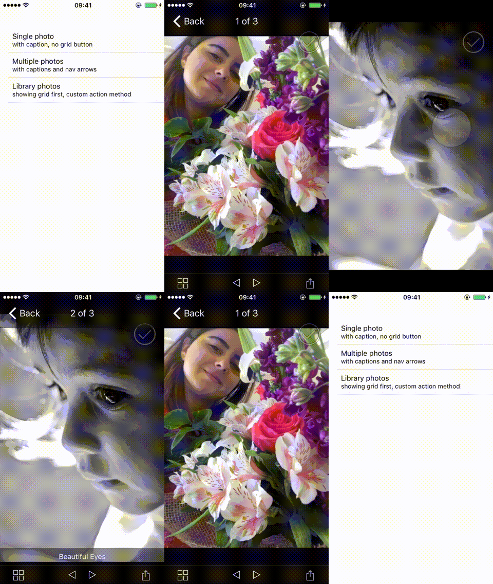
A full screen image gallery with captions, selections and grid view support for react-native. Layout and API design are inspired by great MWPhotoBrowser library.
The component has both iOS and Android support.


Installation
npm install react-native-photo-browser --save
Properties
| Prop | Type | Description | Default |
|---|---|---|---|
mediaList |
Array<Media> | List of media objects to display. | [] |
initialIndex |
Number | Sets the visible photo initially. | 0 |
alwaysShowControls |
Boolean | Allows to control whether the bars and controls are always visible or whether they fade away to show the photo full. | false |
displayActionButton |
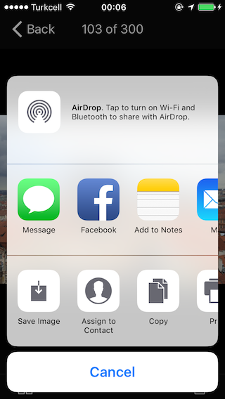
Boolean | Show action button to allow sharing, copying, etc. | false |
displayNavArrows |
Boolean | Whether to display left and right nav arrows on bottom toolbar. | false |
enableGrid |
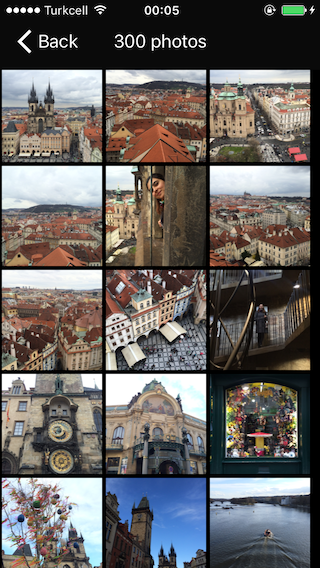
Boolean | Whether to allow the viewing of all the photo thumbnails on a grid. | true |
startOnGrid |
Boolean | Whether to start on the grid of thumbnails instead of the first photo. | false |
displaySelectionButtons |
Boolean | Whether selection buttons are shown on each image. | false |
useCircleProgressiOS |
Boolean | Displays Progress.Circle instead of default Progress.Bar for full screen photos. Check Progress section for more info. | false |
onSelectionChanged |
Function | Called when a media item is selected or unselected. | (media, index, isSelected) => {} |
onActionButton |
Function | Called when action button is pressed for a photo. Your application should handle sharing process, please see Sharing section for more information. If you don't provide this method, action button tap event will simply be ignored. | (media, index) => {} |
onBack |
Function | Called when back button is tapped. | () => {} |
itemPerRow |
Number | Sets images amount in grid row. | 3 |
Media Object
const media = thumb: '' // thumbnail version of the photo to be displayed in grid view. actual photo is used if thumb is not provided photo: '' // a remote photo or local media url caption: '' // photo caption to be displayed selected: true // set the photo selected initially(default is false);Progress Component
Android
Built-in ProgressBarAndroid component is used for Android. Any additional configuration is not needed.
iOS
react-native-progress component is used as progress indicator. The default progress component is Progress.Bar. You can also use Progress.Circle component by simply using useCircleProgress prop, and adding ReactART library to your Xcode project. For more information please check out react-native-progress repo and React Native documentation.
Sharing
I tried delivering sharing photo feature but it was complicated to provide for iOS and android out of the box. I now believe it's a better idea to separate sharing logic into another module. Please check out Example project to see a basic ActionSheetIOS implementation for iOS. You may also use available sharing libraries such as react-native-activity-view and react-native-share.
Examples
See PhotoBrowserExample.js file.
Follow those steps to run the example:
- Clone the repo
git clone https://github.com/halilb/react-native-photo-browser && cd react-native-photo-browser/Example - Install dependencies
npm install - Follow official instructions to run the example project in a simulator or device.
Roadmap
- Android support
- Improve performance for bigger collections
- Video support
- Photo zoom
- Zooming photos to fill the screen