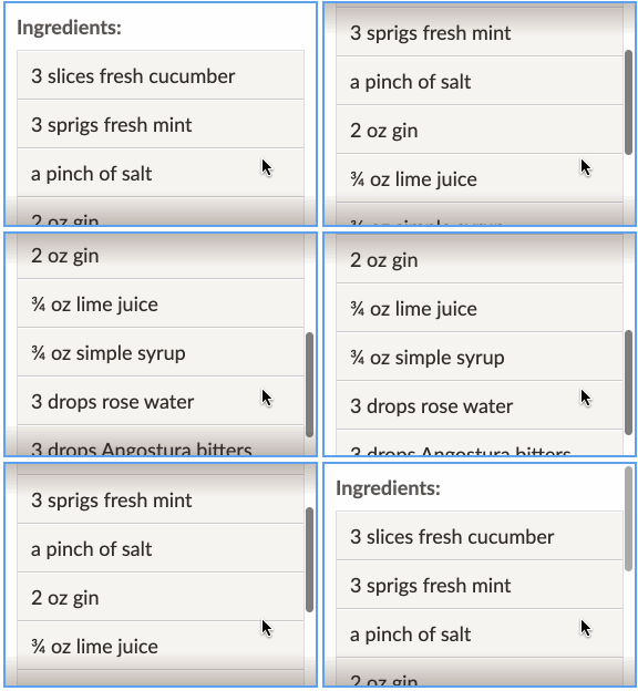
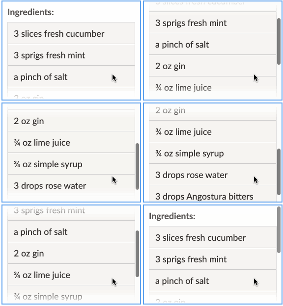
react-overflow-indicator ⏬
- Let users know when there’s more content to see in an
overflowcontainer, in case their device hides scrollbars. - Uses
Intersection Observer
for performance and accuracy – no listening for
scrollorresizeevents. - Flexible: render any style of indicator you want (shadows, arrows, messages, etc.) wherever you want, using any styling solution.
| Some examples: shadows, fades, icons… | ||
|---|---|---|
Quick Start
Install:
$ yarn add react-overflow-indicatorImport:
import Overflow from 'react-overflow-indicator';Render indicators automatically using <Overflow.Indicator> inside of
<Overflow>:
<Overflow>
  <Overflow.Content>
    Render an element or put your content directly here…
  </Overflow.Content>
  <Overflow.Indicator direction="down">👇</Overflow.Indicator>
</Overflow>
…or, use the onStateChange prop to react to overflow however you like:
const [canScroll, setCanScroll] = useState(false);

return (
  <>
    <Overflow onStateChange={state => setCanScroll(state.canScroll.down)}>
      <Overflow.Content>
        Render an element or put your content directly here…
      </Overflow.Content>
    </Overflow>
    {canScroll ? '👇' : '🌈'}
  </>
);
API
Overflow
The overflow state provider. At a minimum it must contain an
<Overflow.Content> element, otherwise it will do nothing.
<Overflow>
  <Overflow.Content>
    Your element(s) here!
  </Overflow.Content>
<Overflow>
As with any standard element, its height must be limited in some way in order
for it to actually scroll. Apply that style as you would any other element, with
style or className:
<Overflow style={{ maxHeight: 500 }}>…</Overflow>Usage with styled-components:
const MyContainer = styled(Overflow)`
  max-height: 500px;
`;
Any remaining props beyond those documented below will be passed along to the
underlying DOM element. Use this to pass className, style, or any other
native attribute.
Props
| Name | Type | Default | Description | |
|---|---|---|---|---|
| children | Node |
Elements to render inside the outer container. This should include an
|
||
| onStateChange | Function |
Callback that receives the latest overflow state and an object of refs, if you’d like to react to overflow in a custom way. |
||
| tolerance |
One of… Number String |
0 |
Distance (number of pixels or CSS length unit like |
|
Overflow.Content
Wrapper for content to render inside the scrollable viewport. This element will
grow to whatever size it needs to hold its content, and will cause the parent
viewport element to overflow. It must be rendered inside an <Overflow>
ancestor.
Although you can style this element directly by passing additional props like
className and style, it’s preferable to include styling on your own element
inside <Overflow.Content> instead – otherwise you risk interfering with the
styles this component needs to function.
Props
| Name | Type | Default | Description | |
|---|---|---|---|---|
| children | Node |
Content to render inside the scrollable viewport. |
||
Overflow.Indicator
A helper component for rendering your custom indicator when the viewport is
scrollable in a particular direction (or any direction). Must be rendered inside
an <Overflow> ancestor.
You can provide a direction prop to indicate when scrolling is allowed in a
particular direction:
<Overflow>
  <Overflow.Content>…</Overflow.Content>
  <Overflow.Indicator direction="right">👉</Overflow.Indicator>
</Overflow>
…or exclude it to indicate when scrolling is allowed in any direction:
<Overflow>
  <Overflow.Content>…</Overflow.Content>
  <Overflow.Indicator>←↕→</Overflow.Indicator>
</Overflow>
This component will mount its children when scrolling is allowed in the
requested direction, and unmount them otherwise. If you’d rather remain mounted
(to allow transitions, for example), then render a function. It will be supplied
with a Boolean (if direction is supplied) or an object with up, left,
right, and down properties:
<Overflow>
  <Overflow.Indicator direction="down">
    {canScroll => (canScroll ? '🔽' : '✅')}
  </Overflow.Indicator>
</Overflow>
Props
| Name | Type | Default | Description | |
|---|---|---|---|---|
| children |
One of… Node Function |
Indicator to render when scrolling is allowed in the requested direction. If
given a function, it will be passed the overflow state and an object containing
the |
||
| direction |
One of… 'up' 'down' 'left' 'right' |
The scrollabe direction to watch for. If not supplied, the indicator will be active when scrolling is allowed in any direction. |
||
useOverflow
This hook provides full access to the Overflow’s context containing its current
state and refs. While <Overflow.Indicator> should be good enough for most
use cases, you can use this if you have other use cases in mind. Must be used
inside an <Overflow> ancestor.
Returns an object like:
{
  state: {
    canScroll: {
      up: Boolean,
      left: Boolean,
      right: Boolean,
      down: Boolean
    }
  },
  dispatch: Function,
  tolerance: Number | String,
  refs: {
    viewport: Object
  }
}
Examples
Make the indicator a button that scrolls the viewport
<Overflow.Indicator direction="down">
  {(canScroll, refs) => (
    <button
      type="button"
      onClick={() => {
        refs.viewport.current.scrollBy({
          top: refs.viewport.current.clientHeight,
          behavior: 'smooth'
        });
      }}
      style={{ position: 'absolute', right: 10, bottom: 10 }}
    >
      {canScroll ? '⏬' : '✅'}
    </button>
  )}
</Overflow.Indicator>
Implementation Details
Instead of the traditional method of listening for scroll and resize events,
this uses the more performant
Intersection Observer API.
Here, an IntersectionObserver watches each of the 4 sides of the viewport
element to see when the scrollable content extends past that edge.
What’s the purpose of each element?
When rendered, you’ll see a structure similar to this:
<div data-overflow-wrapper>
  <div data-overflow-viewport>
    <div data-overflow-content>
      <div data-overflow-tolerance></div> (Optional)
      Finally, your scrollable content here…
    </div>
  </div>
</div>
That seems like a lot! But each one serves a purpose – various CSS and DOM behaviors make this surprisingly difficult to implement otherwise.
From the top down:
- The element with
data-scrollable-wrappercontains everything. If you want to insert some indicator overlay (like shadows, an arrow, a floating message), they should usually be children of this element so that they’ll be siblings of the scrollable viewport and thus will remain in their positions instead of scrolling away. When you define aheightormax-heightto define the scrollable viewport size, it will be on this element. - The element with
data-scrollable-viewportis the one withoverflow: auto. It will match the size of its parent (thedata-scrollable-wrapper). Any indicators you render will usually be siblings of this element. - The element with
data-scrollable-contentcontains your content. It will grow to whatever size it needs and potentially cause thedata-scrollable-viewportelement to overflow. - The element with
data-scrollable-tolerancewill optionally be inserted if you use a nonzerotolerancevalue; in that case, this element will be observed instead of the content element.

