# React PlaceMoulder React Place Moulder uses existing component structure to render loading skeletons with very minimal code changess. Click here for Live Demo and for code click Example Repo Link This is more of a philosophy which can be extended to any framework in Frontend.


Installation
Install using npm install --save react-placemoulder
Pre-Requisite
- Works well with
dumborpresentationalcomponent. - Make sure you do not have any analytics/tracking code in the component
Features
- Uses exisiting component structure ( provided Component is dumb/presentational).
- While Modifying Component, skeleton is not required to be modified as per new design.
How it works
- Class name
stensil( spelling mistake is intentional to avoid accidental clash with correct spelling ) is required to be added to render stencil when the data is being loaded. - Create a dummy data or Schema and pass it to your component.
- To render loading state of the list, use
StencilListHOC, or to show loading state of individual component, useStencilHOC. See props table for accetable props.
StencilList
| prop | type | Description |
|---|---|---|
| data* | object | data is dummy or representational data which will be used to determine the dummy space occupied by the DOM element |
| length | number | Number of repetitive skeletons required to fill in the placeholder list |
| schema* | object | If data is not provided, provide schema of the props required by Component. |
| Component | ReactElement | Component for which we want to generate skeleton on the fly |
StencilWrapper
| prop | type | Description |
|---|---|---|
| Children | ReactElement | Component on which loading state is required |
| repeat | number | Number of times to repeat the skeleton placeholder |
Stencil
| prop | type | Description |
|---|---|---|
| Children | ReactElement | Component on which loading state is required |
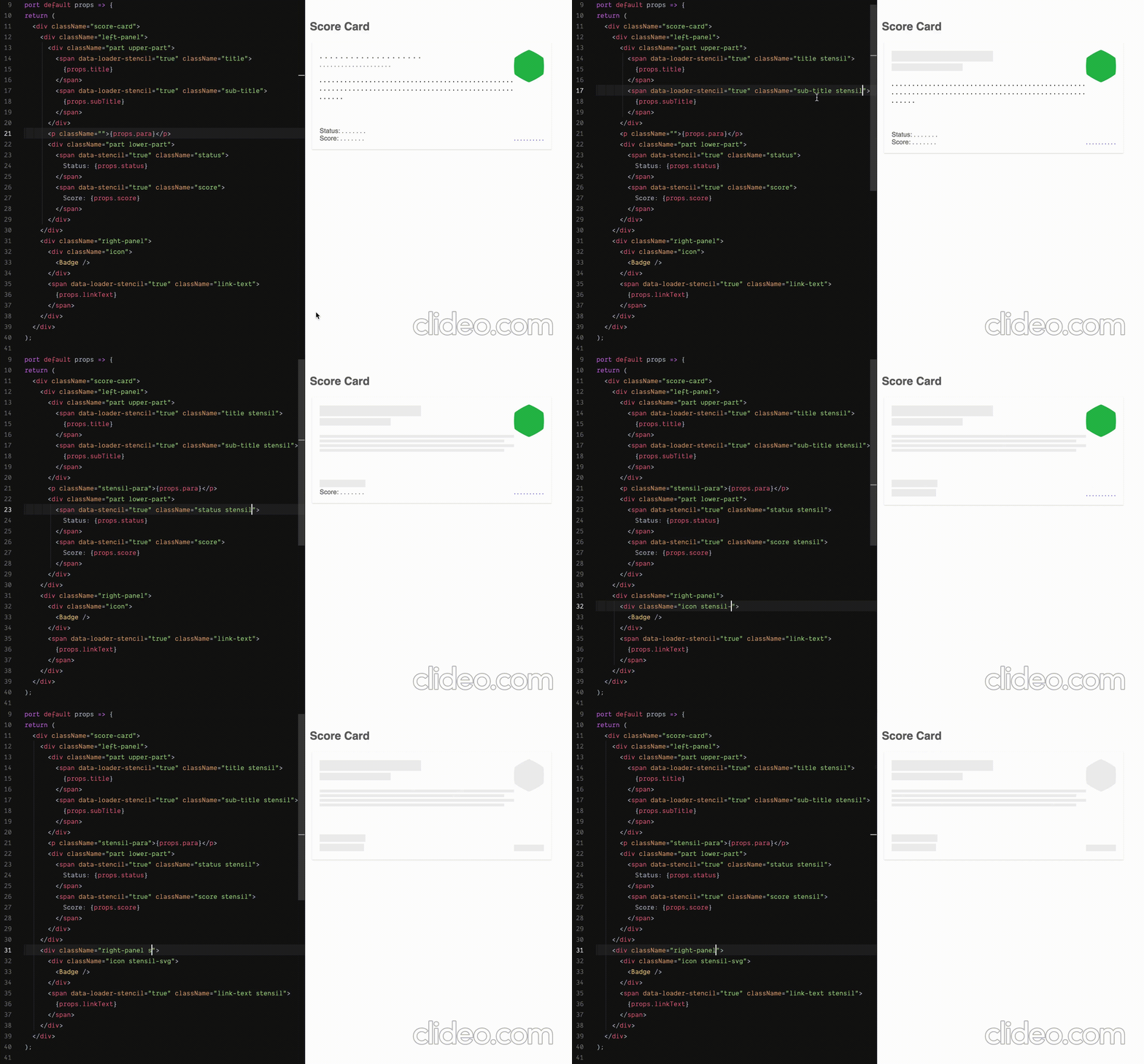
Available selectors to achieve desired result. Add required class name along with other classes where you want to show loading state.
To override or extend visuals, extend following classes or add some rules here and use it in your app:
| Selector Class | Description |
|---|---|
| stensil | To get loading state |
| stensil-ignore | To ignore the component in the loading state. Won't show stencil over there |
| stensil-dark | Dark background, useful in image loaders |
| stensil-svg | To get the exact shape of the SVG as a stencil loader |
| stensil-para | To show the paragraph, can be used where there is short description used |
You can have your own classes to override visuals in loading behaviour.
For that wrap your css under the .enable-stensil selector and just use it in your application.
createObjectFromSchema - method
- Takes object schema as an argument and returns dummy component props JSON. It supports nested object structure as well.
Example
Follow simple following steps
1. Importing
Refer Live Examples for more clarity
import {
  Stencil,
  StencilList,
  StencilWrapper,
  createObjectFromSchema
} from "react-placemoulder";

.... your code ...
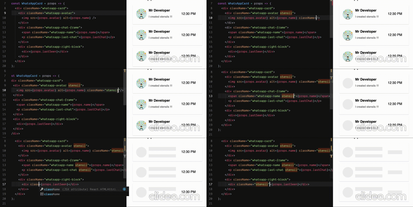
2. To render loading state of the whatsapp card, add stensil class name to the appropriate DOM element for data to be rendered.
const WhatsAppCard = props => (
  <div className="whatsapp-card">
    <div className="whatsapp-avatar stensil">
      <img src={props.avatar} alt={props.name} className="stensil-ignore" />
    </div>
    <div className="whatsapp-chat-frame">
      <span className="whatsapp-name stensil">{props.name}</span>
      <p className="whatsapp-last-chat stensil">{props.lastChat}</p>
    </div>
    <div className="whatsapp-right-block">
      <div className="stensil">{props.lastSeen}</div>
    </div>
  </div>
);
3. Invoke HOC when the data is being loaded. wData is similar in schema with actual data. Its nothing but props object for the WhatsAppCard. Alternatively you can also use schema.
    {loading ? (
          <StencilList length={3} Component={WhatsAppCard} data={wData} />
        ) : (
          [...Array(3)].map((_, index) => (
            <WhatsAppCard key={index} {...wData} />
          ))
        )}
OR using StencilWrapper which accepts only one child
    {loading ? (
          <StencilWrapper repeat={3}>
              <WhatsAppCard {...wData} />
          </StencilWrapper>
        ) : (
          ... render your cards
        )}
4. Provide data or schema. Here data takes precedence over schema.
Example of schema: Where numbers against prop key indicated average length ( decided by you ) to show the stencil.
{
  name: 12,
  lastChat: 65,
  lastSeen: 10
};
Where your dummy data can be like this:
{
  name: "Mr Developer",
  avatar:
    "https://clipartstation.com/wp-content/uploads/2017/11/software-developer-clipart-5.jpg",
  lastChat: "I created stencils !!!",
  lastSeen: "12:30 PM"
};
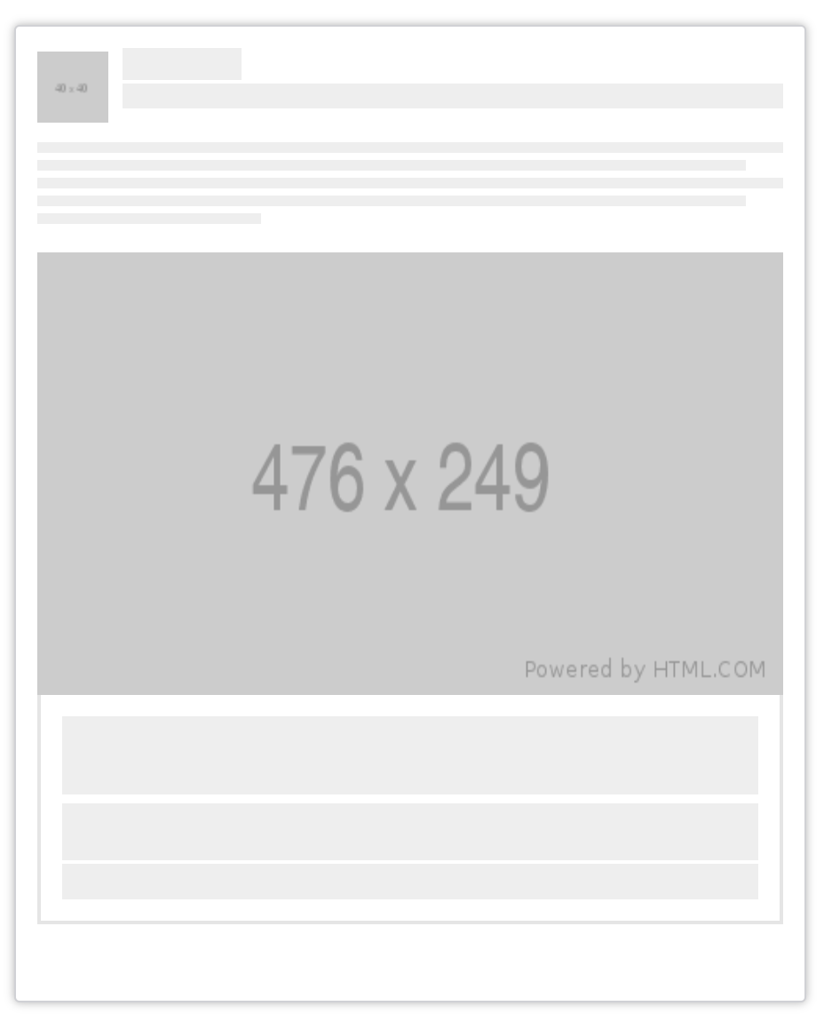
More Skeleton Examples


