react-pro-panels
A Higher-Order Component wrapper to make any component resizable, draggable, and persistent!
See project on npm »
Table of Contents
About The Project
React Pro Panels provides a way for developers to quickly and easily make their components resizable, draggable, and stackable with other components. The package features a Higher-Order Component that will wrap any component and can be moved around the screen easily. This frees the developer from having to worry about where to place the component on the screen.
Here's an example of react-pro-panels in action:
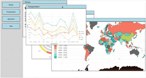
You might notice a few major benefits:
- The wrapper component handles Z-indexes for you automatically.
- Clicking, dragging, and resizing all work intuitively, just like a native operating system.
- The panels will also remember their sizes and positions after being removed and re-added to the DOM. (In the example, the buttons on the left trigger conditional rendering for the panels)
Why react-pro-panels?
React-Pro-Panels uses "react-rnd" as a dependency to enable the positioning and resizing. However, react-rnd requires you to import it into every component's page and use a lot of boilerplate code. Additionally, react-rnd is applied to each component independently, so you can not easily specify how the panels should overlay each other. React-Pro-Panels makes this process easy!
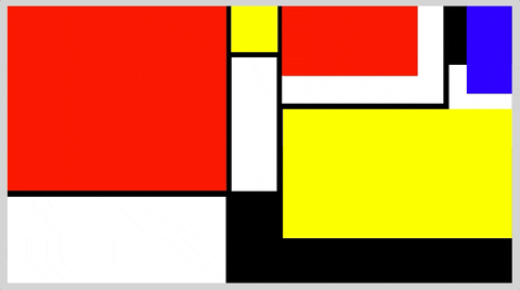
Here's a sample of some Mondrian Art a user can get up and running super easily:
Installation
npm install react-pro-panels react-rnd
Usage
Simply import the Pro Panel into any component that you would like to make into a pro panel, and make sure to wrap the component when you are exporting it.
import withProPanel from "react-pro-panels";

const ExampleComponent = () => {
    return (
        <h1>Hello World!</h1>
    )
}
export default withProPanel(ExampleComponent);
Note: notice that the wrapper component is imported as "withProPanel" which is a naming convention for higher-order-components.
Import the Pro Panel Container component, then place any of your Pro Panels inside. The "defaults" prop defines the initial size and position of your component within the parent ProPanelContainer (detailed below ).
import { ProPanelContainer } from "react-pro-panels";
import ExampleComponent from "./ExampleComponent";

const App = () => {
    return (
        <div id="app">
            <ProPanelContainer>
                <ExampleComponent defaults={{name: "red-box", x: 100, y: 100, height: "100px", width: "100px"}}>
                <ExampleComponent defaults={{name: "blue-box", x: 0, y: 0, height: "5rem", width: "2rem"}}>
                <ExampleComponent defaults={{name: "green-box", x: 50, y: 50, height: "50vh", width: "50vw"}}>
            </ProPanelContainer>
        </div>
    )
}
Props
defaults={ name, x, y, height, width}
- name: defines name of the component, used for storing position for when component is removed and added back to the DOM.
- x: initial X position relative to parent container
- y: initial Y position relative to parent container
- height: initial height of component
- width: initial width of component
Change Log
- [v1.0.1] README added
- [v1.0.0] Project created and published to NPM
Contact
Timothy Akana - timothyakana.tech - TimothyAkana@gmail.com
Project Link: https://github.com/TimothyAkana/react-pro-panels