Reforma

A Local State Driven Approach to Forms in React
Reforma focuses on creating forms quickly and easily, by letting the developer
worry about things like validation and server responses. Utilizing and easy
to use plug-and-play API, Reforma makes building forms easy.
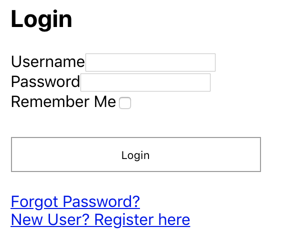
; { const onSubmit errors = props; return <Reforma className="reforma-form" onSubmit=thisonSubmit errors=thisstateerrors> <h2>Login</h2> <InputField name="username" label="Username" /> <br/> <InputField type="password" name="password" label="Password" /><br/> <CheckboxField label="Remember Me" /> <br/> <button className="submit" type="submit">Login</button> <div className="login-links"> <a href="/reset-password">Forgot Password?</a><br/> <a href="/register">New User? Register here</a> </div> </Reforma> );}This creates a simple form that looks like this:
-
No need to write
onChangeor determinevalueprops for input fields, all that logic is handled for you. -
No need to worry about the state of the form. The local state is handled and update for you using all the performance goodies of
React.PureComponent. -
No need to worry about 3rd party validation libraries either. Reforma uses only vanilla React 16.
-
Nest fields as deeply as you want, and style with container elements. Reforma intelligently clones all
<*Field>elements and attachesonClick,value, and showserrorsif theerrorsprop is shown. -
Fields are built with
React.Fragment, ensuring the fewest number of DOM nodes are rendered, maximizing performance and development speed, without making sacrifices for styling and container hierarchy.
Reforma is focused 100% on the construction and building of forms, leaving elements like validation and submit logic to the developer, not out of the box like other form libraries.
Why Reforma, and not Redux-Form or Formik?
Redux-Form and Formik are excellent and well written tools that make creating forms fast and easy, but I noticed that there's something missing from forms in React:
-
Redux-Form causes unnecessary re-renders - Whenever there's a change event in Redux-Form, the entire app from the
Providercomponent emits three distinct actions,onKeyUp,onKeyDown, andonChange.- Redux-State is meant for ephemeral state to be shared between many components, not just one component. If the values of a form need to travel to many different components that don't have a parent-child relationship, Redux-Form is great! But otherwise, it's just not efficient and abusing Redux state.
-
Formik has all the bells and whistles with validation and submit logic. While I really like Formik and everything it has to offer, it can make your form look really big and bloated. I'm a firm believer in having errors passed in from the parent component's state, and values to live in the individual component's state
-
Reforma Focuses solely on the building of forms, and leaves whatever you want to use for validation and form submission to your own devices. Every server interprets data differently, handles errors and validation their own way, whether it's client-side or server-side, and does its own submit logic their own way.
In a nutshell, Reforma is completely agnostic to validation and submission. It only worries about building forms quickly and easily without styling.
Installation
You can install Reforma with some quick npm commands:
npm install react-reforma --save Or if you're using yarn
yarn add react-reforma Reforma Basics
The default export is the root Reforma element
;You can also import the form fields here as well:
;Usage
All Reforma fields need to live as a child of <Reforma>
; { superprops; thisstate = errors: {} ; thisonSubmit = thisonSubmit; thisvalidate = thisvalidate; } { // Your submit logic goes here! } { // Your validation logic goes here! if /* Some condition where email is invalid... */ this; } { return <Reforma onSubmit=thisonSubmit onValueChange=thisvalidate errors=thisstateerrors> <InputField name="first_name" label="First Name" placeholder="Enter your name" /> <InputField name="last_name" label="Last Name" placeholder="Enter your surname" /> <InputField name="email" type="email" placeholer="name@example.com" /> <button type="submit">Submit</button> </Reforma> ; } ;DRY code with fieldProps
The <Reforma> Component also takes in a fieldProps Object, which allows you to cut down on some repeated code:
Instead of:
<Reforma> <InputField className="input-field" name="first_name" placeholder="First Name" /> <InputField className="input-field" name="last_name" placeholder="Last Name" /> <InputField className="input-field" name="address1" placeholder="Address Line 1" /> <InputField className="input-field" name="address2" placeholder="Address Line 2" /></Reforma>You can cut out the repeated "className" prop by using fieldProps
<Reforma fieldProps= className: 'input-field' > <InputField name="first_name" placeholder="First Name" /> <InputField name="last_name" placeholder="Last Name" /> <InputField name="address1" placeholder="Address Line 1" /> <InputField name="address2" placeholder="Address Line 2" /></Reforma>If an individual component has a className prop on it and fieldProps with a className is passed in, Reforma will respect this and make sure that the individual component gets both the className from its own className prop and fieldProps
<Reforma fieldProps= className: 'input-field' > <InputField className="highlight-red" name="first_name" placeholder="First Name" /> <InputField name="last_name" placeholder="Last Name" /> <InputField name="address1" placeholder="Address Line 1" /> <InputField name="address2" placeholder="Address Line 2" /></Reforma>The example above will have 4 elements with the "input-field" class on it, and the "first_name" input field will also have both "input-field" and "highlight-red" as its class attributes.
The <Reforma> Component
<Reforma> Component props:
| Prop | Type | Required? | Description | Default Value |
|---|---|---|---|---|
| className | String | No | className to pass into the root <form> element |
undefined |
| onSubmit | Function | Yes | Function to use for submitting the form. Returns a ValuesObject. More on that later |
Required |
| onValueChange | Function | No | A function that fires whenever a form's field value has been changed. | Empty function |
| fieldProps | Object | No | Adds object as props to <*Field> components |
{} Empty Object |
| initialValues | ValuesObject | No | The initial values for when the form constructs. | {} Empty Object |
| errors | ErrorsObject | No | Creates Errors. More on this later | {} Empty Object |
ValuesObject and ErrorsObject
A form that looks like this:
<Reforma onSubmit=thisonSubmit> <InputField name="first_name" /> <InputField name="middle_name" /> <InputField name="last_name" /> <InputField name="email" type="email" /></Reforma>Will yield a ValuesObject that looks like this:
first_name: "Smiggles" middle_name: "The" last_name: "Dolphin"Where the name of the field is the key, and the value is the field's
value.
If you want to send in some errors to the form you can send an ErrorsObject as
the errors prop:
const errorsObject = last_name: 'How did a Dolphin type into this form? Does the ocean have wifi now?'; <Reforma onSubmit=thisonSubmit errors=errorsObject> <InputField name="first_name" /> <InputField name="middle_name" /> <InputField name="last_name" /> <InputField name="email" type="email" /></Reforma> In practice, it's normal to keep the errorsObject in the parent component's
state, then pass the parent Component's this.state.errors into <Reforma>
<Reforma onSubmit=thisonSubmit errors=thisstateerrors> <InputField name="first_name" /> <InputField name="middle_name" /> <InputField name="last_name" /> <InputField name="email" type="email" /></Reforma><*Field> components
Reforma comes with a handful of field components:
<InputField>for<input />fields.<SelectField>for<select />fields.<RadioButtonField>for<input type="radio" />fields.<CheckboxField>for<input type="checkbox" />fields.<TextAreaField>for<textarea />fields.
Each field can be passed in the following props:
| Prop | Type | Required? | Description | Default Value |
|---|---|---|---|---|
| label | String or JSX | No | Creates a <label> element before the field. Can use JSX. Useful for Radio buttons or checkbox elements |
undefined |
| labelProps | Object | No | Props to pass in to the <label> element |
{} (empty Object) |
| className | String | No | The field's className | undefined |
| placeholder | String | No | Placeholder prop to pass in for <input> elements |
undefined |
| name | String | Yes | Name to use as the key or identifier for the element | |
| injectOnChange | Boolean | No | If false, Reforma will ignore this field and let you control it with your own onChange and value props |
true |
Any additional props passed on a <*Field> element can take in additional props, like data-*, id, etc.
Field Specific props
<InputField />
-
mask- Adds input masking to the element. Uses react-input-mask for ease of use. For more details on how to use this prop, Read up here -
type- defines the "type" prop for the<input>field. Defaults to"text", but can be"password""email""tel""url"or"number".
<SelectField />
children- Can be either<option>elements, or afunctionthat returns<option>elements.
Using plain <option> elements
<SelectField name="year"> <option value="">Select a year</option> <option value="2018">2018</option> <option value="2019">2019</option> <option value="2020">2020</option> <option value="2021">2021</option> <option value="2022">2022</option></SelectField>Using a function
const currentYear = ;return <SelectField name="year"> { return ...Array5; }} </SelectField>; Or... Why not both?
<SelectField name="year"> <option value="">Select a year</option> { return ...Array5; }}</SelectField> <RadioButtonField>
If you need a group of three radio buttons, create 3 fields with different
radioValue props, but with the same name:
<RadioButtonField name="card_type" label="Visa" radioValue="Visa"/><RadioButtonField name="card_type" label="Mastercard" radioValue="mastercard"/><RadioButtonField name="card_type" label="American Express" radioValue="amex"/>Custom Radio Button Labels
If you're hiding the default browser UI for radio buttons and want to use
something in the <label>, you will need to pass in a unique id prop to
<RadioButtonField>, since Reforma cannot use name and must resort to an
id to handle click events.
Tips and Tricks
Using refs
Reforma doesn't have to be a form. You can use it as a store of key/value pairs
for user entry by using React refs.
{ superprops; thisreformaForm = React; thisonSubmit = thisonSubmit; this_internalSecretMethod = this_internalSecretMethod; } { // Submit logic goes here } { console; // => /* { plant: 'Orchid', rock: 'Rocky' } */ } { return <Reforma ref=thisreformaForm onSubmit=thisonSubmit> <InputField name="plant" label="Favorite Plant" /> <InputField name="rock" label="Favorite Rock" /> </Reforma> }Notice the lack of a "submit" button. This approach is good for combining the
values inside of reforma with other forms that don't use <Reforma>
NOTE:
If you attach a ref: make sure:
- You are accounting for
undefinedornullwhen attempting to accessthis.reformaFormor whatever you decide to name your ref. - Do not attempt to manually set the state of
<Reforma>or force re-renders. - Use the ref as a
read-onlyproperty.
Retrieving just values (with a ref)
If you want to access the forms ValuesObject, you can use:
this.reformaForm.values;
And it will return all the values in a ValuesObject.
This project was made with <3 by @MrBenJ - Proudly hosted on GitHub, and happy to be an OSS project.