A 3D carousel component for React, designed to create immersive, interactive experiences for your users.
- 3D rotation effect for an eye-catching carousel experience
- Customizable speed, direction, and number of visible items
- Responsive design, adaptable to various screen sizes
- Easy to use with simple props and hooks
Install the library via npm:
npm install react-responsive-3d-carouselOr with Yarn:
yarn add react-responsive-3d-carouselHere's a simple example of how to use the 3D Carousel in your React project:
import React from 'react'
import { Carousel } from 'react-responsive-3d-carousel'
import 'react-responsive-3d-carousel/dist/styles.css'

const items = [
  <img src="image1.jpg" alt="image1" />,
  <video src="video1.mp4" autoPlay />,
  <div>Custom Content 1</div>,
]

function App() {
  return (
    <div className="App">
      <Carousel
        items={items}
        startIndex={0}
        onChange={(currentIndex) => console.log(currentIndex)}
      />
    </div>
  )
}

export default App
Note: Make sure to import the CSS file to properly style the Carousel. Otherwise import
react-responsive-3d-carousel/dist/index.esm.min.jswhich includes the CSS.
Check out the full documentation.
| Prop Name | Type | Description | Default Value |
|---|---|---|---|
children |
React.ReactNode |
Optional children elements to be displayed in the 3D space besides the carousel item. | undefined |
ariaLabel |
string |
ARIA label for accessibility. | '3d carousel' |
items |
JSX.Element[] |
The array of items to be displayed in the carousel. | required |
startIndex |
number |
The index of the item to start at. | 0 |
containerWidth |
string |
Width of the carousel container. | '100%' |
containerHeight |
string |
Height of the carousel container. Container height must be fixed when height prop is responsive. |
'auto' |
containerPadding |
string |
Padding for the carousel container. | '1rem' |
width |
string | number |
Width of each item; scales with container width if a number is provided. | '400px' |
height |
string | number |
Height of each item; scales with container height if a number is provided. | '300px' |
aspectRatio |
'auto' | number |
Aspect ratio of each item | 'auto' |
align |
'center' | 'top' | 'bottom' |
Alignment type for the items in the carousel. | 'center' |
boxShadow |
string |
CSS Box shadow style for the items. | '0 0.1rem 0.5rem rgba(0, 0, 0, 0.5)' |
perspective |
string | number |
CSS Perspective distance for the 3D effect; scales with container width if a number is provided. | 1 |
perspectiveOrigin |
string |
CSS Perspective origin for the 3D effect. | 'center' |
layout |
'default' | CarouselLayoutInfo |
The layout prop supports two options: 'default' for a standard layout, and CarouselLayoutInfo for full customization. (see table) |
'default' |
defaultOption |
DefaultOption |
Configuration for default layout, including numOfSlides, widthFactor, depthFactor, and angleFactor (see table below). | undefined |
sizeDuration |
number |
Duration for size transition. | 1000 |
sizeTimingFn |
string |
CSS Transition timing function for width and height. | 'ease-in-out' |
transformDuration |
number |
Duration for transform transition. | 1000 |
transformTimingFn |
string |
CSS Transition timing function for transform transition. | 'ease-in-out' |
focusOnSelect |
boolean |
If true, the selected item is centered when clicked. | true |
pauseOnHover |
boolean |
If true, pauses auto-play when hovered. | true |
pauseOnTransition |
'none' | 'size' | 'transform' | 'both' |
Determines when sliding is allowed based on the completion of transition animations. | 'both' |
onChange |
(index: number, item: JSX.Element) => void |
Callback function triggered when the centered item changes. | undefined |
onClickItem |
(e: MouseEvent, index: number, item: JSX.Element, isCurtIndex: boolean) => void |
Callback when an item is clicked, providing event, index, item, and if it’s the current item. | undefined |
autoPlay |
boolean |
Enables auto-play of the carousel. | true |
interval |
number |
Interval time (in ms) for auto-play. | 3000 |
infiniteLoop |
boolean |
Enables infinite loop of the carousel items. | true |
autoFocus |
boolean |
If true, the carousel container will automatically when it's loaded. | true |
slideWithKeyboard |
'none' | 'vertical' | 'horizontal' | 'both' |
Enables sliding with keyboard arrow keys. | 'both' |
swipeable |
boolean |
Enables swipe interaction for the carousel on touch devices. | true |
swipeDirection |
'horizontal' | 'vertical' |
Direction of swipe allowed. | 'horizontal' |
onSwipeStart |
(event: TouchEvent) => void |
Callback function triggered when a swipe starts. | undefined |
onSwipeEnd |
(event: TouchEvent) => void |
Callback function triggered when a swipe ends. | undefined |
onSwipeMove |
(event: TouchEvent) => void |
Callback function triggered during a swipe move. | undefined |
showStatus |
boolean |
If true, displays status for the carousel. | true |
status |
StatusProps |
Additional Status props (see table below). | {} |
showArrows |
boolean |
If true, displays arrows navigation buttons. | true |
arrows |
ArrowsProps |
Additional Arrows props (see table below). | {} |
showIndicators |
boolean |
If true, displays indicators for each item in the carousel. | true |
indicators |
IndicatorsProps |
Additional Indicators props (see table below). | {} |
These props are only effective when layout is set to 'default'.
| Prop Name | Type | Description | Default Value |
|---|---|---|---|
numOfSlides |
'auto' | 2 |3 | 5 |
Number of slides to show, or 'auto' for automatic adjustment. | 'auto' |
widthFactor |
number |
Carousel spread factor for width. | 1 |
depthFactor |
number |
Depth intensity for the carousel effect. | 1 |
angleFactor |
number |
Rotation intensity for each item. | 1 |
Try using the Custom Layout Editor !
CarouselLayoutInfo lets you define custom layouts for carousel items, controlling each item’s size, position, and rotation relative to the selected item. Each CarouselLayoutInfo entry consists of multiple LayoutInfo objects applied to items based on their index.
The default layout uses the same structure. See Example.
By default, each carousel item is centered within the container.
export type LayoutInfo = {
  width?: number | string // scales with container width if a number. When it's undefined or 'auto', the width prop is used.
  height?: number | string // scales with container height if a number. When it's undefined or 'auto', the height prop is used.
  translate: {
    x: number | string // scales with container width if a number
    y: number | string // scales with container height if a number
    z: number | string // scales with container width if a number
  }
  rotate: {
    x: number // in degrees
    y: number // in degrees
    z: number // in degrees
  }
  offset: {
    x: number | string // scales with item width if a number
    y: number | string // scales with item height if a number
    z: number | string // scales with item width if a number
  }
}
CarouselLayoutInfo defines the layout for each carousel item, including a default-key layout used when no specific layout is provided.
- 0: Represents the selected item
- Positive numbers: For upcoming items
- Negative numbers: For previous items
export type CarouselLayoutInfo = {
  default: LayoutInfo
  [key: number]: LayoutInfo
}
Arrows props are sub-fields used under the arrows object prop in the Carousel component.
| Prop Name | Type | Description | Default Value |
|---|---|---|---|
width |
string |
Width of the arrow buttons. | '3rem' |
height |
string |
Height of the arrow buttons. | '5rem' |
color |
string |
Color of the arrow buttons. | '#ffffff' |
hoverColor |
string |
Color of the arrow buttons when hovered and active. | '#888888' |
shadow |
string |
CSS Drop shadow style for the arrow buttons. | '0 0.05rem 0.1rem rgba(0, 0, 0, 0.3)' |
prevIcon |
JSX.Element |
Custom icon for the previous arrow. | undefined |
nextIcon |
JSX.Element |
Custom icon for the next arrow. | undefined |
nextArrowTranslate |
[string, string] |
Translation offset for the next arrow button. [X, Y] | ['0px', '0px'] |
prevArrowTranslate |
[string, string] |
Translation offset for the previous arrow button. [X, Y] | ['0px', '0px'] |
onClickNext |
(e: MouseEvent) => void |
Callback function triggered when the next arrow is clicked. | undefined |
onClickPrev |
(e: MouseEvent) => void |
Callback function triggered when the previous arrow is clicked. | undefined |
Indicators props are sub-fields used under the indicators object prop in the Carousel component.
| Prop Name | Type | Description | Default Value |
|---|---|---|---|
width |
string |
Width of each indicator. | '0.7rem' |
height |
string |
Height of each indicator. | '0.7rem' |
color |
string |
Color of the inactive indicators. | '#ffffff' |
activeColor |
string |
Color of the indicator when active and hovered. | '#888888' |
gap |
string |
Gap between each indicator. | '1.5rem' |
shadow |
string |
CSS Drop shadow style for the indicators. | '0 0.05rem 0.1rem rgba(0, 0, 0, 0.5)' |
translate |
[string, string] |
Translation offset for the indicators container. [X, Y] | ['0px', '0px'] |
indicatorIcon |
JSX.Element |
Custom icon for indicators. | undefined |
onClick |
(e: MouseEvent, index: number) => void |
Callback function triggered when an indicator is clicked. | undefined |
Status props are sub-fields used under the status object prop in the Carousel component.
| Prop Name | Type | Description | Default Value |
|---|---|---|---|
color |
string |
Color of the status text. | '#ffffff' |
fontSize |
string |
Font size of the status text. | '1rem' |
fontWeight |
string |
Font weight of the status text. | '600' |
shadow |
string |
CSS Text shadow style for the status text. | '0 0.05rem 0.1rem rgba(0, 0, 0, 0.5)' |
translate |
[string, string] |
Translation offset for the status container. [X, Y] | ['0px', '0px'] |
The CarouselContext is a React context that provides access to the current index of the carousel. This makes it easy to integrate custom behaviors based on the carousel's current state.
type DefaultContext = {
  curIndex: number
  setCurIndex: React.Dispatch<React.SetStateAction<number>>
  slideNext: () => void
  slidePrev: () => void
}
Use the CarouselContext within the <Carousel /> component. For example, you can access it in any React component passed as the items or children prop.
import React, { useContext } from 'react'
import { CarouselContext } from 'react-responsive-3d-carousel'

function CarouselItem() {
  const { curIndex, setCurIndex } = useContext(CarouselContext)

  return (
    <div>
      <p>Current Slide: {curIndex}</p>
      <button onClick={() => setCurIndex(0)}>Go to first slide</button>
    </div>
  )
}- You can fully customize the carousel by overriding its default CSS styles.
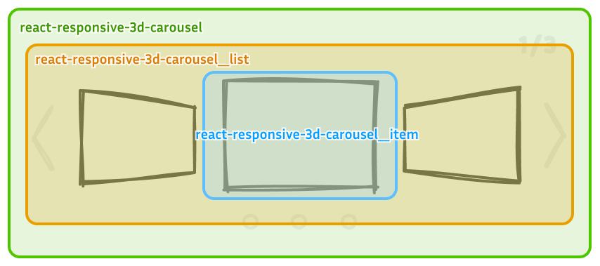
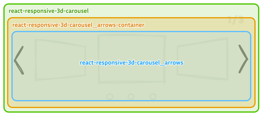
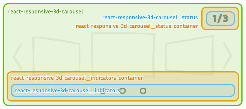
- To prevent style conflicts, all class names are prefixed with
react-responsive-3d-carousel. Refer to the images below for details on each class name.
- The
*-containerclass positions the component withposition: absoluteand appliespointer-events: noneto prevent interference with user interactions over carousel items. - Access each arrow button using the
buttonchild selector.
- The
*-containerclasses position the components withposition: absoluteand appliespointer-events: noneto prevent interference with user interactions over carousel items. - Use the
pchild selector to style the status text. - Use the
ulandlichild selectors to style indicators.
This project is licensed under the MIT License - see the LICENSE file for details.
Contributions, issues, and feature requests are welcome! Feel free to check the CONTRIBUTING.md if you want to contribute.
If you like this project, please give it a ⭐️ on GitHub!


