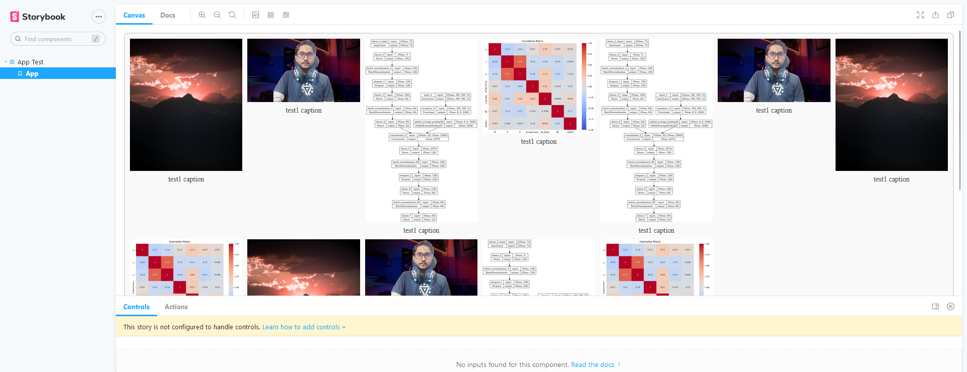
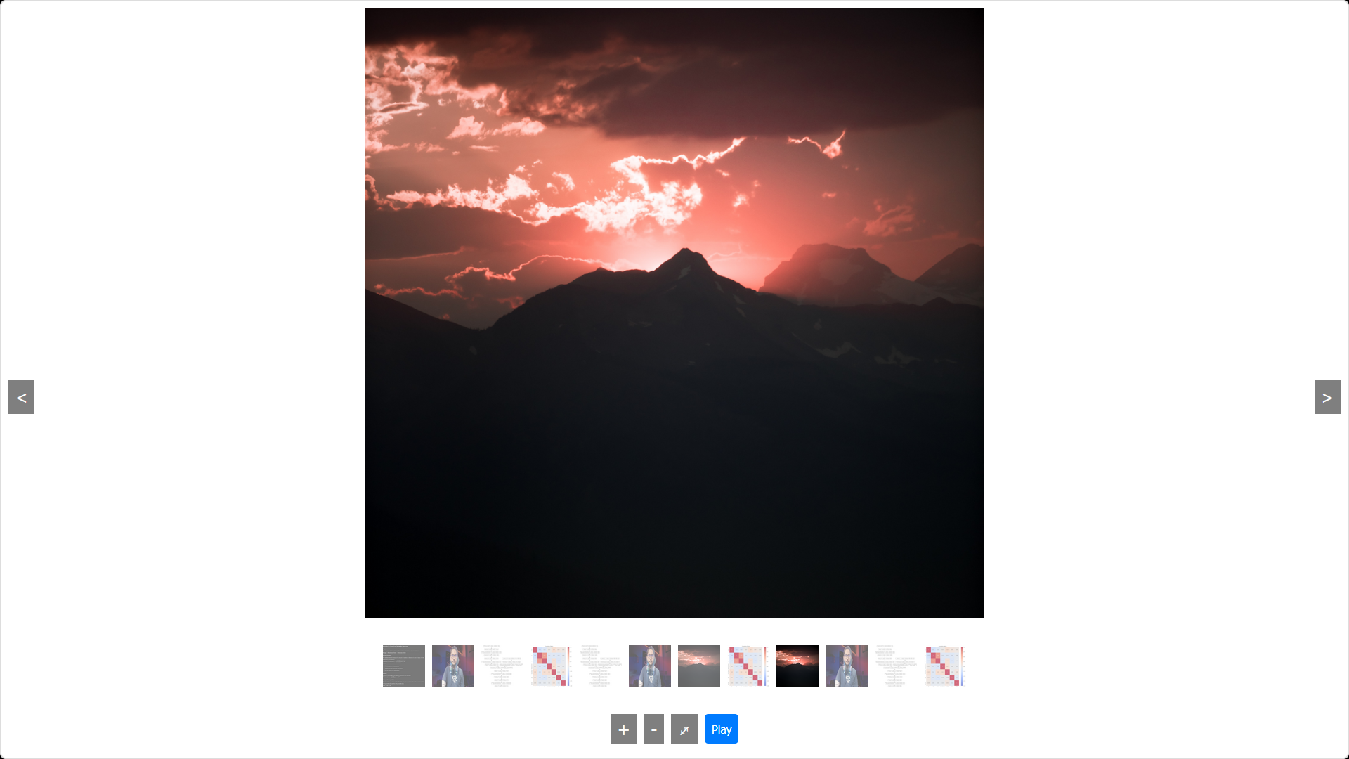
React Sleek Design Gallery is a customizable React gallery library that provides an immersive image viewing experience with features like lazy loading, lightbox with zoom and pan, customizable transition effects, image captions, fullscreen mode, thumbnail navigation, autoplay slideshow, and mobile gesture support.
NPM Link - https://www.npmjs.com/package/react-sd-gallery?activeTab=readme
- Lazy Loading: Load images as they appear in the viewport, improving performance.
- Lightbox: Display images in a full-screen overlay with zoom and pan capabilities.
- Customizable Transition Effects: Switch between images with various transition effects like fade and slide.
- Image Captions: Show captions on image hover or inside the lightbox.
- Fullscreen Mode: View images in fullscreen with a simple toggle.
- Thumbnail Navigation: Quickly navigate through images using thumbnail previews.
- Autoplay Slideshow: Automatically transition through images at a user-defined interval.
- Mobile Gesture Support: Navigate through images and control zoom with intuitive touch gestures.(In development)
Install react-sd-gallery using npm or yarn:
npm install react-sd-galleryor bash
yarn add react-sd-gallery
Here's an example of how to use the library in your React application:
jsx
// App.js
import React from 'react';
import { Gallery } from 'react-sd-gallery';

const images = [
  {
    src: 'path/to/image1.jpg',
    alt: 'Image 1',
    thumbnail: 'path/to/thumbnail1.jpg',
    alt_thumbnail: 'Thumbnail 1',
    caption: 'This is image 1'
  },
  {
    src: 'path/to/image2.jpg',
    alt: 'Image 2',
    thumbnail: 'path/to/thumbnail2.jpg',
    alt_thumbnail: 'Thumbnail 2',
    caption: 'This is image 2'
  },
  // More images...
];

const MyGallery = () => (
  <Gallery images={images} autoplayTime={5000} />
);

export default MyGallery;
- images: An array of image objects, each containing:
- src: The main image source.
- alt: Alt text for the main image.
- thumbnail: (Optional) Thumbnail image source.
- alt_thumbnail: (Optional) Alt text for the thumbnail.
- caption: (Optional) Caption text for the image.
- autoplayTime: (Optional) Interval time in milliseconds for the autoplay slideshow.
Contributions are welcome! Please submit a pull request or open an issue to suggest improvements or report bugs. This is still in development hence suggest improvements.
I am Subham Divakar and I am the developer of multiple python and react libraries. Check out my worksamples on my portfolio site.
LinkedIn: https://www.linkedin.com/in/subham-divakar-a7420a12a/
GitHub: https://github.com/shubham10divakar
Portfolio: https://shubham10divakar.github.io/showcasehub/
Your feedback is important! Please share your thoughts and suggestions. License
This project is licensed under the MIT License.


