
React Select Bootstrap
This package only offers the styling of the react-select package for the Bootstrap 5, focused essentially on colors, borders, shadows and validation.
Install
npm install react-select-bootstrapUsage
Component usage example.
import 'bootstrap/dist/css/bootstrap.min.css';
import { ReactSelectBootstrap } from 'react-select-bootstrap';
export default () => {
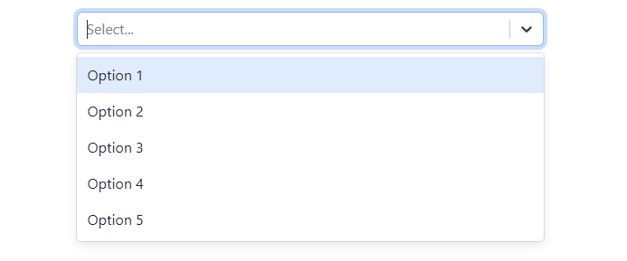
return <ReactSelectBootstrap className='mt-3'
options={[
{ value: "1", label: "Option 1" },
{ value: "2", label: "Option 2" },
{ value: "3", label: "Option 3" },
{ value: "4", label: "Option 4" },
{ value: "5", label: "Option 5" }
]}
/>
}You can see a interative component in Storybook.
Props
ReactSelectBootstrap
This component accept all react-select props with the addition of isInvalid.
| Name | Type | Default | Description |
|---|---|---|---|
| isInvalid | boolean | false | Define input style |
License
MIT