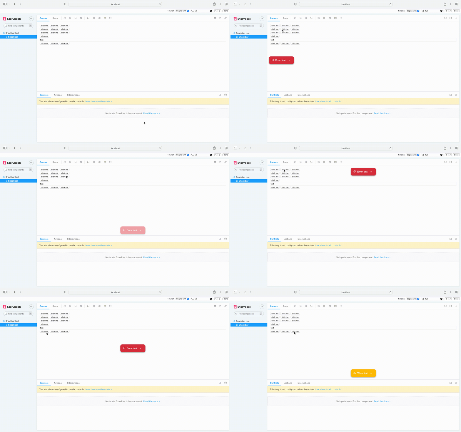
a simple react notification snack bar that was made with react typescript with RTL support and I made it to make my own life and everybody else's easier in their projects.
now, the library supports older versions of react
Pre-made words were removed from snack bar in both RTL and LTR
you can easily install it with npm
npm install react-snackbar-notif
there are 2 sides to this project that you should use.
there is a provider that you should put all of your components in it.
import {SnackbarProvider} from 'react-snackbar-notif'

function App() {
  return (
    <SnackbarProvider>
        <Component />
    </SnackbarProvider>
  )
}
there is also a hook component that you can use in your code to make the snack bar come up
import {useSnackbar} from 'react-snackbar-notif'

function SomeComponent() {
    const snackbar= useSnackbar();

    const showSnackbar=()=>{
        snackbar({message: "some message", color: "success"});
    }

    return(
        <button onClick={showSnackbar}>click me</button>
    )
}
in this example code we have a button so when you click on it a snack bar with green color comes up and shows "some message" text
there are some optional props for each of them I will show you now
I used all of the props in this example
import {SnackbarProvider} from 'react-snackbar-notif'

function App() {
  return (
    <SnackbarProvider
      timeout={timeout}
      vertical={vertical}
      horizontal={horizontal}
      dir={dir}
    >
        <Component />
    </SnackbarProvider>
  )
}interface Props{
timeout: number;
vertical: "top"|"center"|"bottom";
horizontal: "left"|"center"|"right";
dir: "ltr"|"rtl"
}timeout prop is used to declare the time of snack bar shows on the screen in ms and the default value is 3000ms.
we have vertical and horizontal props for this part that declares the position of the snack bar on the screen and you have 3 options for each of them so you can declare the position of the snack bar with 9 different props and the default value of them is "center-bottom".
the last prop is dir that you can choose the direction of your snack bar between "rtl" and "ltr" by the way the default value is "ltr".
  const snackbar= useSnackbar();

  snackbar({
    message: "message",
    color: "error",
    vertical: 'top',
    horizontal: "left"
})interface Props{
message: string;
vertical: "top"|"center"|"bottom";
horizontal: "left"|"center"|"right";
color: "error"|"success"|"warning"
}we have the vertical and horizontal option again here that is completely optional you can set your default values from the snack bar provider that I explained earlier but if you need somewhere to change the position of one of the snack bars you can use these. (again the default value is "center-bottom")
message option is the string that you want to show in snack bar.
you have 3 color options if you choose success it will be green for error it will be red and the warning is kinda yellow
I am a front-end developer who knows a little bit of back-end you can follow me on my git accounts and LinkedIn


