
React SVG Gauge
Simple SVG Gauge component, inspired by JustGage
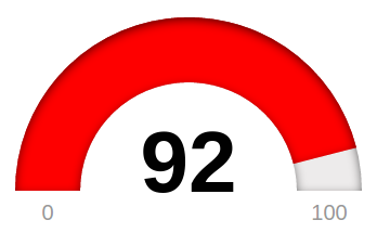
Demo
https://reggino.github.io/react-svg-gauge
Sample implementation
import React, { Component } from 'react';
import Gauge from 'react-svg-gauge';

export default class App extends Component {
    render() {
        return (
            <div>
                <Gauge value={this.state.value} width={400} height={320} label="This is my Gauge" />
            </div>
        );
    }
}
Options
- label (default: "React SVG Gauge")
- min (default: 0)
- max (default: 100)
- value (default: 40)
- width (default: : 400)
- height (default: 320)
- color (default: '#fe0400')
- backgroundColor (default: '#edebeb')
- topLabelStyle (style object)
- valueLabelStyle (style object)
- minMaxLabelStyle (style object)
- valueFormatter (function (number) => string)
Styling can be done via Style-properties, or by applying CSS to SVG Text elements.