
React SVG Tooltip 


A React component to create tooltips for SVG elements.
The library offers a Tooltip component which can be embedded into any SVG element hierarchy.
The component does not actually provide a tooltip.
Instead, it provides a 0-based coordinate system relative to the current mouse position, so you can place your favorite SVG elements in whichever style suits your needs.
Behind the scenes, the library handles all mouse listener logic and makes sure that your tooltip is always rendered on top of all other SVG elements (by using a React portal).
You might want to read this blog post for further details.
Installation
npm install react-svg-tooltip
Note that react and react-dom peer dependencies must already be installed in version 16.3.x or above.
Basic Usage
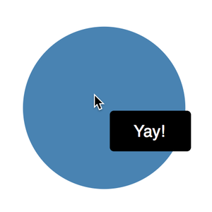
This example demonstrates how to attach a rectangular tooltip with some text to a circle shape.
The triggerRef property accepts a reference to an arbitrary element (a circle in our example), which further serves as the mouse trigger.
Note how the x/y-coordinates of the tooltip contents (rect and text) can be expressed relative to the mouse position.
import * as React from 'react';import Tooltip from 'react-svg-tooltip'; const App = const circleRef = ReactcreateRef<SVGCircleElement>; return <div ='App'> <svg ='0 0 100 100'> <circle = = = = ='steelblue'/> <Tooltip => <rect = = = = = = ='black'/> <text = = = ='white'>Yay!</text> </Tooltip> </svg> </div> ;; ;
Advanced Usage
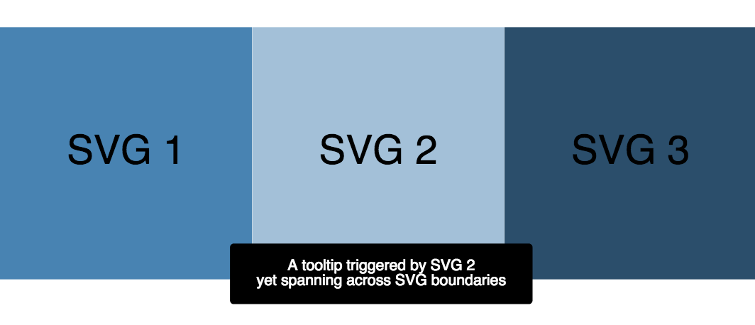
By default, the tooltip is added to the SVG root element which parents the triggering element.
This can be limiting in certain scenarios, e.g. if a small SVG triggers a tooltip which is larger than its own SVG root.
It is therefore possible to add the tooltip to a different SVG root, making glass-pane-like usages possible.
The following example illustrates how 3 small SVG tiles can display tooltips on a shared SVG glass pane.
The wiring is achieved through the containerRef property.
import * as React from "react";import * as ReactDOM from "react-dom";import Tooltip from "react-svg-tooltip";import "./index.css"; const App = const containerRef = ReactcreateRef<SVGSVGElement>; const triggerRef1 = ReactcreateRef<SVGSVGElement>; const triggerRef2 = ReactcreateRef<SVGSVGElement>; const triggerRef3 = ReactcreateRef<SVGSVGElement>; return <div ="app"> <svg = ="glasspane" ="0 0 100 100" /> <svg = ="tile" ="0 0 100 100"> <rect ="100%" ="100%" ="steelblue" /> <text ="50%" ="50%"> SVG 1 </text> </svg> <svg = ="tile" ="0 0 100 100"> <rect ="100%" ="100%" ="#a2c0d9" /> <text ="50%" ="50%"> SVG 2 </text> </svg> <svg = ="tile" ="0 0 100 100"> <rect ="100%" ="100%" ="#2a4e6c" /> <text ="50%" ="50%"> SVG 3 </text> </svg> <Tooltip = => <rect = = = = = = ="black" /> <text = = = ="white"> <tspan>A tooltip triggered by SVG 1</tspan> <tspan = ="1em"> yet spanning across SVG boundaries </tspan> </text> </Tooltip> <Tooltip = => <rect = = = = = = ="black" /> <text = = = ="white"> <tspan>A tooltip triggered by SVG 2</tspan> <tspan = ="1em"> yet spanning across SVG boundaries </tspan> </text> </Tooltip> <Tooltip = => <rect = = = = = = ="black" /> <text = = = ="white"> <tspan>A tooltip triggered by SVG 3</tspan> <tspan = ="1em"> yet spanning across SVG boundaries </tspan> </text> </Tooltip> </div> ;; ReactDOM;
Acknowledgements
Based on typescript-library-starter-lite.
License
Licensed under MIT License.
© Rahel Lüthy 2018