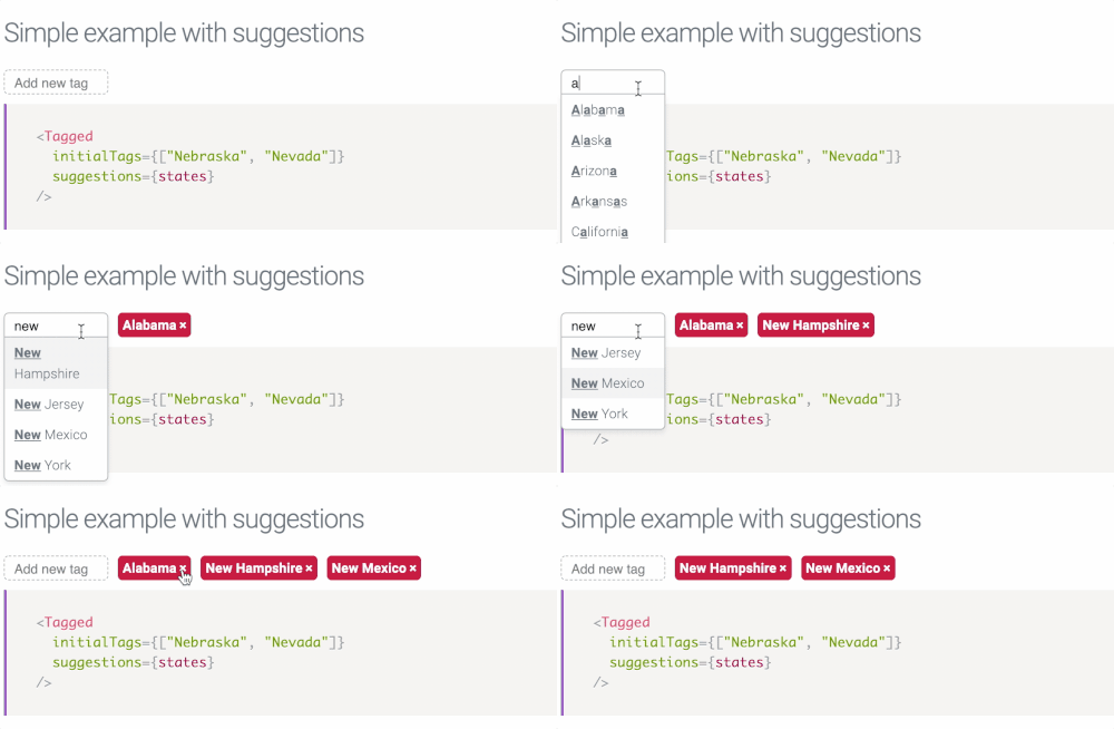
A minimalistic React tags component with TypeScript.
💾 1.3KB GZipped
🔋 TypeScript declarations included
⌨ Keyboard shortcuts (using arrows to pick suggestions, etc.)
😍 Fully-customizable look (including animations) via CSS
Multiple examples are available in our storybook.
npm install --save react-tagged

# or
yarn add react-taggedimport { Tagged } from 'react-tagged'
import 'react-tagged/dist/index.css' // styles
<Tagged
initialTags={[]} // selected tags (array of strings)
suggestions={[]} // suggestions (array of strings)
onChange={(tags) => {}} // called every a tag is added or removed, tags is an array of strings
suggestionWrapPattern="<b><u>$1</u></b>" // how to highlight search pattern in suggestions
allowCustom={true} // when false, it will only allow tags from suggestions
inputPlaceholder="Add new tag" // the input placeholder
suggestionsThreshold={1} // how many characters typed before suggestions appear
autoFocus={false} // put focus into the input field
reverse={false} // what should go first: tags or the input
/>You can override the CSS classes. Changing the tag background, for instance, looks like this:
.react-tagged--tag {
  background-color: orange;
}The default transition is applied to the max-width of a tag. There are four CSS classes that handle CSS transitions on tag appear and on tag leave. Override them to change it.
.react-tagged--tag-enter {
  transition: max-width 0.2s ease-out;
  max-width: 0;
}

.react-tagged--tag-enter.react-tagged--tag-enter-active {
  max-width: 100px;
}

.react-tagged--tag-leave {
  transition: max-width 0.2s ease-in;
  max-width: 100px;
}

.react-tagged--tag-leave.react-tagged--tag-leave-active {
  max-width: 0;
}
