React-TaxonomyPicker
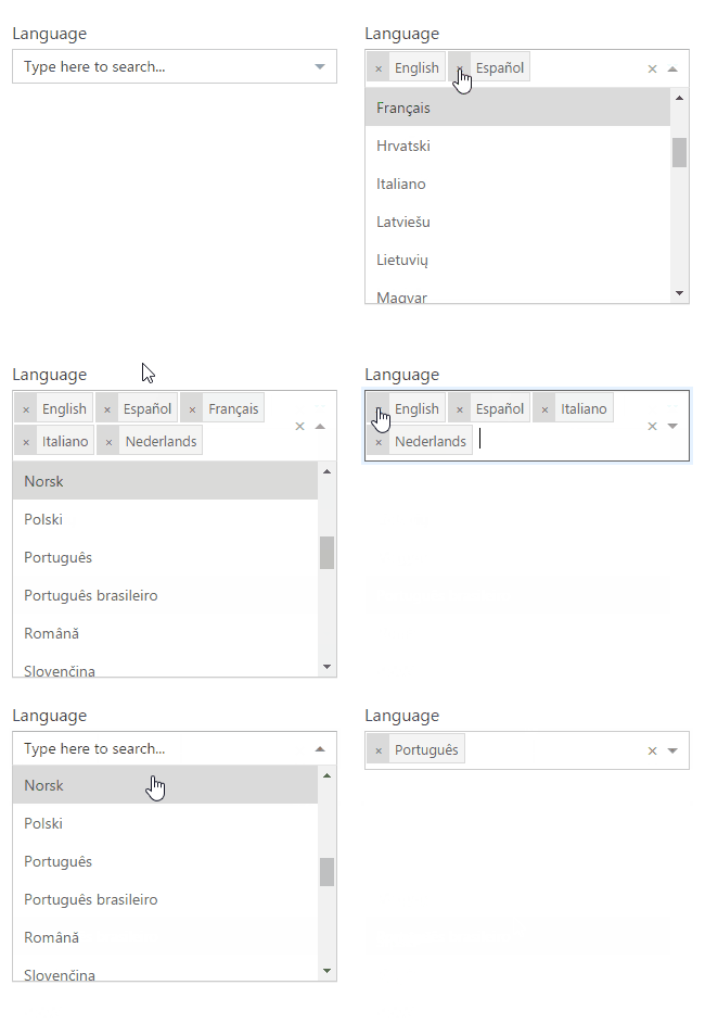
A Taxonomy Picker control built with TypeScript for React based on React-Select. Initially built for use in Office 365 / SharePoint.

DEMO
https://jquintozamora.github.io/react-taxonomypicker
Features
- Retrieve Terms from a Term Set by Term Set GUID.
- Support for large Term Set using Async mode
- Configurable via termSetCountMaxSwapToAsync property
- Use SP.Taxonomy.js
- Use Promise (polyfill it if needed IE)
Features not supported
- Add new Terms (Open TermSets)
Scenarios supported
- SharePoint Web Part using Script Editor or Content Editor Web Part
- SharePoint Framework Web Part (SPFx)
- ES6 project consumer sample
- TypeScript project consumer sample
- SPFx project consumer sample
Scenarios not supported
- SharePoint Provider-hosted app
- Other environment in which we are not allowed to use JSOM
- Add new terms to the Taxonomy Store (specific for get terms by now)
Installation
Steps to use react-taxonomypicker in your React project
1.Install from NPM
npm install --save react-taxonomypicker
2. Import and use in your application
import TaxonomyPicker from "react-taxonomypicker";
// Include its styles in you build process as well
import "react-taxonomypicker/dist/React.TaxonomyPicker.css";
3. Usage
Mock / Local mode
Don't configure termSetGuid and load the options from defaultOptions object.
<TaxonomyPicker name="Language" displayName="Language" defaultOptions= label: "English" value: "f50249b6-310d-43b6-aaa6-f0cb46d851bf" label: "Spanish" value: "237ca323-1ed8-4199-a49b-a9f7ce4256bf" label: "German" value: "44024c7e-f738-4755-90e1-15866327c806" label: "Italian" value: "65f67491-bdca-491a-84fa-f6fd913f40fa" multi showPath/>SharePoint environment mode
Configure termSetGuid with the desired term set
<TaxonomyPicker name="Language" displayName="Language" termSetGuid="26ebf149-101a-4996-9df2-8179a537350d" termSetName="Language" termSetCountMaxSwapToAsync=100 multi showPath/>Done
- Expose as a Module / Global / UMD library
- Upload to npm
- Create ES6 sample application for usage
- Create TypeScript sample application for usage
- Create SPFx webpart sample for usage
- Create types and include them with the npm package
- onPickerChange event handler exposed
- react-select properties exposed (extends them)
- termSetCountMaxSwapToAsync property exposed to choose between Sync / Async modes
- defaultOptions array exposed to enable input mock data when no termSetGuid configured
- Create and Expose properties for custom styles
TODOs
- Create types to allow people include with @types
Want to contribute?
Anyone can help make this project better
License
MIT License
Copyright (c) 2017 - 2018 José Quinto
Permission is hereby granted, free of charge, to any person obtaining a copy of this software and associated documentation files (the "Software"), to deal in the Software without restriction, including without limitation the rights to use, copy, modify, merge, publish, distribute, sublicense, and/or sell copies of the Software, and to permit persons to whom the Software is furnished to do so, subject to the following conditions:
The above copyright notice and this permission notice shall be included in all copies or substantial portions of the Software.
THE SOFTWARE IS PROVIDED "AS IS", WITHOUT WARRANTY OF ANY KIND, EXPRESS OR IMPLIED, INCLUDING BUT NOT LIMITED TO THE WARRANTIES OF MERCHANTABILITY, FITNESS FOR A PARTICULAR PURPOSE AND NONINFRINGEMENT. IN NO EVENT SHALL THE AUTHORS OR COPYRIGHT HOLDERS BE LIABLE FOR ANY CLAIM, DAMAGES OR OTHER LIABILITY, WHETHER IN AN ACTION OF CONTRACT, TORT OR OTHERWISE, ARISING FROM, OUT OF OR IN CONNECTION WITH THE SOFTWARE OR THE USE OR OTHER DEALINGS IN THE SOFTWARE.


