


A beautiful, smooth, and interactive time picker component for React applications with iOS-style rolling animation.
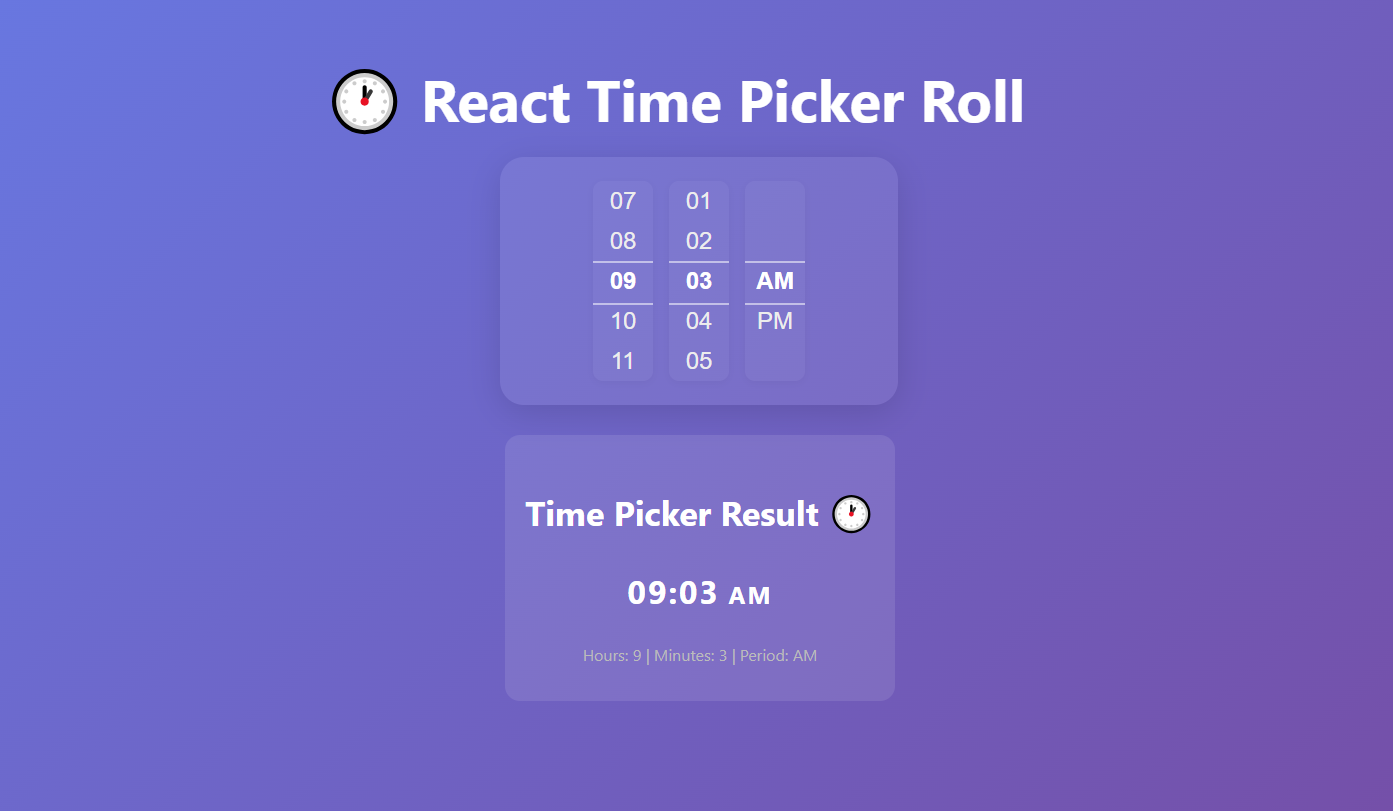
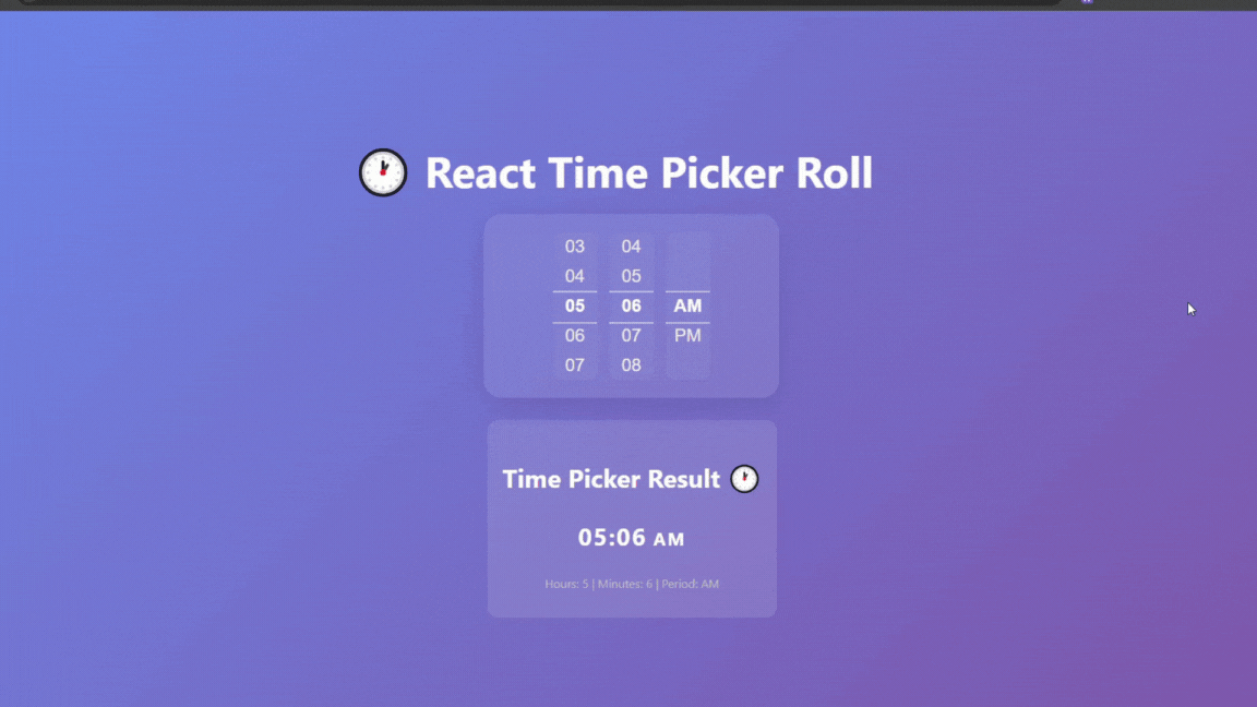
Default usage (without input field):
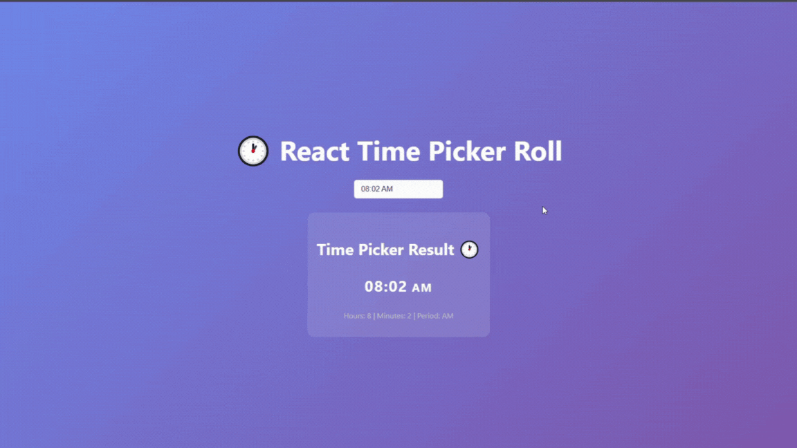
With input field (asInput):
- 🎨 Beautiful UI: Modern glassmorphism design with smooth animations
- 🎯 Interactive: Drag to scroll, mouse wheel support, and touch-friendly
- ⚡ Smooth Animations: Powered by Framer Motion for fluid interactions
- 📱 Responsive: Works perfectly on desktop and mobile devices
- 🎪 Customizable: Easy to style and integrate into any design
- 🔧 TypeScript: Full TypeScript support with proper type definitions
- 🚀 Lightweight: Minimal bundle size with no heavy dependencies
Want to try or download the full purple-style demo project?
👉 View or Download the Demo Project on GitHub
npm install react-time-picker-rollimport React, { useState } from 'react';
import { TimePickerComponent } from 'react-time-picker-roll';
const App = () => {
const [time, setTime] = useState({ hours: 6, minutes: 0, period: 'AM' });
return (
<div>
{/* Default usage */}
<TimePickerComponent initialTime={time} onChange={setTime} />
{/* Glassmorphism style */}
<TimePickerComponent
initialTime={time}
onChange={setTime}
variant='glass'
/>
{/* Professional style */}
<TimePickerComponent
initialTime={time}
onChange={setTime}
variant='professional'
/>
{/* Input field (modal picker) */}
<TimePickerComponent initialTime={time} onChange={setTime} asInput />
</div>
);
};You can use the picker directly or as an input field (modal). See the GIFs above for both options.
| Prop | Type | Default | Description |
|---|---|---|---|
initialTime |
{ hours: number; minutes: number; period: string } |
{ hours: 6, minutes: 0, period: 'AM' } |
Initial time value |
onChange |
(time: { hours: number; minutes: number; period: string }) => void |
- | Callback function when time changes |
natural |
boolean |
false |
If true, removes background, shadow, and padding for a plain look |
variant |
'default' | 'professional' | 'glass' |
'default' |
'glass' for glassmorphism style, 'professional' for modern look |
asInput |
boolean |
false |
If true, shows an input field and opens the picker in a modal |
interface TimeValue {
  hours: number; // 1-12
  minutes: number; // 0-59
  period: string; // 'AM' | 'PM'
}The component uses CSS modules for styling, but also provides global class names for easy targeting:
-
.rtp-time-picker(main container) -
.rtp-time-picker-column(each column) -
.rtp-time-item(each time value)
You can customize the appearance by overriding these classes in your own CSS:
.rtp-time-picker {
  /* Custom styles for the main container */
}

.rtp-time-picker-column {
  /* Custom styles for columns */
}

.rtp-time-item.selected {
  /* Custom styles for selected item */
}# Install dependencies
npm install
# Start development server
npm start
# Build the library
npm run build
# Run tests
npm testThis project is licensed under the MIT License - see the LICENSE file for details.
Contributions are welcome! Please feel free to submit a Pull Request.
If you have any questions or need help, please open an issue on GitHub.