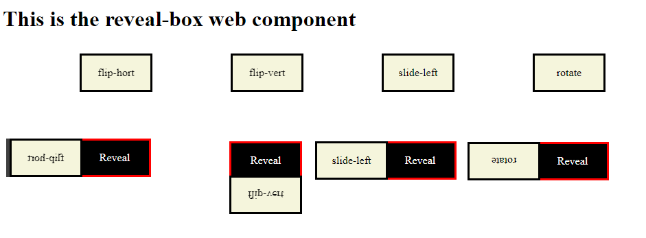
RevealBox:
What is it?
Reveal box is a custom web component (inline-block element). It hides contents of a box with another box. When a user hovers over the box the top box will move out of the way so that the user can see the contents of the hidden box. The top box will move out of the way by the effects you assign to it. Currently there are nine effects and more will be added later.

How to use it?
It is quite easy to use it on your webpage. Just follow the below steps:
- Include the link to the script file that holds the this custom web component (reveal-box.js) near the bottom of the body section of your webpage. See below
<script src="./revealbox.js"></script>
- Then use the custom element tags on your webpage.
    <reveal-box width="100px" height="50px" effect="flip-hort" style="background-color: Beige; border: 3px solid black;">
        <div slot="cover">
            <p>Cover Box</p>
        </div>
        <div slot="reveal">
            <p>Reveal</p>
        </div>
    </reveal-box>
Note: That is all you have to do to use this custom element. There is an example HTML page (acronym.html) that shows how to use it.
    <!DOCTYPE html>
    <html>
      <head>
        <title>Acronym Web Component</title>
        <script>
            function revealclick(){
                alert("click event has been triggered!!");
            }
        </script>
      </head>

      <body>

        <h1>This is the RevealBox web component</h1>

        <reveal-box width="100px" height="50px" effect="flip-hort" style="background-color: Beige; border: 3px solid black; onclick="revealclick">
            <div slot="cover">
                <p>Cover Box</p>
            </div>
            <div slot="reveal">
                <p>Reveal</p>
            </div>
        </reveal-box>

        <script src="./revealbox.js"></script>

      </body>

    </html>
There are only four properties that you can use to customize this element.
There are four attributes that you need to set:
- width - the width of the reveal box
- height - the height of the reveal box
- effect - the type of effect the box will have when a user hovers over it
- style - this allows you to style the look of the outer reveal box
There are two div elements that you need to include:
- div with the slot = "cover" will hold the html code for the cover box
- div with the slot = "reveal" will hold the html code for the reveal box
Note: a user can style these two div anyway you want but the width and height will be determine by the attribute set in the reveal-box tag
There are currently nine effects that can be used by this custom element when you hover over the reveal-box
- flip-hort: will rotate the top box along the horizontal axis (180 degrees)
- flip-vert: will rotate the top box along the vertical axis (180 degrees)
- slide-left: will slide the top box to the left
- slide-right: will slide the top box to the right
- rotate: will rotate the top box by 180 degrees
- sweep-hort: will sweep the top box along the horizontal axis
- sweep-vert: will sweep the top box along the vertical axis
- shrink: will shrink the top box until it is gone
- fade: Will fade out the top box
To Do:
- Add more effect when I have the time
Note: Even through it has default attributes you should really set your own. Make sure to set width, height, effect, style and the two div tags
