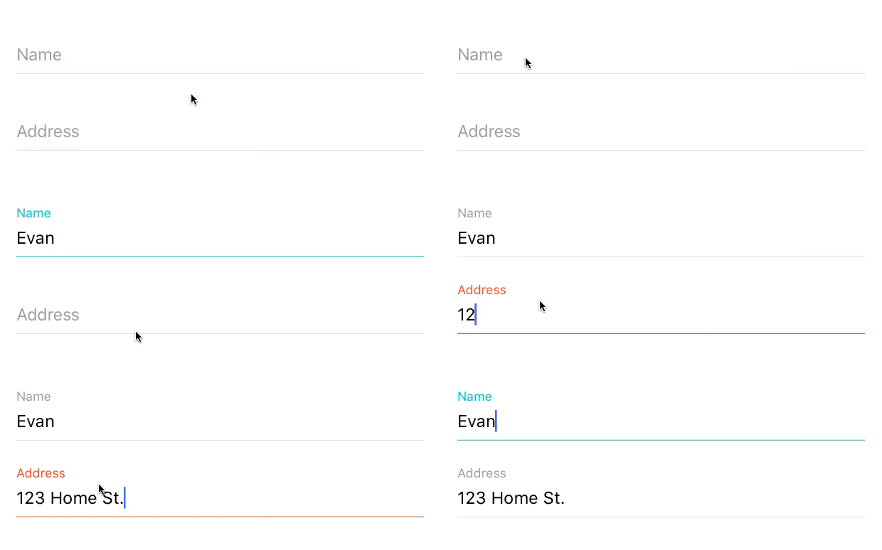
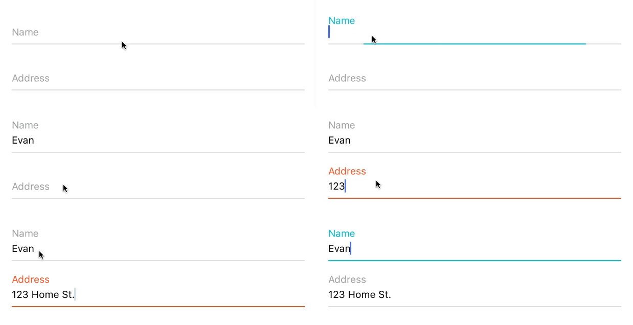
React Native TextInput styled with Material Design.
Original repository: https://github.com/evblurbs/react-native-md-textinput
I just created a new repository because the original author has been inactive for 3 years and there were many unanswered issues and unmerged pull requests.
Feel free to create PRs and issues in here.
npm install rn-md-textinput
I'm going to refer to the rn-md-textinput Component as TextField. You can name it whatever you like when importing it.
The most basic usage is to import the TextField Component and render it with the props label and highlightColor. Note that this example uses the ScrollView Component. This allows the keyboard to be dismissed when users tap outside the input and keyboard area.
import TextField from 'rn-md-textinput';

class App extends React.Component {
  render() {
    return (
      <ScrollView>
        <TextField label={'Name'} highlightColor={'#00BCD4'} />
      </ScrollView>
    );
  }
}To customize the TextInput that is rendered inside the TextField Component, simply pass props the TextInput accepts to the TextField Component. You can find the props the TextInput Component accepts here.
Here is an example of how to change the keyboard type to numeric.
import TextField from 'rn-md-textinput';

class App extends React.Component {
  render() {
    return (
      <ScrollView>
        <TextField
          label={'Name'}
          highlightColor={'#00BCD4'}
          keyboardType={'numeric'}
        />
      </ScrollView>
    );
  }
}To use the "dense" styling that matches the Material Design Style Guide, you can set the prop dense to true. By default, this prop is set to false.
Below are the props you can pass to the React Component to customize the TextInput.
| Prop | Type | Default | description |
|---|---|---|---|
| label | string | This string appears as the label. | |
| highlightColor | string | This string represents the hex code, rgb, or rgba color of the TextInput label and underline when it is active/focused on. | |
| duration | number | 200 |
A number representing the duration of floating label and underline animations in milliseconds. |
| labelColor | string | #9E9E9E |
This string represents the hex code, rgb, or rgba color of the TextInput label when it is inactive. |
| textColor | string | #000 |
This string represents the hex code, rgb, or rgba color of the text entered in the TextInput. Note: If you set textFocusColor or textBlurColor, those colors will override this one during the corresponding state of the TextInput. |
| textFocusColor | string | This string represents the hex code, rgb, or rgba color of the text entered in the TextInput when it is active/focused on. | |
| textBlurColor | string | This string represents the hex code, rgb, or rgba color of the text entered in the TextInput when it is inactive. | |
| borderColor | string | #E0E0E0 |
This string represents the hex code, rgb, or rgba color of the TextInput underline when it is inactive. |
| dense | bool | false |
If true, it will render the "dense" input field which is smaller in height and has smaller font sizes. You can view more here. |
| multiline | bool | false |
If true, it will allow multiline text input |
| height | number | undefined |
A number representing the initial height of the textInput |
| autoGrow | bool | false |
If true enables autogrow of the textInput |
| underlineColorAndroid | string | rgba(0,0,0,0) |
This sets the default underline color on Android to transparent (Issue #1). |
The main purpose of this component is to easily add a TextInput that matches the Material Design Style Guide. With that said, there have been requests (i.e. PR #4) to style the component beyond the Material Design Style Guide. I've added the props below to allow you to do exactly that. DO THIS AT YOUR OWN RISK. Changing the layout requires an understanding of the main elements of this component (i.e. FloatingLabel, the Viewwrapper, and the TextInput), and may cause compatibility issues between Android and iOS (Issue #2). I'll try to support any issues with these props, but they will be treated as second class citizens.
| Prop | Type | Default | description |
|---|---|---|---|
| inputStyle | Object | Object to override the styles of the TextInput.1 | |
| wrapperStyle | Object | Object to override the styles of the View that wraps the TextInput.1 | |
| labelStyle | Object | Object to override the styles of the Label that animates on focus of the TextInput.1 |
1: Object to override styles needs to match the format of inline styles. You can find the supported properties here.
- [ ] Support multi-line TextInput fields
- [ ] Support character limit
- [ ] Add option for dark theme

