rn-searchbox
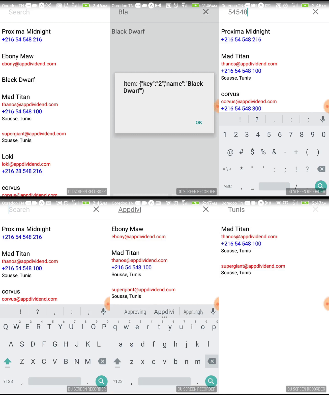
A simple Search Bar with Flatlist Component for handling huge and large data.
With simple search capability which can be utilised by handing the component data to Flatlist Component and providing a onClick function which will receive the item selected of the data array.
The search function uses a Dice Algorithm to traverse the data and looks for an indexOf the user input within all strings, numbers, and boolean values in the data.
Build for React Native App and works on both Android and iOS.

Install
npm install --save rn-searchbox

or

yarn add rn-searchbox
Component props
| Property | Type | Default | Description |
|---|---|---|---|
| onClick(item) | function | null |
Fires after each Click and return item data. |
| itemsStyles | array | [] |
The array of styles of data to be displayed in FlatList. |
| data | array | [] required* |
The array of data to be searched |
| placeholder | string | Search |
The placeholder for the search bar. |
| onFocus | function | null |
Fires when the search bar receives focus. |
| onBlur | function | null |
Fires when the search bar loses focus. |
| closeButton | Component | MaterialIcon | Sets the close button component. |
| closeButtonAccessibilityLabel | string | Clear search text |
Accessibility label for the close button. |
| heightAdjust | number | 0 |
Adjust the height of the search bar. |
| backgroundColor | string | white |
The background colour of the search bar. |
| iconColor | string | gray |
The color of the back and X icons. |
| textColor | string | gray |
The color of the search bar text. |
| selectionColor | string | lightskyblue |
The color of the the search bar cursor and text selection. |
| placeholderTextColor | string | lightgray |
The color of the placeholder text. |
| showOnLoad | boolean | false |
Show the search bar when it is first rendered. |
| clearOnShow | boolean | false |
Clear input when the search bar is shown. |
| clearOnHide | boolean | true |
Clear input when the search bar is hidden. |
| clearOnBlur | boolean | false |
Clear input when the search bar is blurred. |
| focusOnLayout | boolean | true |
Focus the text input box whenever it is shown. |
| autoCorrect | boolean | true |
AutoCorrect the search bar text. |
| autoCapitalize | string | sentences |
Auto capitialize behaviour of the text input - enum('none', 'sentences', 'words', 'characters') |
| keyboardAppearance | string | 'default' | Determines the color of the keyboard. |
| fontFamily | string | System |
The font family to be used. |
| fontSize | number | 20 | Sets the font size. |
Usage
import React Component from 'react' import StyleSheet Alert from 'react-native' import SearchBox from 'rn-searchbox' { Alert } { return <SearchBox = = = /> } const itemsStyle = return name: fontSize: 18 email: color: 'red' phone: fontSize: 16 color: 'blue' const data = "users": "key": "0" "name": "Proxima Midnight" "phone": "+216 54 548 216" "key": "1" "name": "Ebony Maw" "email": "ebony@appdividend.com" "key": "2" "name": "Black Dwarf" "key": "3" "name": "Mad Titan" "email": "thanos@appdividend.com" "phone": "+216 54 548 100" "adress": "Sousse, Tunis" ... Next Step:
- Possibility to add a custom icon/image to the ListView
- New Algorithm for String Matching
- Update docs for Box component
- Update react, react-native & other dependencies
Questions?
Feel free to contact me or create an issue.
Author
kerim selmi karimation
License
This project is licensed under the MIT License