Premium DOM Component
File Tabs
For multitasking UI/UX
by Read Write Tools May 4, 2020| Abstract |
|---|
| The rwt-file-tabs DOM component is a thin bar containing named file tabs. It is typically used with apps that allow multiple files to be worked on simultaneously. |
Motivation
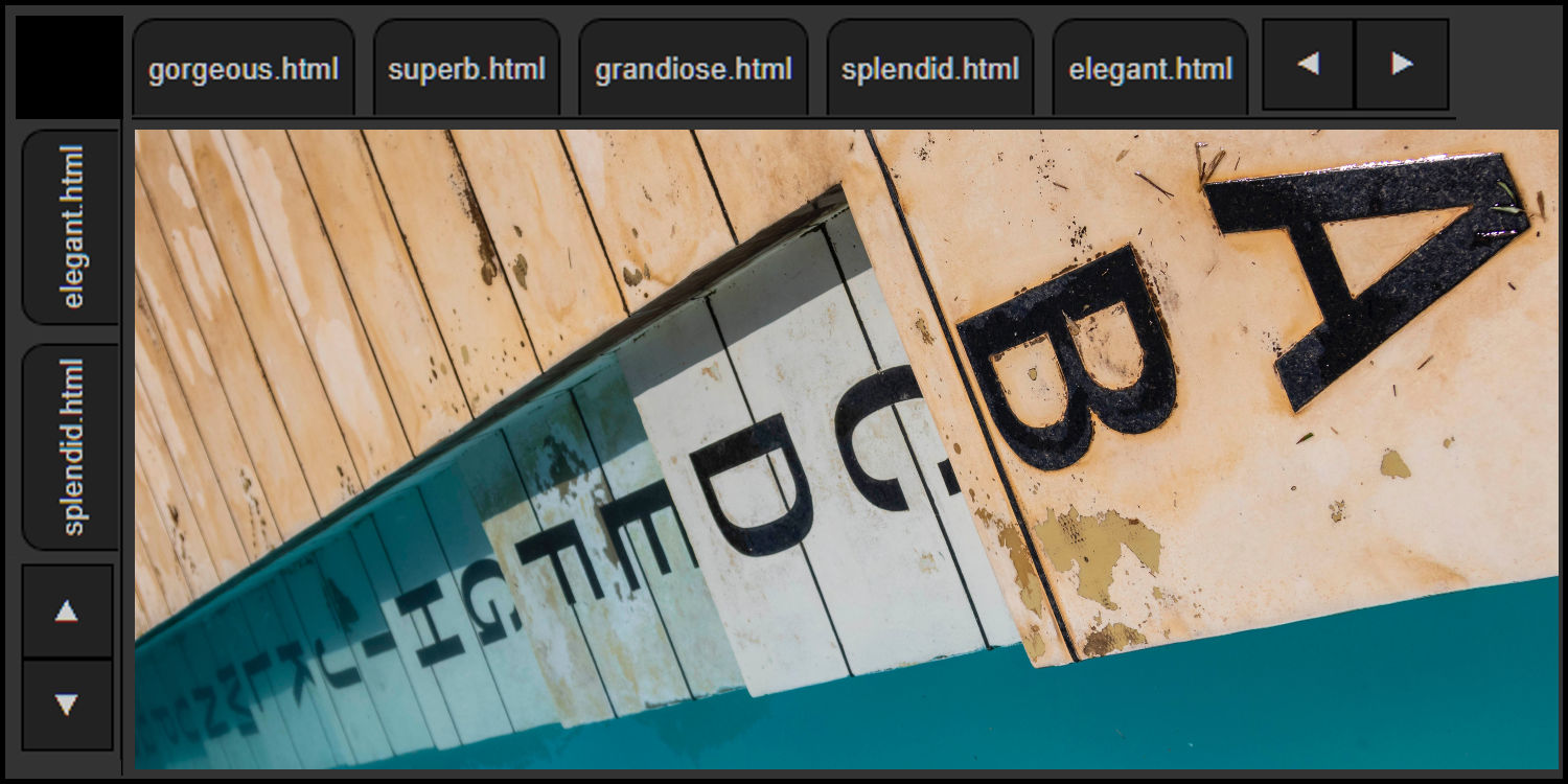
The rwt-file-tabs DOM component can be used in scenarios with multiple views or multiple work tasks.
This component can be configured with a fixed set of tabs which are slotted into the component when designing the document. Alternatively, its programming API allows tabs to be created and removed as needed, when working with a dynamic set of tabs.
Tabs can be configured using CSS to adjust their size and typography.
The tab bar occupies a fixed width. When the size of all tabs exceeds that width, scroll buttons are automatically enabled.
Dynamic tabs can be closable
or not, based on an attribute set on
the DOM component by the developer.
In the wild
To see an example of this component in use, visit the BLUEFIDDLE website. It uses two components: one vertical and one horizontal. To understand what's going on under the hood, use the browser's inspector to view the HTML source code and network activity, and follow along as you read this documentation.
Installation
Prerequisites
The rwt-file-tabs DOM component works in any browser that supports modern W3C standards. Templates are written using BLUE PHRASE notation, which can be compiled into HTML using the free Read Write View desktop app. It has no other prerequisites. Distribution and installation are done with either NPM or via Github.
Download
Download using NPM
OPTION 1: Familiar with Node.js and the package.json file?
Great. Install the component with this command:
npm install rwt-file-tabs OPTION 2: No prior experience using NPM?
Just follow these general steps:
- Install Node.js/NPM on your development computer.
- Create a
package.jsonfile in the root of your web project using the command:
npm init npm install rwt-file-tabs Important note: This DOM component uses Node.js and NPM and package.json as a convenient distribution and installation mechanism. The DOM component itself does not need them.
Download using Github
If you prefer using Github directly, simply follow these steps:
- Create a
node_modulesdirectory in the root of your web project. - Clone the rwt-file-tabs DOM component into it using the command:
git clone https://github.com/readwritetools/rwt-file-tabs.git Using the DOM component
After installation, you need to add a few things to your HTML page to make use of it.
- Add a
scripttag to load the component'srwt-file-tabs.jsfile:
<script src='/node_modules/rwt-file-tabs/rwt-file-tabs.js' type=module></script>-
Add the component tag somewhere on the page, configuring it with these optional attributes:
-
closableThis optional attribute instructs the component to add an 'x' button to each dynamically added tab, allowing the user to remove the tab. -
scroll-side={left|right}When the space occupied by the tabs is too large, scroll buttons are enabled. They can be positioned to theleftor therightof the tabs. -
anchor-side={left|right}When the space occupied by the tabs is less than the width of the component, the unoccupied space can be anchored to theleftor to therightof the tabs. -
role=navigationThis web accessible ARIA attribute tells readers that the component is used for navigation.
-
Slotted usage
If the component is to be used with a predetermined set of tabs, they can be slotted in. Here's an example:
<rwt-file-tabs role=contentinfo>
    <button slot=tabitem id=tab1 title='Read only view'>READ</button>
    <button slot=tabitem id=tab2 title='Text editing view'>WRITE</button>
    <button slot=tabitem id=tab3 title='Web browser preview'>PREVIEW</button>
</rwt-file-tabs>
Programmatic API
If the component is to be used with a dynamic set of tabs, they can be added and removed using these methods.
insertTab(id, value, title)- The
idshould be a unique identifier. It will be used for manipulating the tab. - The
valueis the text to display on the tab. Text that is too long will be ellipsed. - The
titleparameter is optional, and if provided will be used as the hover tooltip. removeTab(id)- The
idis the identifier of the tab to remove. getCurrentTab()- Returns an object with two values:
currentTabIdandcurrentTabValue. setCurrentTab(id)- Changes the current tab to be the one identified with
id. getScrollableOverflow()- The size, in pixels, of the tabs that are hidden when the component isn't wide enough for all of them.
setScrollPosition(left)- The
leftparameter is the number of pixels to programmatically scroll the tabs. It should be an integer from 0 toscrollableOverflow. scrollMaxRight()- Scroll the tabs all the way to the right. This is only meaningful when there is scrollable overflow.
Life-cycle events
The component issues life-cycle events.
component-loaded- Sent when the component is fully loaded and ready to be used. As a convenience you can use the
waitOnLoading()method which returns a promise that resolves when thecomponent-loadedevent is received. Call this asynchronously withawait. tab-activated- Sent when the user switches to a new tab. The
eventargument has adetailproperty containing thecurrentTabIdandcurrentTabValueof the newly activated tab. tab-closing- Sent when the user clicks on the 'x' to close a tab. This event allows the developer to determine if it's safe to close the tab. Use
preventDefault()to cancel the operation. Theeventargument has adetailproperty containing thecurrentTabIdandcurrentTabValueof the item about to be closed.
Styling
Tab styling
The component can be styled with these CSS variables:
rwt-file-tabs {
    --width: 100%;
    --height: 2rem;
    --nav-button-size: 1.6rem;
}
The tabs can be styled with these CSS variables:
rwt-file-tabs {
    --font-weight: normal;
    --letter-spacing: 0px;
    --text-align: left;
    --min-width: 2rem;
    --max-width: 6rem;
}
Dialog color scheme
The default color palette for the component uses a dark mode theme. You can use CSS to override the variables' defaults:
rwt-file-tabs {
    --color: var(--white);
    --accent-color1: var(--pure-white);
    --background: var(--black);
    --accent-background1: var(--pure-black);
    --accent-background2: var(--nav-black);
    --accent-background3: var(--medium-black);
    --accent-background4: var(--gray);
}
Vertically oriented tabs
The component can be oriented vertically by wrapping it in a positioned element and using a CSS transform. Here's an example of how to do it:
HTML
<div id=viewtabs-area>
    <rwt-file-tabs id=viewtabs scroll-side=left anchor-side=right>
        <button id=id4 slot=tabitem title='Delta view'>Delta</button>
        <button id=id3 slot=tabitem title='Gamma view'>Gamma</button>
        <button id=id2 slot=tabitem title='Beta view'>Beta</button>
        <button id=id1 slot=tabitem title='Alpha view'>Alpha</button>
    </rwt-file-tabs>
</div>
CSS
div#viewtabs-area {
    position: absolute;
    top: 2.3rem;
    left: 0;
    bottom: 0;
    width: 2.0rem;
    border-top: 1px solid #000;
    border-bottom: 1px solid #000;
}
#viewtabs {
    position: absolute;
    transform: rotate(-90deg);
    transform-origin: left top;
    width: 34rem; /* JavaScript will override */
    top: 34rem;   /* JavaScript will override */
}
JavaScript
function onResize() {
    var viewTabsArea = document.getElementById('viewtabs-area');
    var viewTabs = document.getElementById('viewtabs');
    var height = viewTabsArea.offsetHeight;
    viewTabs.style.width = `${height}px`;
    viewTabs.style.top = `${height}px`;
}

window.addEventListener('resize', onResize);
Reference
| Documentation | READ WRITE HUB | |
| Source code | github | |
| Component catalog | DOM COMPONENTS | |
| Package installation | npm | |
| Publication venue | READ WRITE STACK |
License
The rwt-file-tabs DOM component is not freeware. After evaluating it and before using it in a public-facing website, eBook, mobile app, or desktop application, you must obtain a license from Read Write Tools .
File Tabs Software License Agreement
- This Software License Agreement ("Agreement") is a legal contract between you and Read Write Tools ("RWT"). The "Materials" subject to this Agreement include the "File Tabs" software and associated documentation.
- By using these Materials, you agree to abide by the terms and conditions of this Agreement.
- The Materials are protected by United States copyright law, and international treaties on intellectual property rights. The Materials are licensed, not sold to you, and can only be used in accordance with the terms of this Agreement. RWT is and remains the owner of all titles, rights and interests in the Materials, and RWT reserves all rights not specifically granted under this Agreement.
- Subject to the terms of this Agreement, RWT hereby grants to you a limited, non-exclusive license to use the Materials subject to the following conditions:
- You may not distribute, publish, sub-license, sell, rent, or lease the Materials.
- You may not decompile or reverse engineer any source code included in the software.
- You may not modify or extend any source code included in the software.
- Your license to use the software is limited to the purpose for which it was originally intended, and does not include permission to extract, link to, or use parts on a separate basis.
- An eBook published under a single title and author.
- A mobile app for distribution under a single app name.
- A desktop application published under a single application name.
- A website published under a single domain name. For this purpose, and by way of example, the domain names "alpha.example.com" and "beta.example.com" are considered to be separate websites.
- A load-balanced collection of web servers, used to provide access to a single website under a single domain name.
Activation
To activate your license, copy the rwt-registration-keys.js file to the root
directory of your website, providing the customer-number and access-key sent to
your email address, and replacing example.com with your website's hostname.
Follow this example:
export default [{
    "product-key": "rwt-file-tabs",
    "registration": "example.com",
    "customer-number": "CN-xxx-yyyyy",
    "access-key": "AK-xxx-yyyyy"
}]


