这是一个SAO-UI BETA版本
可能大家已经遗忘了它吧,就和我一样 新冠疫情大家肯定都不好受,我也是经历了大病后患上了哮喘 如今心脏也有一些小小的毛病,不过好在不严重,只是要比以前更加的爱护自己的身体 现在这个项目又重启了,没错他又重启了,我需要好好的想想它需要什么,重新学习结合新的技术 虽然人生有点抑郁,漫漫走下去吧。只是希望半夜哭泣时能有人在身边
DEMO: https://yamapink.com/sao-ui
github: https://github.com/Cad-noob/SAO-UI
QQ:544172399 邮箱:544172399@qq.com
更新内容
1.傻逼一样的写了一个BUG特多的alert(BUG不想说,不知道有没有人发现),现在应该可以正常使用了
2.菜单栏可以通过active进行权限控制了!
3.菜单栏的滚动不再影响其他滚动条
安装&引用
安装:
npm i sao-ui-beta
全局引用
//main.js
import sao from 'sao-ui-beta'
音频TIPS
所有音频都是不能打开网页就立即播放,这个大家都懂为什么。所以使用起来得符合规范,例如进场的LINK START就可以采取点击一些”小玩意”来触发。所以LINK START并不适用于打开网页直接触发。
拖拽
添加了拖拽的directive,想用的话就直接在标签里使用吧,使用时v-drag = "true"
如果想LIVE2D这种只想横向拖拽也可以使用v-dragX = "true"
用法如下:
//main.js
import {Drag,DragX} from 'sao-ui-beta'

Vue.directive('drag',Drag)
Vue.directive('dragX',DragX)
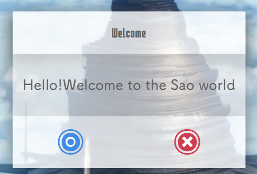
alert框
模仿了Sao Utils的对话框,做了很多个人喜欢的动画效果
标签:<sao-alert></sao-alert>
效果图:
用法举例
<template>
  <div>
  	<button @click="open">Alert</button>
    <sao-alert :icon="true" :title="title" :visible.sync="AlertVisible" @ok='test'>
      {{msg}}
    </sao-alert>
  </div>
</template>
<script>

export default {
  data(){
    return{
      title:"Welcome",
      AlertVisible:false,
      msg:"Hello!Welcome to the Sao world"
    }
  },
  methods:{
    open(){
      this.AlertVisible = true;
    },
    test(){
	  console.log('test');
	}
  }
}
</script>
<style scoped>
</style>
Attributes
| 参数 | 说明 | 类型 | 可选值 | 默认值 |
|---|---|---|---|---|
| visible | 是否显示 弹出框,支持 .sync 修饰符 | Boolean | true,false | false |
| title | 弹出框的标题 | String | — | Message |
| icon | 是否显示底部开关,不显示点击对话框就可以关闭 | Boolean | — | true |
| clickClose | 是否点击自身可以关闭弹出框 | Boolean | — | false |
| ContextHeight | 中间内容的高度 | String | — | 101px |
Slot
| name | 说明 |
|---|---|
| center | 会插入到弹出框中间的内容 |
| footer | 可以编辑底部的内容,不要和显示icon情况下一起使用 |
Events
| 事件名称 | 说明 | 回调函数 |
|---|---|---|
| ok | 当显示底部开关后,点击蓝色按钮的回调 | — |
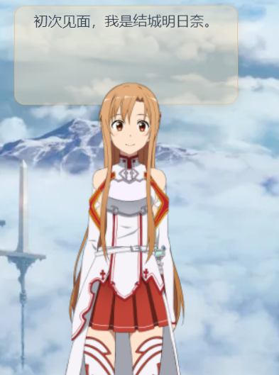
LINK START动画
一个类似SAO动画里的入场动画,纯CSS写的3D动画算是比较创意的地方?
标签:<link-start></link-start>
效果图:


用法举例
<template>
  <div>
    <button @click="open">Link Start</button>
    <link-start :visible.sync="LSVisible"></link-start>
  </div>
</template>
<script>

export default {
  name:"test",
  data(){
    return{
      LSVisible:false,
    }
  },
  methods:{
    open(){
      this.LSVisible = true;
    }
  }
}
</script>
<style scoped>
</style>
Attributes
| 参数 | 说明 | 类型 | 可选值 | 默认值 |
|---|---|---|---|---|
| visible | 是否显示 弹出框,支持 .sync 修饰符 | Boolean | true,false | false |
Live2d
一个还在不断完善的组件,其实不用开放属性有接触过的应该都懂那些参数配置是啥,总之先这样了。基于GITHUB上各位大佬们的代码,我只是做了个简单的修改。
因为waifu-tips.js采用了大量的jquery,我不太想改成原生了(懒),文档中会附带vue2中所需要做的jquery该如何配置,有兴趣的朋友可以帮我改改哈哈。
模型现在是挂在我服务器上的,所以如果流量不够了以后可能会转其他地方,或者大家自己下载配置?
PS:我关闭了原作者很多的功能,我希望看起来更简洁,当然不是说原来的不好。
标签:<live2d></live2d>
效果图:
用法举例
<template>
  <div>
    <live2d v-dragX="true" :textures-id="textId" :hitokoto="false" :json="json" :edge-side="75"></live2d>
  </div>
</template>
<script>

export default {
  data(){
    return{
      textId:1,
      json:'https://www.yamapink.com/sao-ui/waifu-tips.json',
    }
  },
}
</script>
<style scoped>
</style>
Attributes
| 参数 | 说明 | 类型 | 可选值 | 默认值 |
|---|---|---|---|---|
| Textures | 模型皮肤ID,总共有几十个吧,暂时更新了10个,会陆续更新的(修改配置好累啊,自己没事可以随便填填ID也许我就更新了) | Number | 1 ~ 40 | 1 |
| Hitokoto | 随机出现一些名人名言,true打开功能,false关闭 | Boolean | true,false | false |
| Json | 对话内容文件地址 | String | — | https://www.yamapink.com/sao-ui/waifu-tips.json |
| EdgeSide | live2d模型所在初始横坐标百分比 | Number | 0 ~ 100 | 80 |
| freshIcon | 刷新图标,可以结合自身喜好(各种图标库)自己选择 | String | — | — |
注意:
1.json文件无论你放在哪,本地也好 anywhere u like ,但是文件名一定得是 waifu-tips.json,不理解的话可以阅读waifu-tips.js
2.json文件的内容参考这个文件就行,很容易看懂的
jquery配置
注意:
因为我在配置里依赖了jquery,所以兄弟们如果自己也使用了jquery(虽然我不喜欢用),记得看看这会不会导致BUG
这里列下我的版本,虽然我感觉应该问题不是很大
 "dependencies": {
    "jquery": "^3.6.0",
  }
需要在vue.config.js中对jquery进行配置
const webpack = require('webpack')

module.exports = {
    // 扩展 webpack 配置,使 packages 加入编译
    chainWebpack: config => {
        config.plugin('provide').use(webpack.ProvidePlugin, [{
            $: 'jquery',
            jquery: 'jquery',
            jQuery: 'jquery',
            'window.jQuery': 'jquery'
        }]);
    }
}
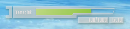
HP栏
用来现实SAO款式的HP小组件,具体怎么去表现,需要大家集思广益,共同猜想
标签:<hp></hp>
效果图:
用法举例
<template>
  <div>
    <hp :position="['5%','100px']" :username="'Yamapink'" :current="hp" :total="1000" :level="10"></hp>
  </div>
</template>
<script>

export default {
 data(){
    return{
   	    hp:500,
    }
 }
 beforeMount(){
    setInterval(()=>{
      this.hp = Math.round(Math.random()*1000);
    },2000)
  }
}
</script>
<style scoped>
</style>
Attributes
| 参数 | 说明 | 类型 | 可选值 | 默认值 |
|---|---|---|---|---|
| position | 组件初始位置,数组中依次保存横坐标,纵坐标,单位可以是"px"也可是"%" | Array | — | ["6%","8%"] |
| username | 用户名 | String | — | player |
| current | 当前血量m,不要输入负数哦,任一正数 | Number | — | 100 |
| total | 总血量,如上一样 | Number | — | 100 |
| level | 用户等级 | Number | — | 0 |
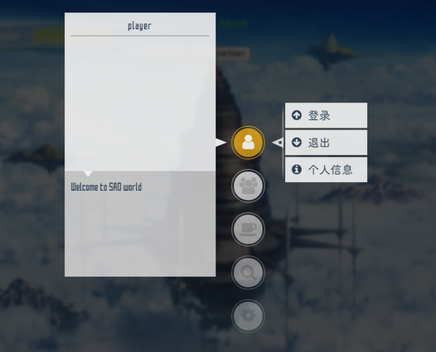
菜单栏
模仿SAO UTILS的弹出框,alt+keyCode既可弹出信息框,keyCode需要自己传入设定,鼠标按住666ms内快速向Y轴方向滑动一段距离(250)也能呼出(需设置)
这个栏有很多有意思的动画,今后在想如何实现3D曲面的变化
<pop-up-menu></<pop-up-menu>为整个组件的容器
<menu-bar></menu-bar>为中间的主菜单
<left-info></left-info>为左侧个人信息框,整个我的初期设想是只有个人信息显示
<child-bar></child-bar>为主菜单栏的扩展
这个组件还是比较复杂的,今后在B站的视频中我会纤细介绍下
标签:<pop-up-menu></<pop-up-menu>、<menu-bar></menu-bar>、<left-info></left-info>、<child-bar></child-bar>
效果图:
用法举例
<template>
  <div>
    <pop-up-menu :slide-down="true" ref="menu">
      <menu-bar :icon-arr="arr"></menu-bar>
      <left-info></left-info>

      <child-bar>
        <ul id="userInfo">
          <li @click="close"><i class="fa fa-arrow-circle-up"></i><span>登录</span></li>
          <li><i class="fa fa-arrow-circle-down"></i><span>退出</span></li>
          <li><i class="fa fa-info-circle"></i><span>个人信息</span></li>
        </ul>

        <ul id="friendsLink">
          <li><i class="fa fa-link"></i><span>友情链接</span></li>
        </ul>

        <ul id="share">
          <li><i class="fa fa-coffee"></i><span>文章分享</span></li>
          <li><i class="fa fa-gift"></i><span>DEMO分享</span></li>
        </ul>

        <ul id="search">
          <li><i class="fa fa-search"></i><span>搜索文章</span></li>
        </ul>
      </child-bar>
    </pop-up-menu>
  </div>
</template>
<script>

export default {
  data(){
    return{
      arr:[
        {name:'userInfo',iClass:'fa fa-user',canActive:true},
        {name:'friendsLink',iClass:'fa fa-users',canActive:true},
        {name:'share',iClass:'fa fa-coffee',canActive:true},
        {name:'search',iClass:'fa fa-search',canActive:true},
        {name:'systemMsg',iClass:'fa fa-cog',canActive:false}
      ],
    }
  },
  methods:{
    //调用组件中的关闭方法,对整个组件进行关闭操作
    close(){
      this.$refs.menu.close();
    }
  },
}
</script>
<style scoped>
</style>
Attributes
pop-up-menu
| 参数 | 说明 | 类型 | 可选值 | 默认值 |
|---|---|---|---|---|
| keyCode | 配合alt的组合键,弹出菜单栏 | Number | — | 65(A) |
| slideDown | 是否可以按住滑动鼠标呼出 | Boolean | true,false | true |
| curved | 是否呼出菜单具有曲面特效 | Boolean | true,false | true |
| slideDownY | 下滑激活所需要的移动高度差 | Number | — | 250 |
| activeDuration | 下滑激活的时间范围 | Number | — | 666 |
| active | 用于控制权限时使用 | Boolean | true,false | true |
menu-bar
| 参数 | 说明 | 类型 | 可选值 | 默认值 |
|---|---|---|---|---|
| iconArr | 图标数组,包含了name,iClass,canActive三个属性,iClass是传入使用的font,name是选项名称(这个很关键和之后的子联动有关),canActive是指是否可以激活(设想是权限相关) | Array | — | — |
| infoActive | 可以激活左侧的信息科,我初期的设想只有一个,个人信息(支持提建议) | String | — | userInfo |
left-info
| 参数 | 说明 | 类型 | 可选值 | 默认值 |
|---|---|---|---|---|
| username | 用户的名称 | String | — | player |
| des | 描述信息,或者你自己想输入的内容 | String | — | Welcome to SAO world |
Slot
pop-up-menu
| name | 说明 |
|---|---|
| — | 可以插入三个联动的子标签(当然可以插入其他的东西),建议还是按照案例中来写 |
left-info
| name | 说明 |
|---|---|
| — | 可以根据接口回调的值插入个人头像,图片等你喜欢的都行(没有写任何样式,自己随便玩) |
child-bar
| name | 说明 |
|---|---|
| — | 建议按照图中的实例来实现二级菜单,id一定要和传入的iconArr中的name一致 |