Shimmer / Lazyload UI Components for React 🚀
Customizable Shimmer UI Compoenents Effects for React.
🔥 MORE CUSTOMIZATION OPTIONS COMING SOON - STAY TUNED!!!
Install
npm install shimmer-ui-effect --save
or
yarn add shimmer-ui-effect
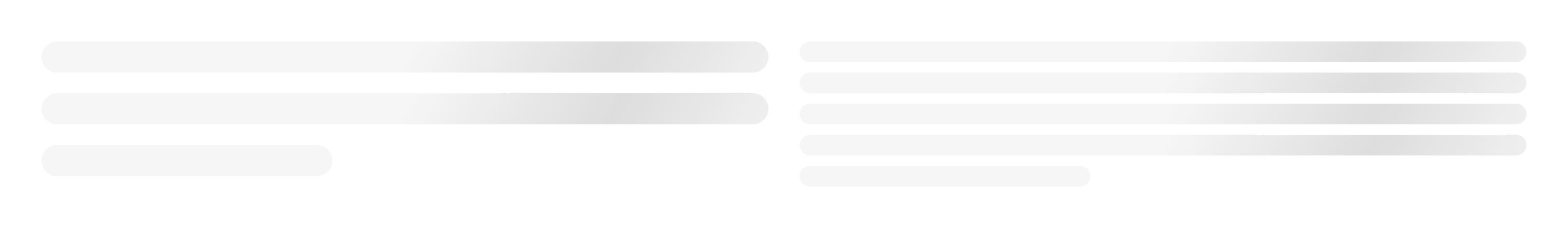
Elements
1️⃣ Shimmer UI Button

import React from "react";
import { ShimmerUIButton } from "shimmer-ui-effect";

const App = () => {
  return (
    return <ShimmerUIButton  borderRadius={4} height={40} width={400} />;
  )
}
Properties
| Property |
Type |
Required |
Default value |
Description |
borderRadius |
number |
no |
4 |
Border Radius of the button in px unit |
height |
number |
no |
30 |
Height of the button in px unit |
width |
number |
no |
120 |
Width of the button in px unit |
2️⃣ Shimmer UI Title
import React from "react";
import { ShimmerUITitle } from "shimmer-ui-effect";

const App = () => {
  render() {
    return <ShimmerUITitle line={3} gap={10} variant="primary" />;
  }
}
Properties
| Property |
Type |
Required |
Default value |
Description |
line |
number |
yes |
3 |
Number of line |
gap |
number |
yes |
10 |
Gap between of lines. Four options available [10, 15, 20, 30] |
variant |
string |
yes |
primary |
Tow options available ["primary", "secondary"] |
className |
string |
no |
|
Additonal style classes |
3️⃣ Shimmer UI Text

import React from "react";
import { ShimmerUIText } from "shimmer-ui-effect";

const App = () => {
  render() {
    return <ShimmerUIText line={5} gap={15} />;
  }
}
Properties
| Property |
Type |
Required |
Default value |
Description |
line |
number |
yes |
5 |
Number of line |
gap |
number |
yes |
15 |
Gap between of lines. Four options available [10, 15, 20, 30] |
className |
string |
no |
|
Additonal style classes |
4️⃣ Shimmer UI Badge

import React from "react";
import { ShimmerUIBadge } from "shimmer-ui-effect";

const App = () => {
  render() {
    return <ShimmerUIBadge width={200} height={30} />;
  }
}
Properties
| Property |
Type |
Required |
Default value |
Description |
width |
number |
no |
100 |
Width of the badge in px unit |
height |
number |
no |
24 |
Height of the badge in px unit |
5️⃣ Shimmer UI Circular Image

import React from "react";
import { ShimmerUICircularImage } from "shimmer-ui-effect";

const App = () => {
  render() {
    return <ShimmerUICircularImage size={200} />;
  }
}
Properties
| Property |
Type |
Required |
Default value |
Description |
size |
number |
no |
100 |
Size of Image |
center |
boolean |
no |
false |
Center alignment property |
className |
string |
no |
|
Additonal style classes |
6️⃣ Shimmer UI Thumbnail Image

import React from "react";
import { ShimmerUIThumbnail } from "shimmer-ui-effect";

const App = () => {
  render() {
    return <ShimmerUIThumbnail height={200} rounded />;
  }
}
Properties
| Property |
Type |
Required |
Default value |
Description |
width |
number |
no |
|
Width of Thumbnail. By default 100% |
height |
number |
yes |
200 |
Height of Thumbnail. |
center |
boolean |
no |
false |
Center alignment property |
rounded |
boolean |
no |
false |
Border radius option enable/disable |
fitOnFrame |
boolean |
no |
false |
Adjust height of parent. Will block 100% of parent element(s) |
className |
string |
no |
|
Additonal style classes |
Contribute
Feel free to send PR and any suggestions. Thanks & Best Regards 😊
License
MIT © Hiren K Vaghasiya