slate-toolbar 
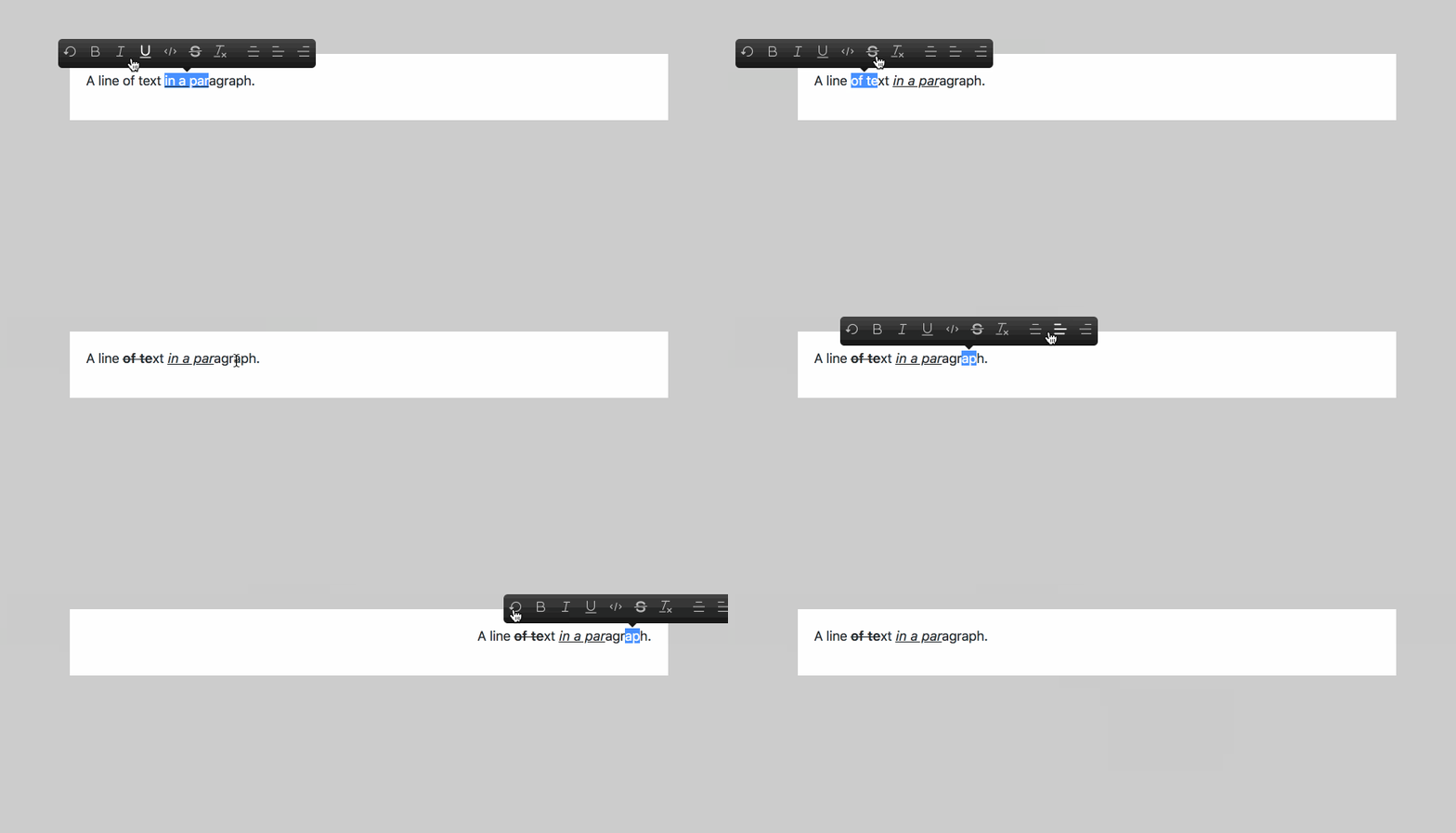
Quick and easy way to implement medium like toolbar in your slate editor

Installation
$ npm install --save slate-toolbarUsage
slate-toolbar is the easiest way to implement a medium-like toolbar in your slate editor.
Just add a decorator @toolbar() on you editor component. The parent component of this component must pass two props value: Value and onChange: (change: Change) => void.
; @ // ----> Add this line and your toolbar is implemented in your editorComponent<Props> // On change, update the app's React state with the new editor state. { return <div className="editor"> <Editor ...thisprops /> </div> ; } Component<{} value: Value > // Set the initial state when the app is first constructed. state = value: initialValue ; { return <div className="container markdown-body"> <EditorContainer value=thisstatevalue onChange= this plugins=plugins /> </div> ; }see codes for full implementation and demo
Options
slate-toolbar is fully customizable, so it allows you to pass options to setup items you want to implement in your toolbar.
NOTE: Remember to add certain plugin to your editor's plugins
There's an example
const options = // default icons are Bold, Undo, Italic icons: Undo // ----> this must be one of icon in https://github.com/Canner/slate-editor-icons#icon-packages Bold Italic Underline Code StrikeThrough Clean "divider" // ---> insert a divider to seperate icons AlignCenter AlignLeft AlignRight // position, where toolbar should show up. position: "bottom" | "top" // disabled in block types in the list disabledTypes: "code_block" "code_line" "header_one" "header_two";Start example server
npm start
