
Advanced select dropdown


See website for the full list of settings, methods and event callbacks
- No Dependencies
- JS: 29kb - 5kb gzip
- CSS: 7kb - 1kb gzip
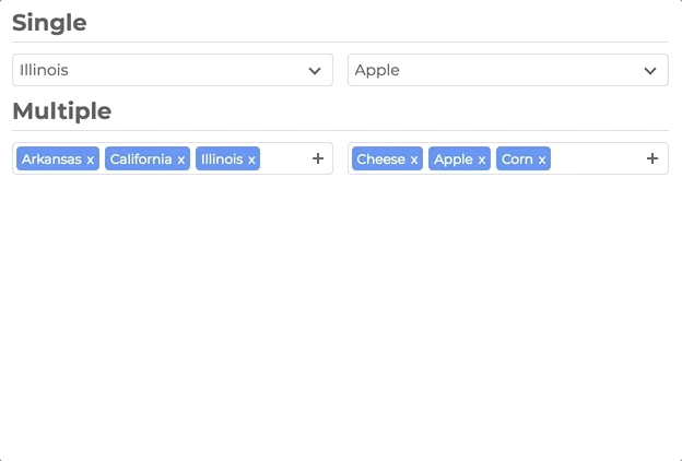
- Single Select
- Multi Select
- User Addable Options
- Html Options
- Settable Data
- Callback Events
- Placeholders
- Search
- Disable Options
- Light CSS
- Light Color Scheme
- Style and Class Inheritance
- Clean Animations
- Performant
- Typescript
- Vue
npm install slim-select<script src="https://unpkg.com/slim-select@latest/dist/slimselect.min.js"></script>
<link rel="stylesheet" href="https://unpkg.com/slim-select@latest/dist/slimselect.css" />import SlimSelect from 'slim-select'
new SlimSelect({
select: '#selectElement',
})<select id="selectElement">
<option value="value1">Value 1</option>
</select>Data is an array of objects that represent both option and optgroups.
See below for list of data types
new SlimSelect({
  select: '#selectElement',

  // Array of Option objects
  data: [{ text: 'Value 1', value: 'value1' }],

  // or

  // Array of Optgroups and/or Options
  data: [{ label: 'Optgroup Label', options: { text: 'Value 1', value: 'value1' } }],
})// <optgroup>
var optgroup = {
label: 'label', // Required
selectAll: false, // Optional - default false
closable: 'off', // Optional - default 'off' - 'off', 'open', 'close'
options: [], // Required - value is an array of options
}
// <option>
var option = {
text: 'text', // Required
value: 'value', // Optional - value will be set by text if not set
html: '<b>Html</b>', // Optional - if set, used for display purposes
selected: false, // Optional - default is false
display: true, // Optional - default is true
disabled: false, // Optional - default is false
mandatory: false, // Optional - default is false
placeholder: false, // Optional - default is false
class: '', // Optional - default is not set
style: '', // Optional - default is not set
data: {}, // Optional - If you have data attributes
}Settings are a list of fields that help customize how SlimSelect operates
new SlimSelect({
  select: '#selectElement',

  settings: {
    // Below are a list of optional fields
    // their values are the defaults
    disabled: false,
    alwaysOpen: false,
    showSearch: true,
    searchPlaceholder: 'Search',
    searchText: 'No Results',
    searchingText: 'Searching...',
    searchHighlight: false,
    closeOnSelect: true,
    contentLocation: document.body,
    contentPosition: 'absolute',
    openPosition: 'auto', // options: auto, up, down
    placeholderText: 'Select Value',
    allowDeselect: false,
    hideSelected: false,
    showOptionTooltips: false,
    minSelected: 0,
    maxSelected: 1000,
    timeoutDelay: 200,
    maxValuesShown: 20,
    maxValuesMessage: '{number} selected',
  },
})
Events are function callbacks for when certain actions happen
new SlimSelect({
  select: '#selectElement',

  events: {
    search: (searchValue: string, currentData: DataArray) => Promise<DataArrayPartial> | DataArrayPartial
    searchFilter: (option: Option, search: string) => boolean
    addable: (value: string) => Promise<OptionOptional | string> | OptionOptional | string
    beforeChange: (newVal: Option[], oldVal: Option[]) => boolean | void
    afterChange: (newVal: Option[]) => void
    beforeOpen: () => void
    afterOpen: () => void
    beforeClose: () => void
    afterClose: () => void
    error: (err: Error) => void
  },
})