React Storybook Props addon
Display Props and Story documentation/source into Storybook UI panels.
Status
This repo is intented to be deprecated when this PR will be finally merged. But if you want to try it...
Purpose
The addon provides two new panels for the Storybook UI.
- Props. Shows component properties (extracted by Storybook using react-docgen)
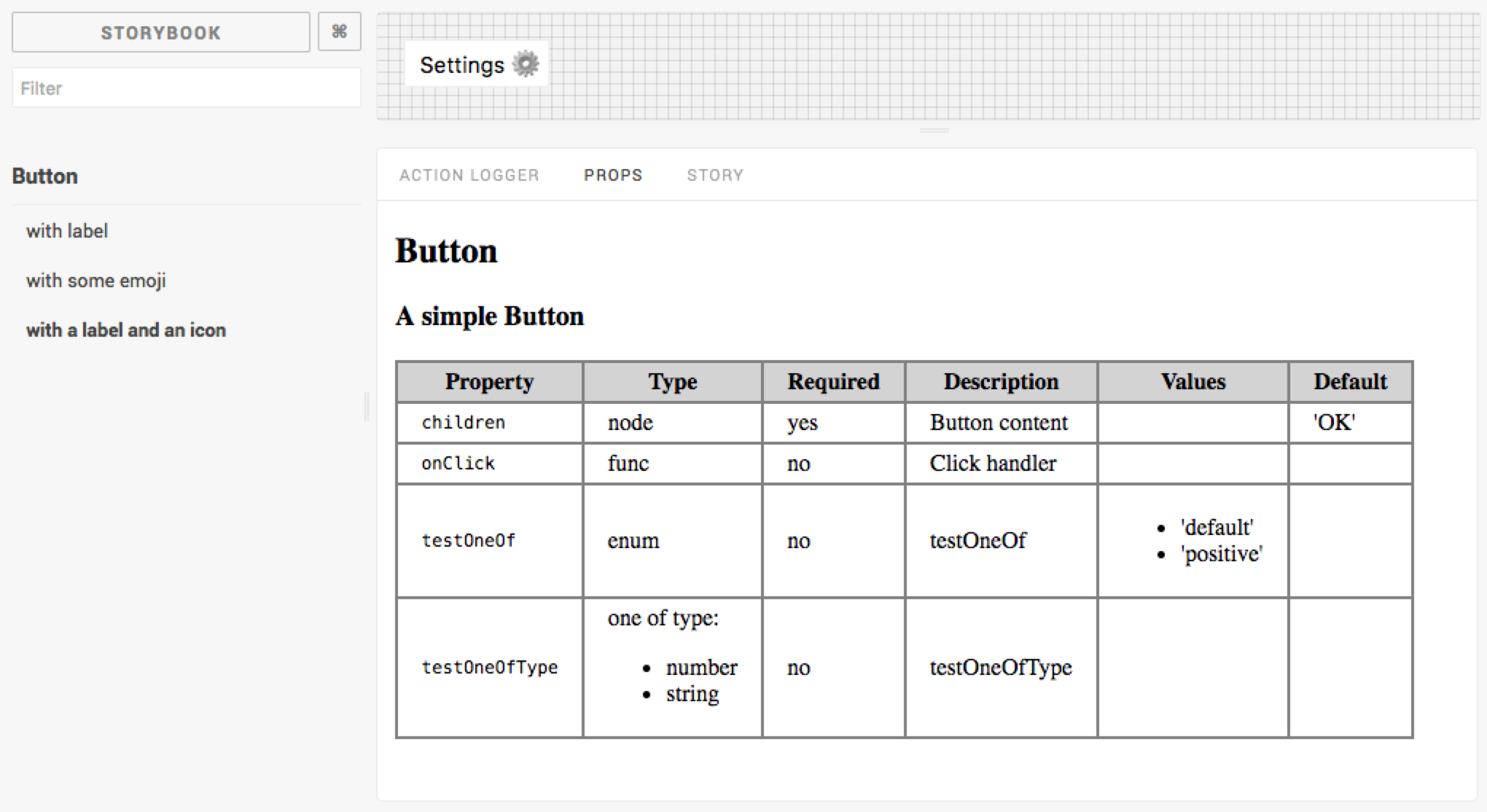
- Story. Shows story description and source code.
Visible information are similar to Storybook Info addon, but doesn't alter the output of the story into the preview area. This provides a better usage for the Storyshots feature because snapshots will only contains the rendered stories.
Install
npm i storybook-addon-props --save-dev
or (using Yarn) :
yarn add storybook-addon-props --dev
Usage
Add a custom .storybook/.babelrc file
The custom balel config is used to set a different resolver for the babel-plugin-react-docgen.
This is necessary to avoid warnings about files with multiple React component exports.
Register addon into the .storybook/addons.js file (view doc)
;;Set addon into the .storybook/config.js file
;; ; { // ...};Write stories
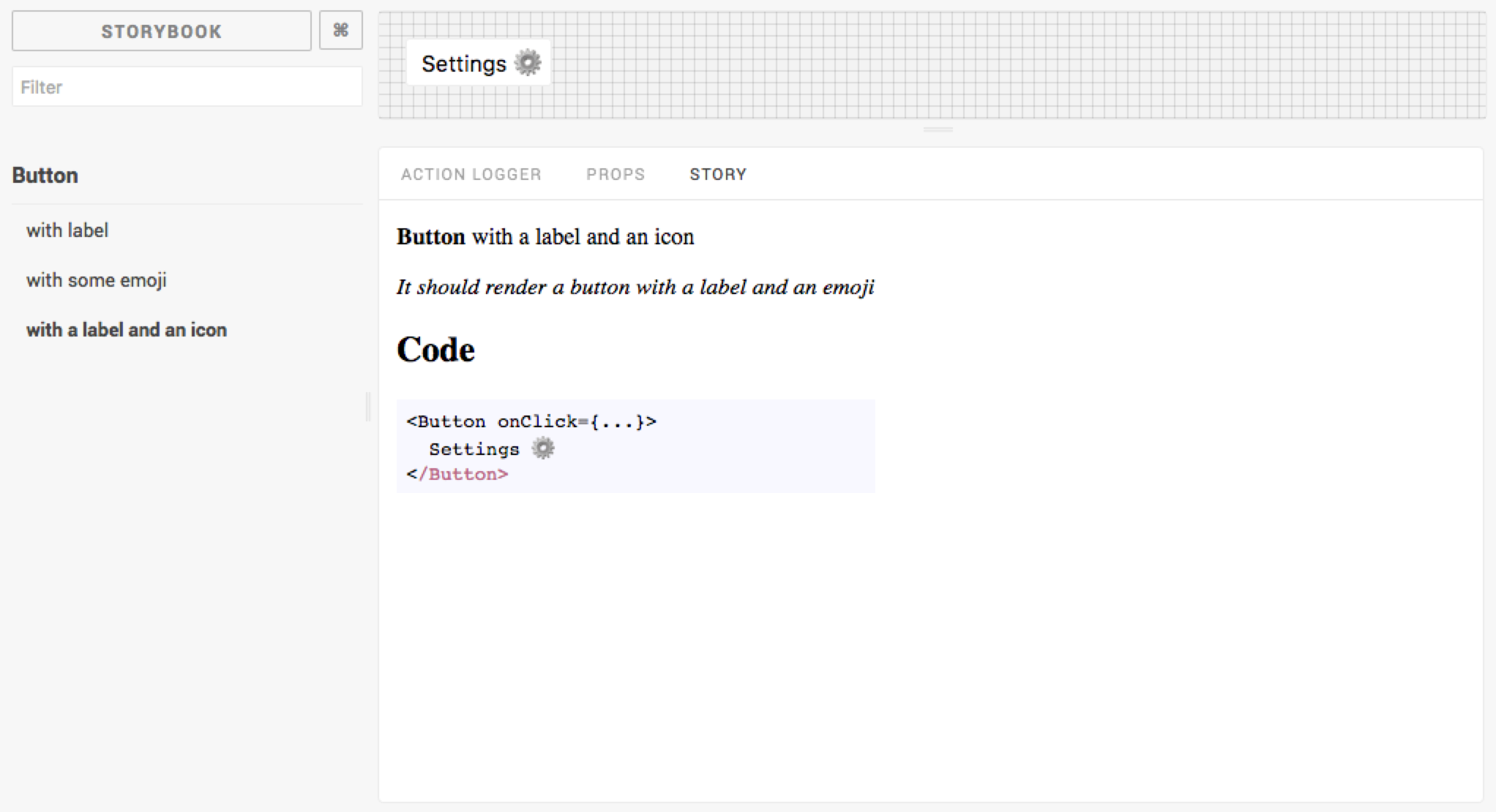
Create your stories using the new addWithDoc function provided by this addon.
import Button from '../Button'; );For another example, have a look at this file.
addWithDoc expects the following parameters:
addWithDoc(storyName, component, description, storyFn)
| Parameter | Description |
|---|---|
storyName |
Name of the story (appears into the Left Panel) |
component |
The main component of the story |
description |
A string displayed into the Story panel (Markdown supported here!) |
storyFn |
The story rendering function |
Options
Alternatively you can configure the addWithDoc function using the configureDoc named export.
This function allows you to pass an options object.
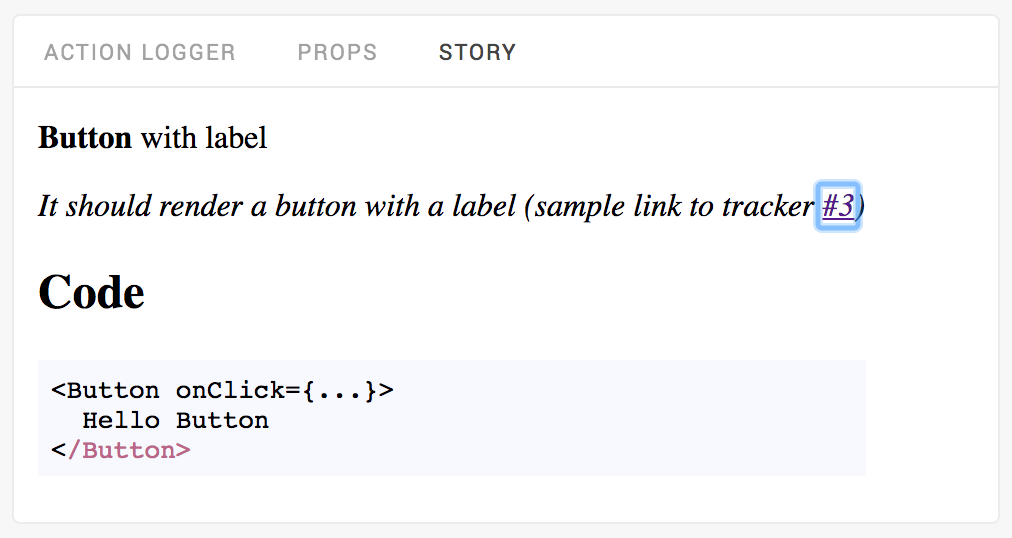
At this time only two options are supported to enable automatic links insertion on a issues tracker when a issue ID pattern is detected into the description field of a story.
Supported options are :
| Parameter | Description | Default |
|---|---|---|
trackerUrl |
The tracker URL template string. Use %ID% to insert the issue ID. |
|
pattern |
The issue ID regexp pattern. | #([0-9]+) |
Pass options into .storybook/config.js like this:
const addWithDoc =;;
Then into a story you can reference an issue like this:
And a link to issue #3 will be added into the story panel:
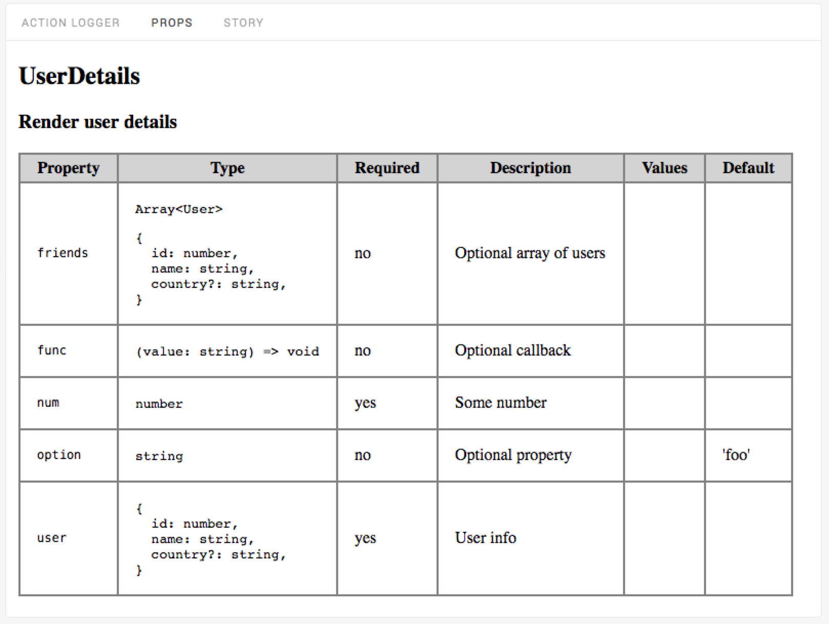
Flow type support
This addon support flow type annotations extracted by react-docgen.
For the following code :
;type Props =/** User info */user: User/** Some number */num: number/** Optional property */option?: string/** Optional callback */func?: void/** Optional array of users */friends?: Array<User>;/** Render user details */Componentprops: Props;static defaultProps =option: 'foo';{}
the Props panel will show something like this:
View complete example: component code and story.