This module is copy of this addon. All credits go to the author. I made a new version, to support flow type annotations.
storybook-addon-react-flow-docgen
Installation
yarn add -D storybook-addon-react-flow-docgen babel-plugin-react-docgenA React Storybook addon to show documentation generated with docgen.
Usage
Add this line in addons.js file within your storybook config directory:
;Then add a decorator to your stories:
;Finally you need to add babel-plugin-react-docgen dt your .babelrc:
"plugins": [
    ["react-docgen", { "DOC_GEN_COLLECTION_NAME": "STORYBOOK_REACT_CLASSES"}]
]
Also add global.STORYBOOK_REACT_CLASSES = {}; somewhere in begging of your code i.e. .storybook/config.js
The FAQ
My component name is undefined or props are not displaying
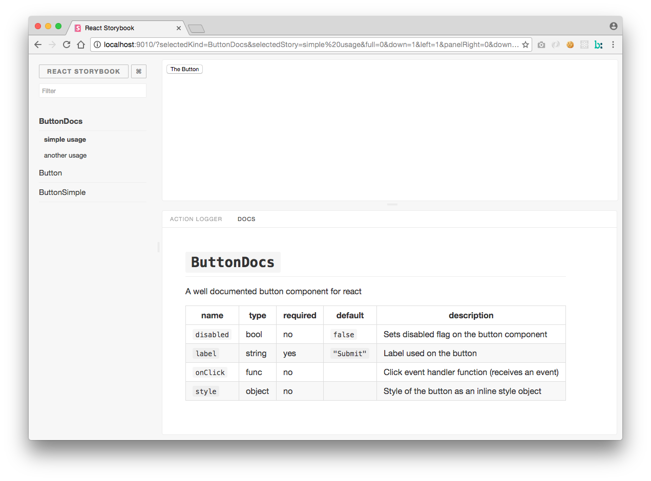
This addon is using the full information from react-docgen. Look at that project for some examples on documenting components. When creating components, set the displayName static property to show the correct component name on static builds.
Example
To run provided example execute following command, storybook will run on port 3000
yarn example