
styled-spinkit


Simple animation loading components with styled-components
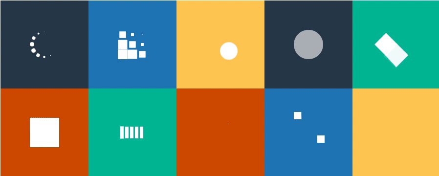
Inspired by SpinKit.
Install
$ yarn add styled-spinkit
or
$ npm install --save styled-spinkit
API
Components
<ChasingDots/><Circle/><CubeGrid/><Pulse/><FadingCircle/><ThreeBounce/><FoldingCube/><WanderingCubes/><WaveLoading/><DoubleBounce/><RotaingPlane/>
Props
| Prop | Type | Default |
|---|---|---|
color |
string |
#333 |
size |
number |
40 |
Contributors
Thanks goes to these wonderful people (emoji key):
 akameco 💻 📖 ⚠️ 🚇 |  jrusx 💻 🐛 |  Bap ☺ 💻 |  KagXaef 💻 |
This project follows the all-contributors specification. Contributions of any kind welcome!
License
MIT © akameco