TvCard
The TvCard is a component that allows you to display a card with a title, a subtitle, a description, an image and a button.


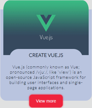
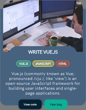
Table of Contents
Installation
Install with npm or yarn
npm install todovue-cardyarn add todovue-cardImport
import { TvCard } from 'todovue-card'You can also import it directly in the main.js file, so you don't have to import it in the pages
import { createApp } from "vue";
import App from "./App.vue";
import TvCard from "todovue-card";

const app = createApp(App);
app.component("TvCard", TvCard);
app.mount("#app");
Usage
<template>
  <tv-card
    @click-button="handleButton"
    :configCard="configCard"
  />
</template>

<script>
import { ref } from "vue";
import TvCard from "todovue-card";

export default {
  name: "Demo",
  components: {
    TvCard,
  },
  setup() {
    const configCard = ref({
      title: "Create Vue.js",
      description: "Vue.js (commonly known as Vue; pronounced /vjuː/...",
      alt: "Card Image",
      image: "https://todovue.com/vue.webp",
      primaryButtonText: "View more",
    });

    const handleButton = () => {
      console.log("Button clicked");
    }

    return {
      configCard,
      handleButton
    }
  }
};
</script>
Props
| Name | Type | Default | Description |
|---|---|---|---|
| configCard | Object | See below | Object with the card configuration |
configCard
| Name | Type | Default | Description | required |
|---|---|---|---|---|
| title | String | "" |
Card title | true |
| description | String | "" |
Card description | true |
| image | String | "" |
Card image | true |
| alt | String | "" |
Card image alt | true |
| primaryButtonText | String | "" |
Card primary button text | true |
| secondaryButtonText | String | "" |
Card secondary button text | false |
| labels | Array | [] |
Card labels | false |
| limitLabels | Number | 3 |
Card limit labels | false |
| backgroundColor | String | #0E131F |
Card custom background color | false |
| color | String | #AFDEDC |
Card custom color | false |
| backgroundButtonColor | String | #EF233C |
Card custom background primary button color | false |
| buttonColor | String | #F4FAFF |
Card custom primary button color | false |
| backgroundButtonSecondaryColor | String | #2F80ED |
Card custom background secondary button color | false |
| colorButtonSecondary | String | #F4FAFF |
Card custom secondary button color | false |
Events
| Name | Description |
|---|---|
| clickButton | Event emitted when the primary button is clicked, returns the button's value |
| clickSecondaryButton | Event emitted when the secondary button is clicked, returns the button's value |
| clickLabel | Event emitted when the label is clicked, returns the label's value |
Customize
You can customize the card by cardConfig, you can see the props section to see the available options
const configCard = ref({
  backgroundColor: "#000000", // Card custom background color
  color: "#ffffff", // Card custom color
  backgroundButtonColor: "#ffffff", // Card custom background primary button color
  buttonColor: "#000000", // Card custom primary button color
  backgroundButtonSecondaryColor: "#ffffff", // Card custom background secondary button color
  colorButtonSecondary: "#000000", // Card custom secondary button color
});<template>
<tv-card
@click-button="handleButton"
:configCard="configCard"
/>
</template>
<script>
import { ref } from "vue";
import TvCard from "todovue-card";
export default {
name: "Demo",
components: {
TvCard,
},
setup() {
const configCard = ref({
title: "Create Vue.js",
description: "Vue.js (commonly known as Vue; pronounced /vjuː/...",
alt: "Card Image",
image: "https://todovue.com/vue.webp",
primaryButtonText: "View more",
backgroundColor: "#000000",
color: "#ffffff",
backgroundButtonColor: "#ffffff",
buttonColor: "#000000",
});
const handleButton = () => {
console.log("Button clicked");
}
return {
configCard,
handleButton
}
}
};
</script>Development
Clone the repository and install the dependencies
git clone https://github.com/TODOvue/todovue-card.gitcd todovue-cardInstall the dependencies
yarn installRun the project
yarn demoRun the tests
yarn test:unitRun the linter
yarn lintRun the build It is not necessary to generate build, since it is generated when you do PR to the master branch
yarn build