


This requires Nuxt.js with the Tailwind CSS module
Quick Setup
- Add the
nuxt-tailvuedependency to your Nuxt.js project
npm install nuxt-tailvue
# OR
yarn add nuxt-tailvue- Add
buttonto themodulessection ofnuxt.config.js
{
  modules: [
    ['nuxt-tailvue', {button: true}],
  ]
}- If you're using Purge, add this module to the content section of
tailwind.config.js
module.exports = {
    content: [
      'node_modules/tv-*/dist/tv-*.umd.min.js',
  }
Features
ButtonGroup component
- Works with themes
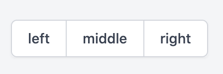
  <ButtonGroup>
    <PushButton group="left">
      left
    </PushButton>
    <PushButton group="middle">
      middle
    </PushButton>
    <PushButton group="right">
      right
    </PushButton>
  </ButtonGroup>
Combine with tv-icon
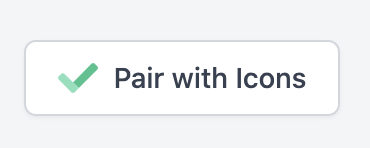
<PushButton>
    <IconCheck class="w-5 h-5 mr-2" primary="text-green-300" secondary="text-green-400"/>
    Pair with Icons
</PushButton>
Use as a nuxt-link
<PushButton to="/about">
  About Us
</PushButton>