vue-single-select

1.1.0 • Public • Published

vue-single-select

simple autocomplete select dropdown component for Vue apps for you!
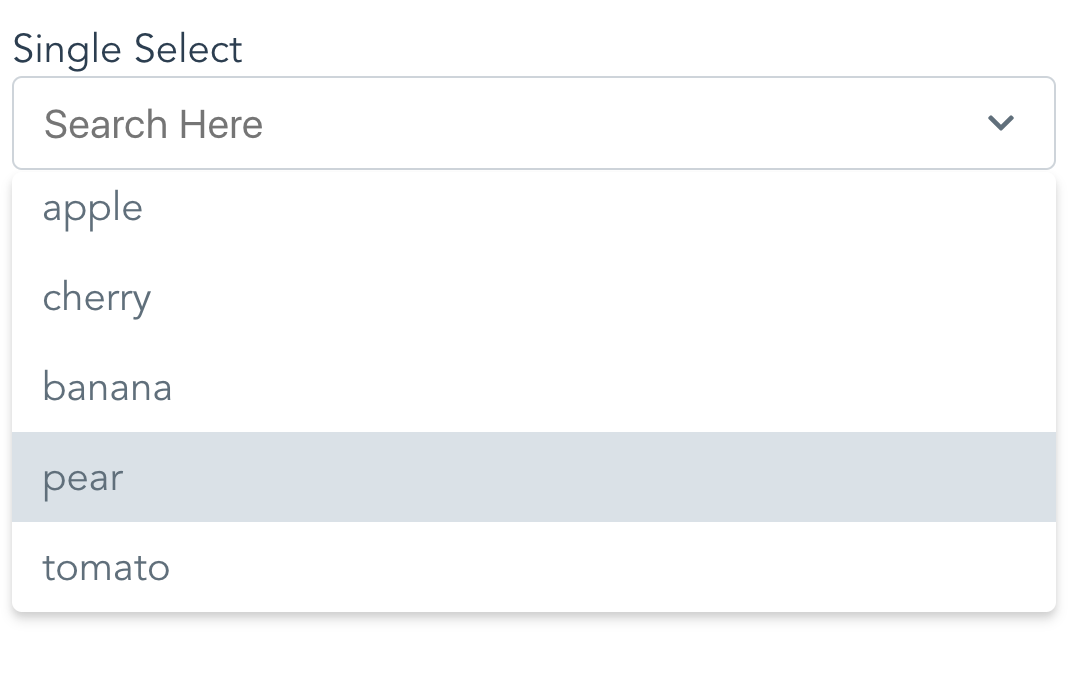
Demo

Check it out on CodeSandbox

What It Does

vue-single-select provides a simple component for making long, unwieldy select boxes more friendly, like Chosen for jQuery.

How Simple?

This simple

<vue-single-select      
    v-model="fruit" 
    :options="['apple','cherry','banana','pear', 'tomato']"
></vue-single-select>    

What It Does Not Do

Nope no Multi Select. See vue-taggable-select for this.

Vue Taggable Select

Install or Use Via CDN

<div id="app">
    <label>Choose a fruit!</label>
    <vue-single-select
        v-model="fruit"
        :options="fruits"
    ></vue-single-select>
</div>
<script src="https://unpkg.com/vue@latest"></script>
<script src="https://unpkg.com/vue-single-select@latest"></script>
<script>
 new Vue({
     el:"#app",
     data: {
         fruit: null,
         fruits: ['peach','pear','apple','orange']
     }
 });
</script> 

Install Via NPM

$ npm i vue-single-select

Register it

In your component:

import VueSingleSelect from "vue-single-select";
export default {
components: {
     VueSingleSelect
  },
  //...
}

Globally:

import VueSingleSelect from "vue-single-select";
Vue.component('vue-single-select', VueSingleSelect);

Use It

<vue-single-select
        v-model="fruit"
        :options="['apple','banana','cherry','tomato']"
        :required="true"
></vue-single-select>

Use It Again

Specify a custom option label and option value

Here each option refereneces a post title in the posts list in data. The option value references a post id in the same list. Like:

posts: [{title: "ok dude", id: 1}, {title: "awesome dude", id: 2}, ...]

<vue-single-select
        name="maybe"
        placeholder="pick a post"
        you-want-to-select-a-post="ok"
        v-model="post"
        out-of-all-these-posts="makes sense"
        :options="posts"
        a-post-has-an-id="good for search and display"
        option-key="id"
        the-post-has-a-title="make sure to show these"
        option-label="title"
></vue-single-select>

Use It Again

Specify a custom option label.

Here the Option Label references a reply the replies list in data. With a format like:

replies: [{reply: "ok dude"}, {reply: "awesome dude"}, ...]
<vue-single-select
        you-want-to-select-a-reply="yes"
        v-model="reply"
        out-of-all-these-replies="yep"
        :options="replies"
        a-reply-only-has-a-reply="sounds about right"
        option-label="reply"
        seed-an-initial-value="what's seed mean?"
        initial="seed me"
        you-only-want-20-options-to-show="is 20 enough?"
        :max-results="20"
></vue-single-select>

Dont like the Styling?

You can override some of it. Like so:

<vue-single-select
        id="selected-reply"
        name="a_reply"
        option-label="reply"
        v-model="reply"
        :options="replies"
        you-like-huge-dropdowns="1000px is long!"
        max-height="1000px"
        you-love-bootstrap="yes!!"
        :classes="{
                    input: 'form-control',
                    wrapper: 'form-group',
                    icons: 'glyphicon',
                    required: 'required'
                    active: 'active',
                    dropdown: 'dropdown'
        }"
></vue-single-select>

Then all you need to do is provide some class definitions like so:

.form-control {
    color: pink;
    width: 10000px;
    _go: nuts;
}
.glyphicon {
    display:none;
}
.form-group {
    background-color: pink;
    font-size: 16px;
}
 
.required {
    color: #721c24;
    background-color: #f8d7da;
    border-color: #f5c6cb;
}
.dropdown{
    color: violet;
}
.active {
    background-color: lemonchiffon;
}
 

Note: Bootstrap 3 Users May want to increase the size of the icons.

If so do this:

.icons svg {
    height: 1em;
    width: 1em;
}

See defaults below.

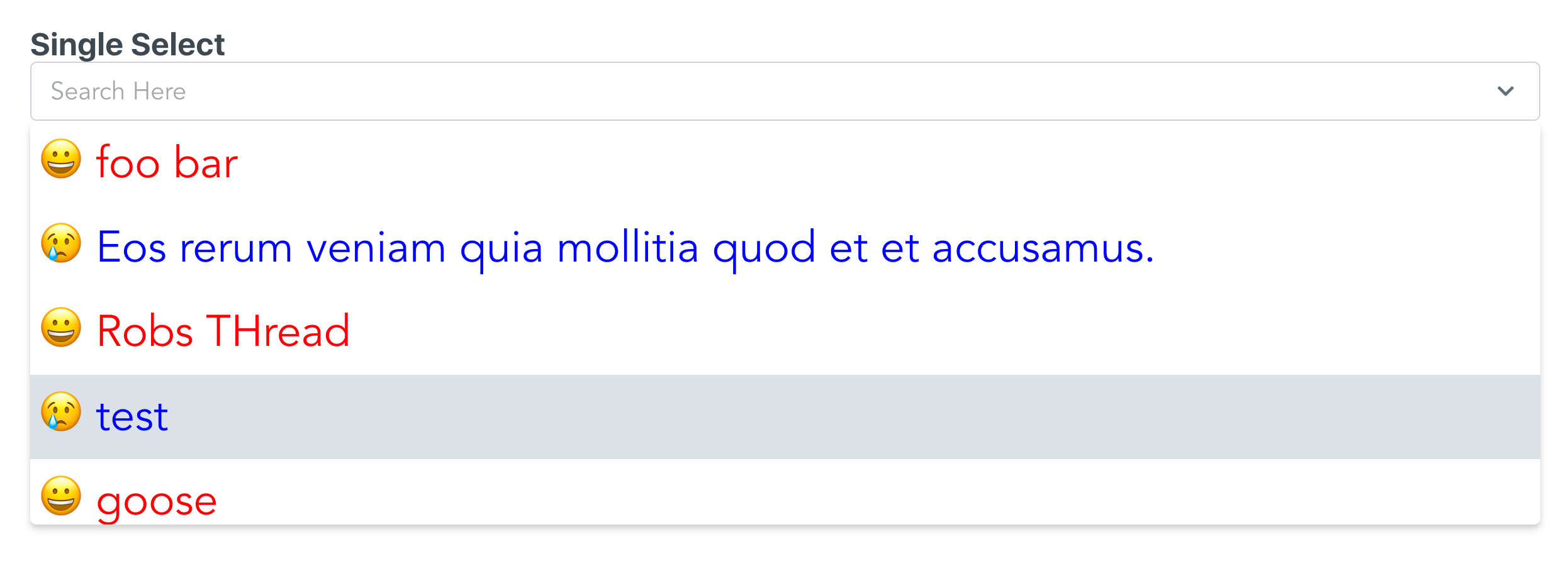
Dont like the styling at all?

Use the slots option to really mix it up.

This is a little advanced, but it's not too hard. Take a look:

<single-select
    option-label="title"
    v-model="thread" 
    :options="threads" 
    max-height="300px"
    >
        <template slot="option" slot-scope="{option, idx}">
            <div style="display:flex;padding: 2px;font-size: 2rem;"
                :class="idx % 2 ? 'emoji-happy' : 'emoji-sad'"
                :style="idx % 2 ? 'color:red' : 'color:blue'">
                <span style="margin-left: 1rem;">
                    {{idx}}</span>
                <span style="margin-left: 1rem;">
                    {{option.title}}</span>
            </div>
        </template>
    </single-select>
.emoji-happy::before {
    content:"\1F600"
}
.emoji-sad::before {
    content:"\1F622"
}

The key is the template element.

Here I give you the option and the current index. From there you can add html, add exta info, or a smiley face.

And here you go:

Image of Smiley

Kitchen Sink

Meh, see props below.

Why vue-single-select is better

  1. It handles custom label/value props for displaying options.

    Other select components require you to conform to their format. Which often means data wrangling.

  2. It's easier on the DOM.

    Other components will load up all the options available in the select element. This can be heavy. vue-single-select makes an executive decision that you probably will not want to scroll more than N options before you want to narrow things down a bit. You can change this, but the default is 30.

  3. Snappy Event Handling

    • up and down arrows for selecting options
    • enter to select first match
    • remembers selection on change
    • hit the escape key to, well, escape
  4. Lightweight

    • Why are the other packages so big and actually have dependencies?
  5. It works for regular 'POST backs' to the server.

    If you are doing a regular post or just gathering the form data you don't need to do anything extra to provide a name and value for the selected option.

  6. Mine just looks nicer

  7. It's simple!!

Available Props:

There are more props than I'd like. But I needed them so you might too.

    props: {
    value: {
      required: true
    },
    // Give your element a name.
    // Good for doing a POST
    name: {
      type: String,
      required: false,
      default: () => ""
    },
    // Your list of things for the select
    options: {
      type: Array,
      required: false,
      default: () => []
    },
    // Tells vue-single-select what key to use
    // for generating option labels
    optionLabel: {
      type: String,
      required: false,
      default: () => null
    },
    // Tells vue-single-select the value
    // you want populated in the select for the 
    // input
    optionKey: {
      type: String,
      required: false,
      default: () => null
    },
    placeholder: {
      type: String,
      required: false,
      default: () => "Search Here"
    },
    maxHeight: {
      type: String,
      default: () => "220px",
      required: false
    },
    // Give your input an html element id
    inputId: {
      type: String,
      default: () => "single-select",
      required: false
    },
    //Customize the styling by providing 
    //these FIVE custom style definitions.
    classes: {
      type: Object,
      required: false,
      default: () => {
        return {
          wrapper: "single-select-wrapper",
          input: "search-input",
          icons: "icons",
          required: "required",
          activeClass: 'active',
          dropdown: 'dropdown'
        };
      }
    },
    // Seed search text with initial value
    initial: {
      type: String,
      required: false,
      default: () => null
    },
    // Disable it!
    disabled: {
      type: Boolean,
      required: false,
      default: () => false
    },
    // Make it required
    required: {
      type: Boolean,
      required: false,
      default: () => false
    },
    // Number of results to show at a time
    maxResults: {
      type: Number,
      required: false,
      default: () => 30
    },
    // meh...
    tabindex: {
      type: String,
      required: false,
      default: () => {
        return "";
      }
    },
    // Tell vue-single-select what to display
    // as the selected option
    getOptionDescription: {
      type: Function,
      default: function (option) {
        if (this.optionKey && this.optionLabel) {
          return option[this.optionKey] + " " + option[this.optionLabel];
        }
        if (this.optionLabel) {
          return option[this.optionLabel];
        }
        if (this.optionKey) {
          return option[this.optionKey];
        }
            return option;
      }
    },
    // Use this to actually give vue-single-select
    // a value for doing a POST
    getOptionValue: {
      type: Function,
      default: function (option) {
        if (this.optionKey) {
          return option[this.optionKey];
        }
        
        if (this.optionLabel) {
          return option[this.optionLabel];
        }
 
        return option;
      }
    },
    //Default filtering, provide your own for fun
    //Like startsWith instead of includes
    filterBy: {
      type: Function,
      default: function (option) {
        if (this.optionLabel && this.optionKey) {
          return (
            option[this.optionLabel]
              .toString()
              .toLowerCase()
              .includes(this.searchText.toString().toLowerCase()) ||
              option[this.optionKey]
              .toString()
              .toLowerCase()
              .includes(this.searchText.toString().toLowerCase())
          )
        }
        
        if (this.optionLabel) {
          return option[this.optionLabel]
            .toString()
            .toLowerCase()
            .includes(this.searchText.toString().toLowerCase())
        }
        
        if (this.optionKey) {
          option[this.optionKey]
            .toString()
            .toLowerCase()
            .includes(this.searchText.toString().toLowerCase())
        }
        
        return option
          .toString()
          .toLowerCase()
          .includes(this.searchText.toString().toLowerCase())
      }
    }
  }

Q&A

Q. What about Ajax?

A. Good question. Why aren't you passing data in as a prop? Seriously, this is just a widget why does it need knowledge of it's data source?

Q. How do I change how items are filtered?

A. Easy. See prop above, matchingOptions. Just override it with your own method as a prop.

Q. What about Templating?

A. What about it? Just use the new scoped slots!

Q. What about Multiple Selects?

A. Nope not found here. See vue-taggable-select

Q. Can I trust this?

A. Yep. It's backed by tests using jest and vue test utils.

Package Sidebar

Install

npm i vue-single-select

Weekly Downloads

253

Version

1.1.0

License

ISC

Unpacked Size

57.2 kB

Total Files

10

Last publish

Collaborators

  • robrogers3