Vue Collapse
Vue.js 2 plugin allowing developers to create very custom accordion lists. It is meant to be very flexible and easy to customize accordion plugin. Plugin itself does not provide any styling for any components or elements. The only included css supports the most basic slide up and down animation using the max-height and the transition properties. VueCollapse is rather a tool for developers who need to create custom accordion list.
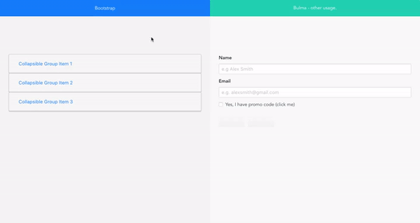
Documentation with live examples
Installation
- Download the npm package
npm install vue2-collapse - Import and install plugin with API provided by Vue.js
import VueCollapse from 'vue2-collapse'
Vue.use(VueCollapse);
Simple usage with Pug:
Without grouping:
ul
  ...
  li > v-collapse-wrapper
    .title(v-collapse-toggle) List element title
    .content(v-collapse-content) This content which will be toggled
  ...
With a group
v-collapse-group
    ul
      ...
      li > v-collapse-wrapper
        .title(v-collapse-toggle) List element title
        .content(v-collapse-content) This content which will be toggled
      ...
With a custom toggle element outside the wrapper
button(v-collapse-toggle="'custom_toggler'") Open my element
v-collapse-group
    ul
      ...
      li > v-collapse-wrapper
        .title(v-collapse-toggle) List element title
        .content(v-collapse-content, ref="'custom_toggler'") This content which will be toggled
      ...
Plugin elements
VueCollapse contains components and directives which provide easy way of building accordions:
Components
v-collapse-wrapper
Description:
Wrapper component which should always be a parent of elements with v-collapse-content and v-collapse-toggle directives.
v-collapse-group
Description:
This is a group component. Sometimes there is a need of creating several different accordion lists. Grouping list elements helps with more complex cases. Components stores list of all elements in the accordion.
Directives
v-collapse-content
Description:
This directive ought to be applied on the DOM element which will contain content of single list element. Only this element will be able to be toggled on and off within wrapper component. Element with this directive should not be a parent of the element with v-collapse-toggle directive
v-collapse-toggle
Description:
The directive changes a default behavior of the element and allows to click on it in order to toggle list element. Note that this directive should be located within the <v-collapse-wrapper></v-collapse-wrapper> in order to make it working without manual binding.
However if it is needed to create a toggle element somewhere else, not inside the wrapper component you can use vue's reference to make it work.
TODO: COMPLEX USAGE, CONFIGURATION, DEMOS.