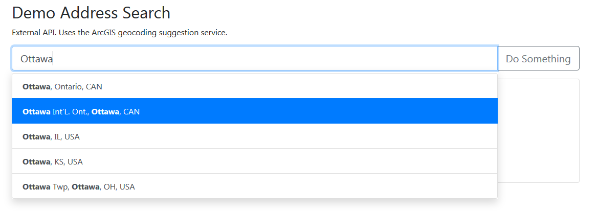
A simple list-group based typeahead/autocomplete using Bootstrap 5 and Vue 3
// npm
npm install vue3-bootstrap-autocomplete

// yarn
yarn add vue3-bootstrap-autocompleteimport VueBootstrapAutocomplete from 'vue3-bootstrap-autocomplete';
// Required dependency of bootstrap css/scss files
import 'bootstrap/scss/bootstrap.scss';
// Global registration
Vue.component('vue-bootstrap-autocomplete', VueBootstrapAutocomplete)
// or
// Local Registration
export default {
components: {
VueBootstrapAutocomplete
}
}The only required props are a v-model and a data array.
<vue-bootstrap-autocomplete
  v-model="query"
  :data="['Canada', 'United States', 'Mexico', 'Netherlands']"
/>| Name | type | Default | Description |
|---|---|---|---|
| append | String | Text to be appended to the input-group
|
|
| autoClose | Boolean |
true | Whether the autocomplete should hide upon item selection |
| backgroundVariant | String | Background color for the autocomplete result list-group items. See values here.
|
|
| backgroundVariantResolver | Function | input => null | Function which accepts the current list item data and returns a background color for the current autocomplete result list-group item. The non-null/non-empty string value returned from this function will supersede the value specified in backgroundVariant. |
| data | Array | Array of data to be available for querying. Required | |
| disabled | Boolean |
false | Enable or disable input field |
| disabledValues | Array |
false | The dropdown items to disable. |
| disableSort | Boolean |
false | If set to true, no sorting occurs and the list is presented to the user as it is given to the component. Use this if you sort the list before giving it to the component. Ex: an elasticsearch result being passed to Vue. |
| highlightClass | String |
vbt-matched-text |
CSS class to style highlighted text |
| ieCloseFix | Boolean | true | Adds (imperfect) handling for auto closing the typeahead list on focus out in IE |
| inputClass | String | Class to be added to the input tag for validation, etc. |
|
| inputName | String | Name to be added to the input tag. |
|
| maxMatches | Number | 10 | Maximum amount of list items to appear. |
| minMatchingChars | Number | 2 | Minimum matching characters in query before the typeahead list appears |
| noResultsInfo | String | No results found. | Text to display when no results are found |
| prepend | String | Text to be prepended to the input-group
|
|
| screenReaderTextSerializer | Function | input => input |
Function used to convert the entries in the data array into the screen reader text string. Falls back to the value of serializer. |
| serializer | Function | input => input |
Function used to convert the entries in the data array into a text string. |
| showAllResults | Boolean |
false | Show all results even ones that highlighting doesn't match. This is useful when interacting with a API that returns results based on different values than what is displayed. Ex: user searches for "USA" and the service returns "United States of America". |
| showOnFocus | Boolean |
false | Show results as soon as the input gains focus before the user has typed anything. |
| size | String | Size of the input-group. Valid values: sm, md, or lg
|
|
| textVariant | String | Text color for autocomplete result list-group items. See values here.
|
|
| state | Boolean | Whether the autocomplete should be in a valid or invalid state. |
| Name | Description |
|---|---|
| blur | Triggered when the input field loses focus, except when pressing the tab key to focus the dropdown list. |
| focus | Triggered when the input element receives focus. |
| hit | Triggered when an autocomplete item is selected. The entry in the input data array that was selected is returned. If no autocomplete item is selected, the first entry matching the query is selected and returned. |
| input | The component can be used with v-model
|
| keyup | Triggered when any keyup event is fired in the input. Often used for catching keyup.enter. |
| paste | Triggered when the user pastes text into the input field. |
There are prepend and append slots available for adding buttons or other markup. Overrides the prepend and append props.
<vue-bootstrap-autocomplete :data="data" v-model="value">
  <template #prepend>
    <button class="btn btn-primary">Prepend</button>
  </template>
  <template #append>
    <button class="btn btn-primary">Append</button>
  </template>
</vue-bootstrap-autocomplete>There is a noResultsInfo slot available for customizing the no results info text. Overrides the noResultsInfo fallback content, which is undefined by default.
<vue-bootstrap-autocomplete :data="data" v-model="query">
  <template #noResultsInfo>
    <span>No results for <b>{{ query }}</b></span>
  </template>
</vue-bootstrap-autocomplete>You can use a scoped slot called suggestion to define custom content for the suggestion list-item's. You can use bound variables data, which holds the data from the input array, and htmlText, which is the highlighted text that is used for the suggestion.
See the custom suggestion slot example for more info.