Vuejs Dialog Plugin
A lightweight, promise based alert, prompt and confirm dialog.


Demo
https://godofbrowser.github.io/vuejs-dialog/
Important updates in version v1.x.x
- Dialog will always resolve with an object. (i.e callback for proceed always will receive an object)
- For directives usage, the object returned in (1) above will include a node. The node is the element the directive was bound to (see issue #5
- Styles will have to be included explicitly as they have been extracted into a separate file (see issue #28)
- If loader is enabled globally, and a dialog is triggered via a directive without a callback, the loader is ignored for clicks on proceed
- Custom class injection on parent node (see issue #25)
- Ability to register custom views. This allows for custom logic, custom buttons, etc (see issue #13, #14, #33)
- For installation via HTML script tag
- The library has been namespaced as it has been split into two. The main library which is the plugin and the mixin which is useful in custom components
- To this effect, the new way to install the plugin is slightly dufferent:
window.Vue.use(VuejsDialog.main.default) - And the mixin can be added to components like so:
mixins: [VuejsDialog.mixin.default, ...otherMixins]
Installation
HTML
// Include vuejs // Include vuejs-dialog plugin // only needed in custom components Package Manager
// installation via npmnpm i -S vuejs-dialog // or // installation via yarnyarn add vuejs-dialog// then // import into project;;; // only needed in custom components // include the default style; // Tell Vue to install the plugin.Vue;Webpack External
// If you're including via script tag and importing as Webpack external// Webpack config // ... other webpack config externals: // .. other externals if any 'vuejs-dialog': 'VuejsDialog' // then // import into project;; // Tell Vue to install the plugin.Vue; // mixin available at: VuejsDialog.mixin.defaultBasic Usage inside a vuejs application
// Anywhere in your Vuejs App. // Trigger an Alert dialogthis$dialog; // Trigger a confirmation dialogthis$dialog ;Basic Usage outside a vuejs application
// VuejsDialog Methods are also available on the global vue// This makes it possible to use the plugin inside a ReactJs application// or just any javascript application// Simply include vue, vuejs-dialog, ask vue to use the plugin and that's all: Vuedialog; Vuedialog ;Return value on success
// Whenever a user clicks on proceed,// the promise returned by the dialog call will be// resolved with a dialog object with the following shape: { dialog // stop the loader (you won't be needing this) dialog // stops loader and close the dialog dialognodeclassName // === "btn-danger" dialogdata // === null}Prompt (collect data from user)
this$dialog prompt title: "Let's hear from you" body: "What is the most important thing in life?" promptHelp: 'Type in the box below and click "[+:okText]"' ;Usage with ajax - Loader enabled
this$dialog ;Usage as a directive
If you don't pass a message, the global/default message would be used.
submit// Callbacks can be provided// Note: If "loader" is set to true, the makeAdmin callback will receive a "dialog" object// Which is useful for closing the dialog when transaction is complete.Make Adminmethods: { // Do stuffs } { // Do nothing or some other stuffs }A more practical use of ths v-confirm directive with multiple triggers - Solution 1
// While looping through usersMake Adminmethods: { // Make user admin from the backend /* tellServerToMakeAdmin(user) */ // When completed, close the dialog /* dialog.close() */ } { // Do nothing or some other stuffs }( new ) A more practical use of ths v-confirm directive with multiple triggers - Solution 2
// While looping through usersMake Adminmethods: { let button = dialognode // node is only available if triggered via a directive let user = buttondatasetuser // Make user admin from the backend /* tellServerToMakeAdmin(user) */ // When completed, close the dialog /* dialog.close() */ } { // Do nothing or some other stuffs }For v-confirm directive, if an "OK" callback is not provided, the default event would be triggered.
// Default Behaviour when used on linksGo to example.comSetting a dialog title (new)
You can now set a dialog title by passing your message as an object instead of a string.
The message object should contain a title and body
let message = title: 'Vuejs Dialog Plugin' body: 'A lightweight, promise based alert, prompt and confirm dialog'; this$dialog;Options
// Parameters and options let message = "Are you sure?"; let options = html: false // set to true if your message contains HTML tags. eg: "Delete <b>Foo</b> ?" loader: false // set to true if you want the dailog to show a loader after click on "proceed" reverse: false // switch the button positions (left to right, and vise versa) okText: 'Continue' cancelText: 'Close' animation: 'zoom' // Available: "zoom", "bounce", "fade" type: 'basic' // coming soon: 'soft', 'hard' verification: 'continue' // for hard confirm, user will be prompted to type this to enable the proceed button verificationHelp: 'Type "[+:verification]" below to confirm' // Verification help text. [+:verification] will be matched with 'options.verification' (i.e 'Type "continue" below to confirm') clicksCount: 3 // for soft confirm, user will be asked to click on "proceed" btn 3 times before actually proceeding backdropClose: false // set to true to close the dialog when clicking outside of the dialog window, i.e. click landing on the mask customClass: '' // Custom class to be injected into the parent node for the current dialog instance; this$dialog ;Global Configuration
// You can also set all your defaults at the point of installation.// This will be your global configuration // use VuejsDialog.main.default if including via script tagVue; // Please note that local configurations will be considered before global configurations.// This gives you the flexibility of overriding the global config on individual call.CSS Override
If you have included the plugin's style and wish to make a few overides, you can do so with basic css, ex:
Useful tip for customization
You can use any of the options in your verification help text. Example:
this$dialog;More flexibility with Custom components
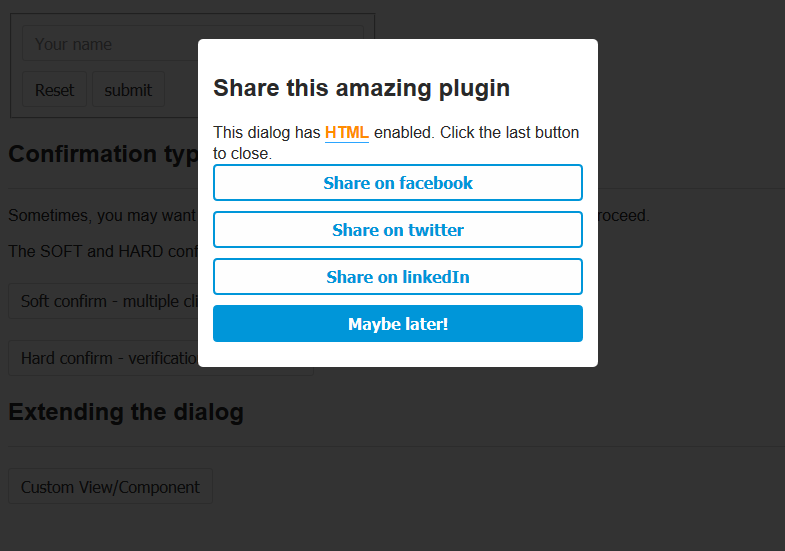
/* File: custom-component.vue */<template> <div class="custom-view-wrapper"> <template v-if=messageHasTitle> <h2 v-if="options.html" class="dg-title" v-html="messageTitle"></h2> <h2 v-else class="dg-title">{{ messageTitle }}</h2> </template> <template v-else> <h2>Share with friends</h2> </template> <div v-if="options.html" class="dg-content" v-html="messageBody"></div> <div v-else class="dg-content">{{ messageBody }}</div> <br/> <ok-btn @click="handleShare('facebook')" :options="options">Facebook</ok-btn> <ok-btn @click="handleShare('twitter')" :options="options">Twitter</ok-btn> <ok-btn @click="handleShare('googleplus')" :options="options">Google+</ok-btn> <ok-btn @click="handleShare('linkedin')" :options="options">LinkedIn</ok-btn> <cancel-btn @click="handleDismiss()" :options="options">Dismiss</cancel-btn> </div></template> <script>import DialogMixin from 'vuejs-dialog/vuejs-dialog-mixin.min.js'; // Include mixinimport OkBtn from 'path/to/components/ok-btn.vue';import CancelBtn from 'path/to/components/cancel-btn.vue'; export default { mixins: [DialogMixin], methods: { handleShare(platform) { this.proceed(platform); // included in DialogMixin }, handleDismiss() { this.cancel(); // included in DialogMixin } }, components: { CancelBtn, OkBtn }};</script> <style scoped="">button { width: 100%; margin-bottom: 10px; float: none;}</style>;; const VIEW_NAME = 'my-unique-view-name';Vuedialog; let vm = methods: { // Note: Use confirm instead of alert if you need to handle rejection this$dialog; } ;... and you get your custom view

Here's a working fiddle for custom component/view
License
Contributing
- Fork it!
- Create your feature branch: git checkout -b my-new-feature
- Commit your changes: git commit -am 'Add some feature'
- Push to the branch: git push origin my-new-feature
- Submit a pull request :)

