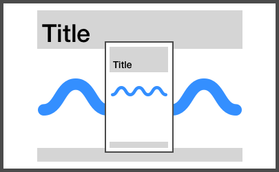
Fluid CSS properties
Create highly responsive and still pixel-perfect websites.
[!TIP] A successor JavaScript-only library called optica has been released. It requires the
clamp()CSS math function but no longer needs any breakpoints.
Best suited when you have a desktop and a mobile design of the site. Wasser will allow you to implement the design pixel perfect on both of these viewports. In between you get a linearly scaling design without any effort. If you only have a design of the desktop version you get the mobile version for free.
Below the CSS-in-JS version is documented. Please refer to the following documentations if you prefer SASS or LESS:
The CSS-in-JS version is newer and requires CSS Variables (no IE11). Both the SASS and LESS version also work with older browsers.
npm i wasser
import React from 'react'
import { render } from 'react-dom'
import { styled, globalCss } from '@stitches/react'
import { wasser, globalVariables, fontObject } from 'wasser'

globalCss(globalVariables())()

const Wrapper = styled('div', {
  padding: wasser(50),
})

const Heading = styled('h1', {
  ...fontObject(50),
})

render(
  <Wrapper>
    <Heading>Scalable Properties</Heading>
  </Wrapper>,
  document.body,
)Click to show usage with @emotion!
import React from 'react'
import { render } from 'react-dom'
import { Global, css } from '@emotion/core'
import styled from '@emotion/styled'
import { wasser, font, head } from 'wasser'

const Wrapper: any = styled.div`
  padding: ${wasser(50)};
`

const Heading: any = styled('h1')`
  ${font(50)}
`

render(
  <Wrapper>
    <Global styles={css(head())} />
    <Heading>Scalable Properties</Heading>
  </Wrapper>,
  document.body
)wasser(max: number, [min]: number)
max will be the value at the upper breakpoint, while min will be the value
at the lower breakpoint.
If min is missing, max divided by the scaling factor will be used.
.some-element {
  padding: ${wasser(20)};
}
const SomeElement = styled('div', {
padding: wasser(20),
})font(max: number, [min]: number, [line-height-ratio]: number)
This call does not require a property as it will set both the font-size and
the associated line-height. The line-height does not require a separate value
since it is stretched by the configurable fontSizeToLineHeightRatio.
.some-text {
  ${font(16)}
}
// =>
.some-text {
  font-size: ...;
  line-height: ...;
}
const Heading = styled('h3', {
...fontObject(18),
})
// =>
const Heading = styled('h3', {
fontSize: ...,
lineHeight: ...,
})Call the configure function before rendering to change the default settings.
import { configure } from 'wasser'

configure({
  scalingRatio: 2,
})
The following variables are available and can be configured.
| Variable | Default | Description |
|---|---|---|
| viewportMin | 320 | Minimum breakpoint |
| viewportMax | 1500 | Maximum breakpoint |
| scalingRatio | 1.5 | Ratio to calculate min from max when min is not explicitly set. |
| scalingRatioFont | 1.2 | Scaling ratio for font properties. |
| fontSizeToLineHeightRatio | 1.5 | Ratio to get line-height from font-size. |


