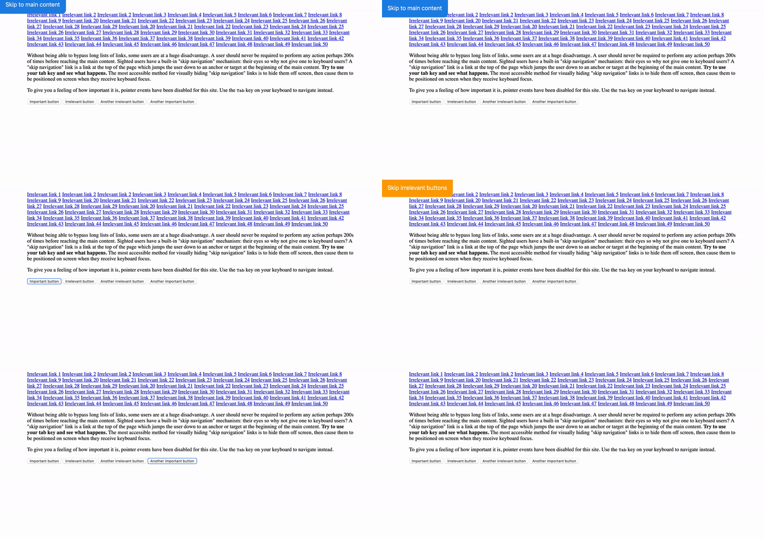
@a11y/skip-navigation
Web component friendly skip navigation functionality. Go here to see a demo https://appnest-demo.firebaseapp.com/skip-navigation/.
➤ Installation
$ npm i @a11y/skip-navigation
➤ Usage
Here's an example on how to use this library. After you have imported it you can use the <skip-button> and <skip-anchor tags. The skip-button element presents a skip button to the user when it is focused. The skip-anchor element defines where to the focus should be set when the skip button is used.
<!DOCTYPE html>
<html>
  <body>
    <skip-button></skip-button>
    <a href="#">Irrelevant link 1</a>
    <a href="#">Irrelevant link 2</a>

    <!-- More irrelevant links.. -->

    <skip-anchor></skip-anchor>

    <!-- Main content -->
  </body>
</html>
If you want to have multiple skip-button elements you can set an id on the skip-anchor and use the for attribute on the skip-button like this.
<!DOCTYPE html>
<html>
  <body>

    <!-- When this skip button is pressed the focus is shifted to the anchor with the maincontent ID -->
    <skip-button for="maincontent">Skip to main content</skip-button>
    <skip-anchor id="navigation"></skip-anchor>

    <a href="#">Irrelevant link 1</a>
    <a href="#">Irrelevant link 2</a>

    <!-- More irrelevant links.. -->

    <skip-anchor id="maincontent"></skip-anchor>

    <!-- Main content -->

    <!-- When this skip button is pressed the focus is shifted to the anchor with the navigation ID -->
    <skip-button for="navigation">Skip to navigation</skip-button>
  </body>
</html>
➤ Documentation
This section documents the attributes, css variables and slots of the web components this library exposes.
➤ skip-button
Button that skips to an anchor.
Attributes
| Attribute | Type | Description |
|---|---|---|
for |
String |
Optional ID of the anchor that should be navigated to. |
Methods
| Method | Type | Description |
|---|---|---|
focusAnchor |
(): void |
Focuses the anchor. |
Slots
| Name | Description |
|---|---|
| Text to the user. Defaults to "Skip to main content" |
CSS Custom Properties
| Property | Description |
|---|---|
--skip-button-bg |
Background. |
--skip-button-border-radius |
Border radius. |
--skip-button-color |
Foreground. |
--skip-button-font-size |
Font size. |
--skip-button-padding |
Padding. |
--skip-button-transition |
Transition. |
➤ skip-anchor
Anchor that the skip button can skip to.
Attributes
| Attribute | Type | Description |
|---|---|---|
id |
String |
Optional ID that should be associated with the anchor when using the skip-button for attribute. |
Methods
| Method | Type | Description |
|---|---|---|
focus |
(): void |
Focuses the component. |
➤ Motivation
Without being able to bypass long lists of links, some users are at a huge disadvantage. A user should never be required to perform any action perhaps 200s of times before reaching the main content. Sighted users have a built-in "skip navigation" mechanism: their eyes so why not give one to keyboard users? A "skip navigation" link is a link at the top of the page which jumps the user down to an anchor or target at the beginning of the main content. The most accessible method for visually hiding "skip navigation" links is to hide them off screen, then cause them to be positioned on screen when they receive keyboard focus.
Read more here if you are interested in learning more.
➤ Contributors
| Andreas Mehlsen | You? |
➤ License
Licensed under MIT.


