AG Grid Angular Legacy
AG Grid is a fully-featured and highly customizable JavaScript data grid. It delivers outstanding performance, has no third-party dependencies and integrates smoothly with Angular.
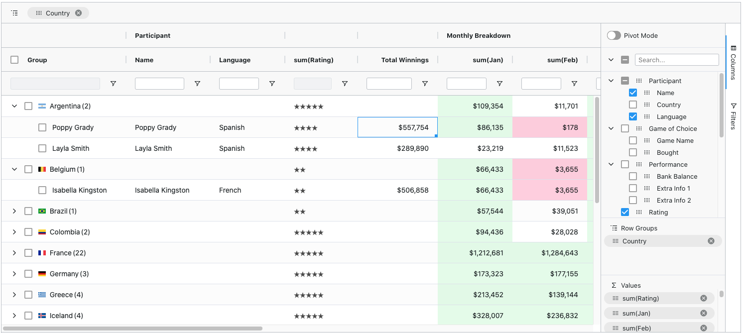
Here's how our grid looks with multiple filters and grouping enabled:
Supported Angular Versions
This legacy version is for use with Angular versions 8-11 as it is distributed in View Engine format now that the corresponding @ag-grid-community/angular package has been moved on to Ivy with a minimum dependency of Angular v12.
See Angular Version Compatibility for which versions of Angular are supported by each AG Grid version.
Features
In addition to the standard set of features you'd expect from any grid:
- Column Interactions (resize, reorder, and pin columns)
- Pagination
- Sorting
- Row Selection
Here are some of the features that make AG Grid stand out:
- Grouping / Aggregation *
- Accessibility support
- Custom Filtering
- In-place Cell Editing
- Records Lazy Loading *
- Server-Side Records Operations *
- Live Stream Updates
- Hierarchical Data Support & Tree View *
- Customizable Appearance
- Customizable Cell Contents
- State Persistence
- Keyboard Navigation
- Data Export to CSV
- Data Export to Excel *
- Excel-like Pivoting *
- Row Reordering
- Copy / Paste
- Column Spanning
- Pinned Rows
- Full Width Rows
- Integrated Charting
- Sparklines
* The features marked with an asterisk are available in the Enterprise version only.
Check out the developer documentation for a complete list of features or visit our official docs for tutorials and feature demos.
Getting started
Use the setup instructions below or go through a 5-minute-quickstart guide.
Install dependencies
$ npm install --save @ag-grid-community/core @ag-grid-community/angularImport AgGridModule and add it to the App module
import { AgGridModule } from '@ag-grid-community/angular';

@NgModule({
	declarations: [AppComponent],
	imports: [BrowserModule, AgGridModule.withComponents([])],
	bootstrap: [AppComponent]
})
export class AppModule {}
Import styles in styles.css
@import "~@ag-grid-community/styles/ag-grid.css";
@import "~@ag-grid-community/styles/ag-theme-alpine.css";
Set the grid's configuration in a parent component
export class AppComponent {
	title = 'app';

	columnDefs: ColDef[] = [
		{ headerName: 'Make', field: 'make' },
		{ headerName: 'Model', field: 'model' },
		{ headerName: 'Price', field: 'price' }
	];

	rowData = [
		{ make: 'Toyota', model: 'Celica', price: 35000 },
		{ make: 'Ford', model: 'Mondeo', price: 32000 },
		{ make: 'Porsche', model: 'Boxster', price: 72000 }
	];
}
Render the grid as the ag-grid-angular child component
<ag-grid-angular
	style="width: 500px; height: 500px;"
	class="ag-theme-alpine"
	[rowData]="rowData"
	[columnDefs]="columnDefs">
</ag-grid-angular>
Issue Reporting
If you have found a bug, please report it in this repository's issues section. If you're using the Enterprise version, please use the private ticketing system to do that.
Asking Questions
Look for similar problems on StackOverflow using the ag-grid tag. If nothing seems related, post a new message there. Please do not use GitHub issues to ask questions.
Contributing
AG Grid is developed by a team of co-located developers in London. If you want to join the team check out our jobs board or send your application to info@ag-grid.com.
License
This project is licensed under the MIT license. See the LICENSE file for more info.


